This was our fourth club competition of the 2019-20 season. Originally it was scheduled to be a print competition, subject "People", to be held on the 3rd April 2020. Due to the covid-19 restrictions it was changed to open subject, (we will hold a "People" print competition when normal club meetings resume), and our judge, Michael Krier MA (photography), ARPS, AFIAP, agreed to judge the entries at home and provide written critiques for each image.
Below are the images (55 in total) and the judge's comments and scores:
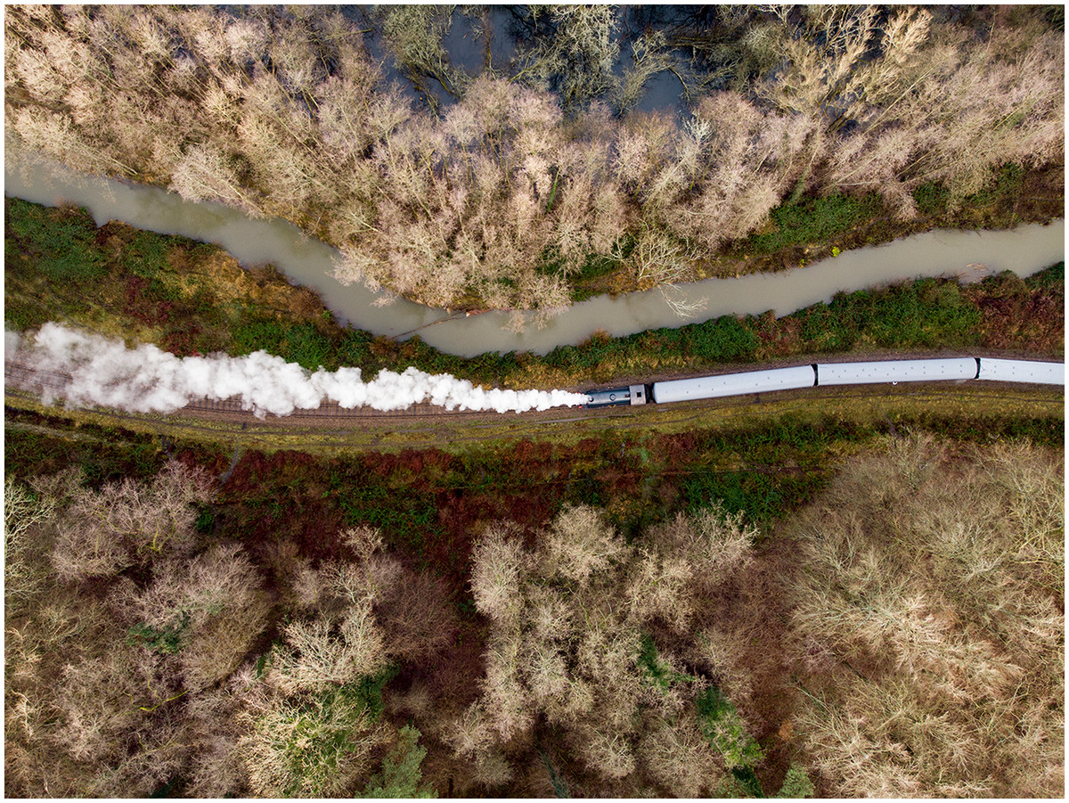
1st place: Steam Train by Iain McCallum, score 20.
Excellent drone (?) shot. Textures, colours, patterns together with precise selection and good timing make for a perfect images & worthy winner.
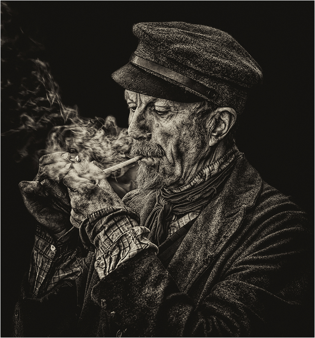
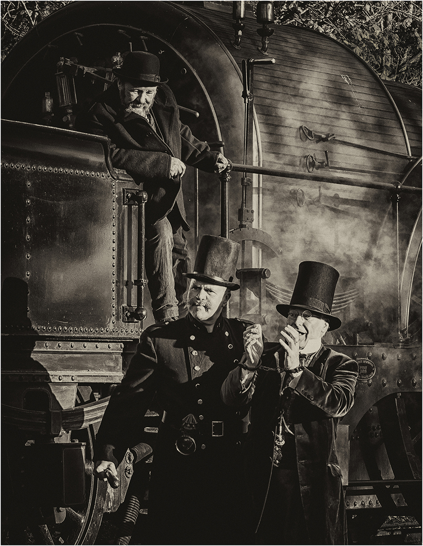
2nd place: One of Life's Little Pleasures by John Crowland, score 19.
Heavily filtered to give atmospheric rendering; match flame and smoke excellent timing/touches; excellent composition & exposure.
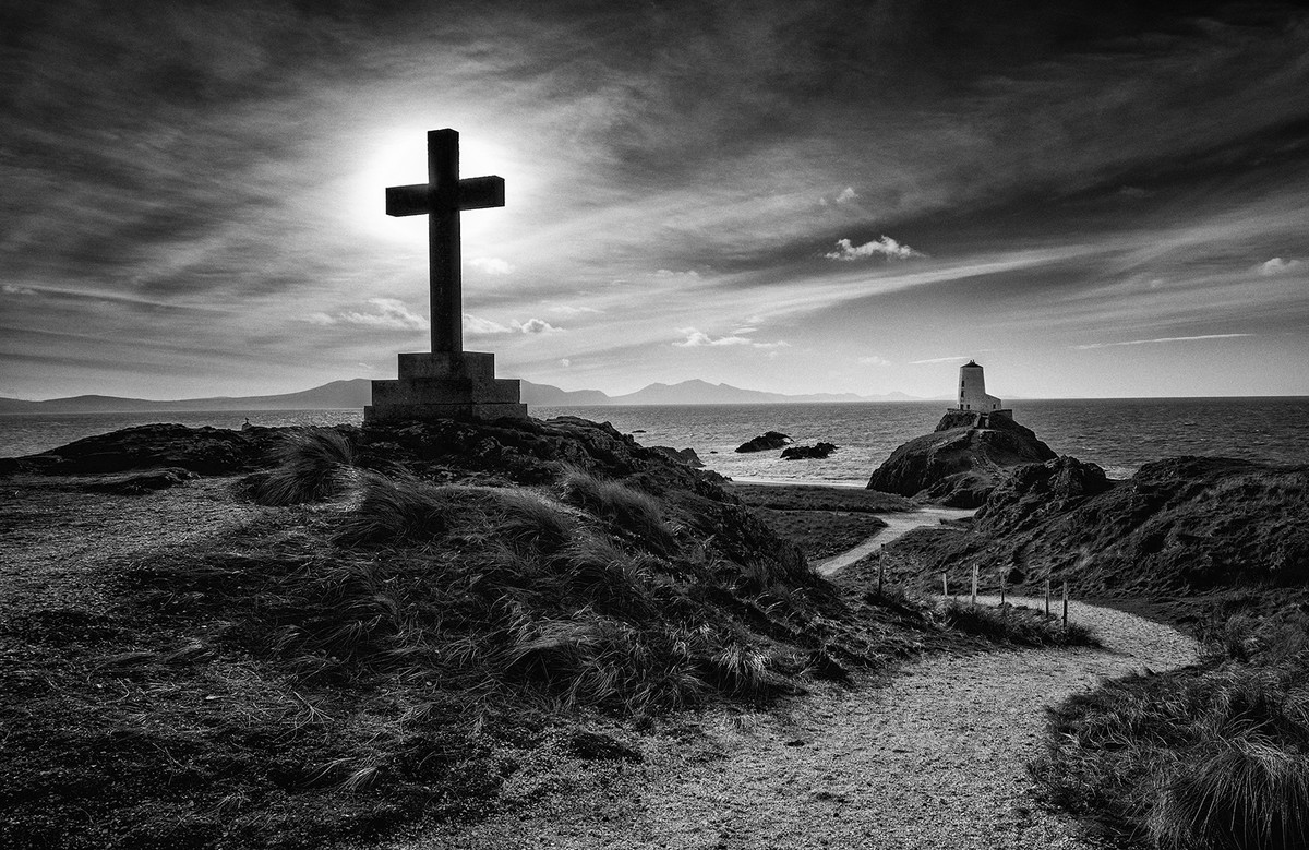
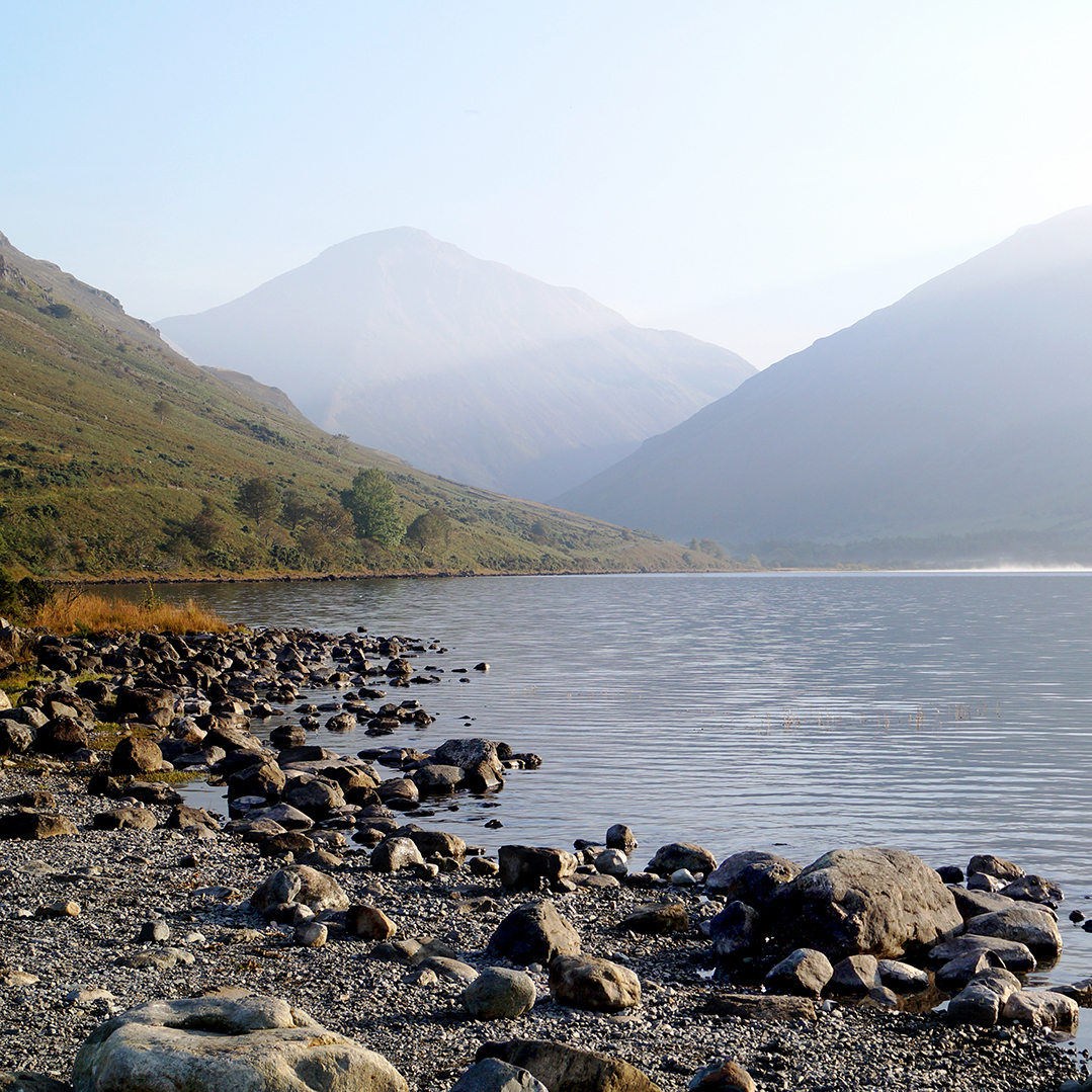
3rd place: Llanddwyn Island by Keith Sharples, score 18.
Excellent mono landscape; exposure w light area behind cross is v gd as is treatment of sky and grass; lead in by path to lighthouse to rocks beyond excellent.
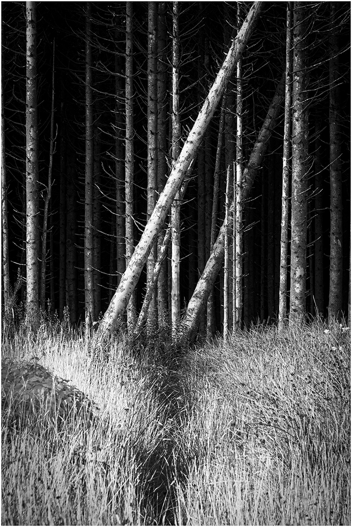
Highly Commended: Path to the Fallen by Iain McCallum, score 17.
I really like this image - the concept, seeing and execution. Pity the foreground isn't quite sharp; the light area on left might be darkened slightly.
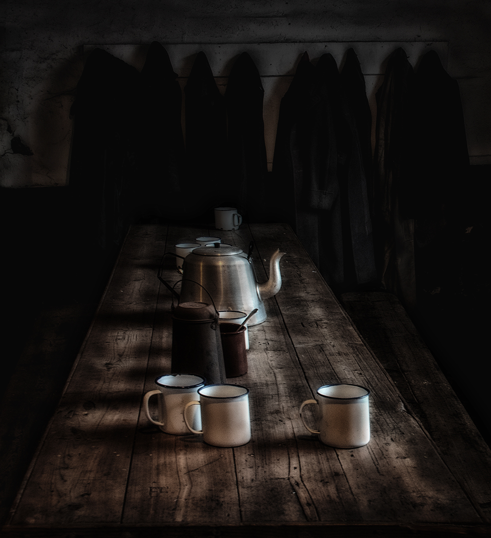
Highly Commended: Slate Workers' Canteen by Keith Sharples, score 17.
Beautiful composition, subdued colours and lighting; perhaps a little more detail/light in the darker areas might improve what is already a very good image.
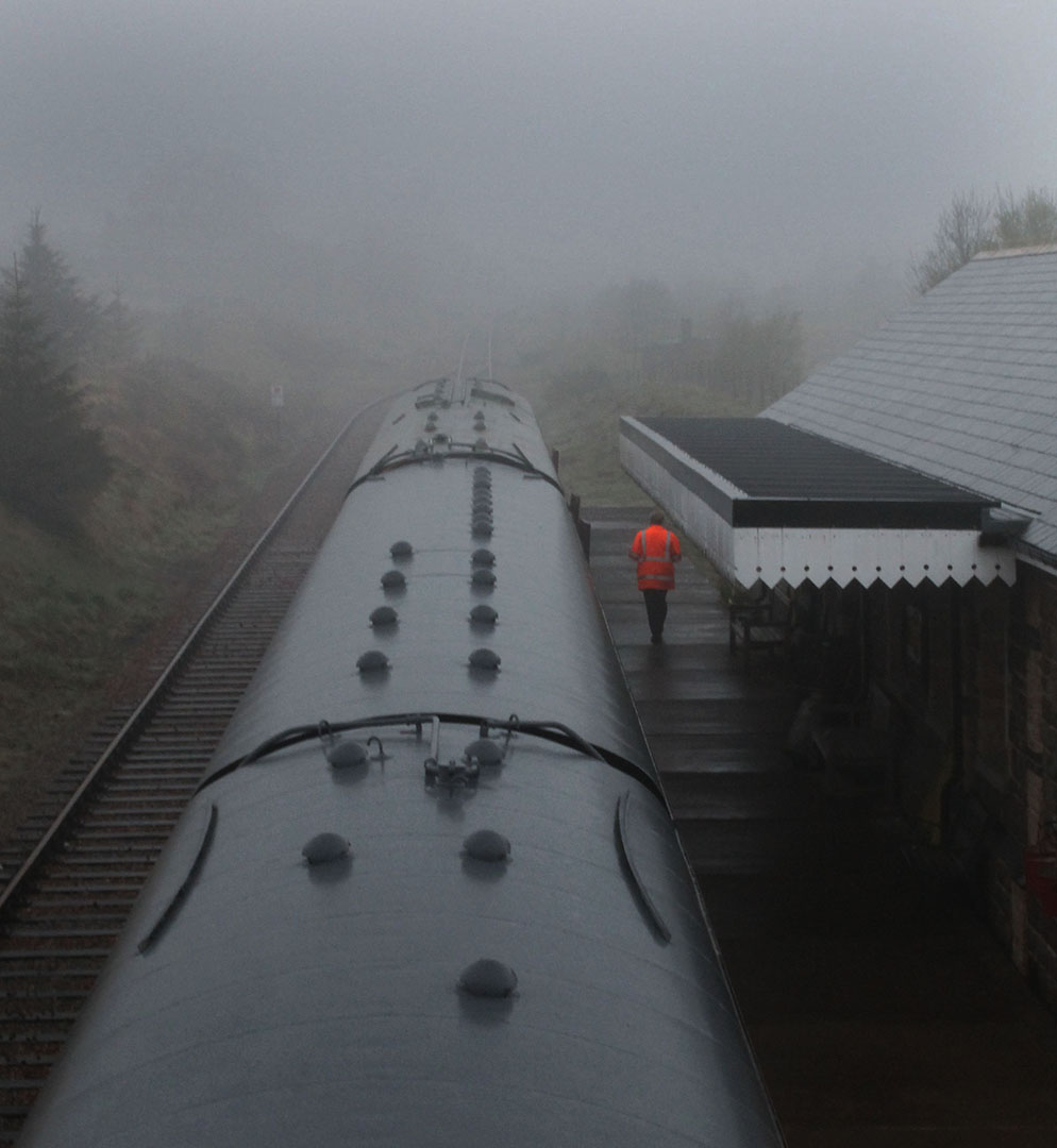
Highly Commended: Railway Worker by Catherine Jones, score 17.
I love the simplicity of this image, the strong composition, the positioning of the high-viz man and the well controlled mist. Very good.
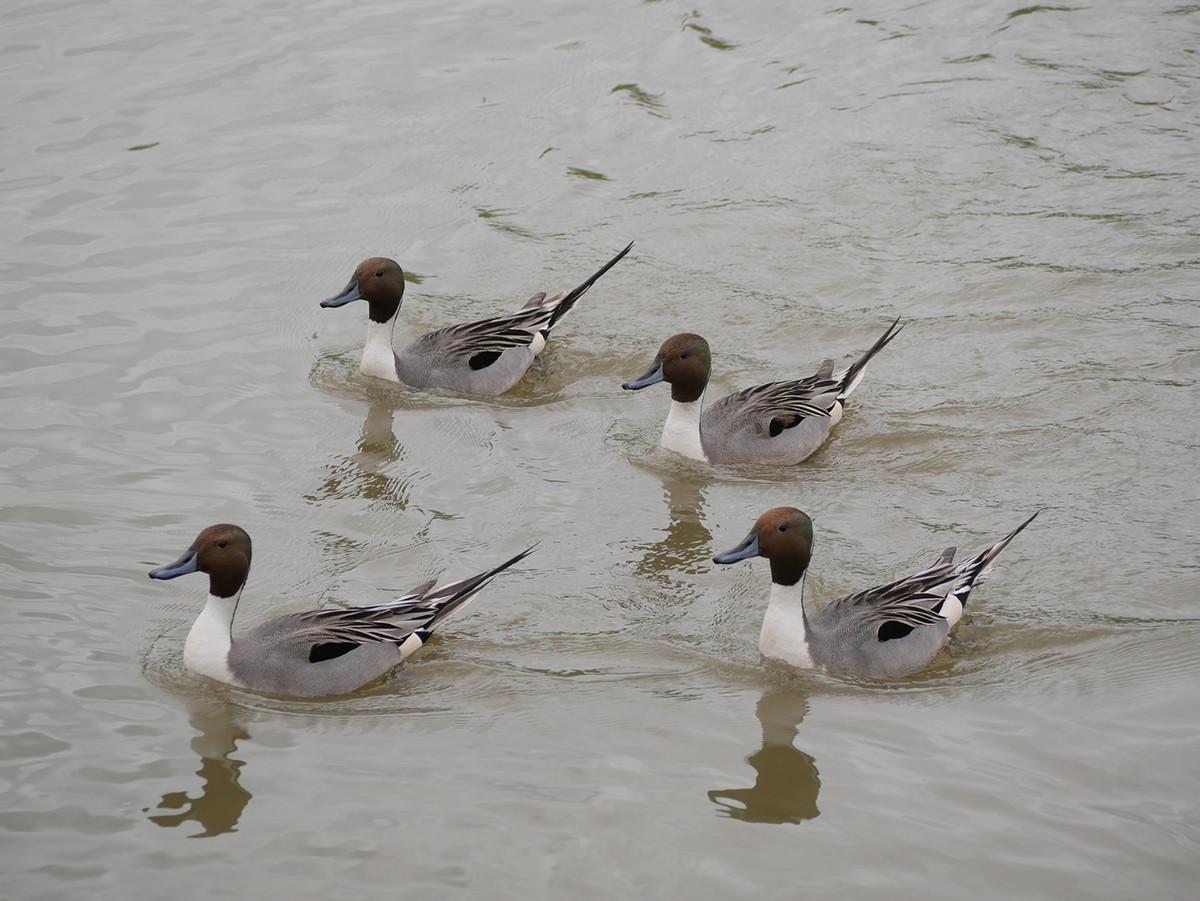
Commended: Pin Tail Ducks by Anne Richards, score 16.
Lighting a bit flat - you could up the contrast, but fantastic arrangement, water patterns and lighting.
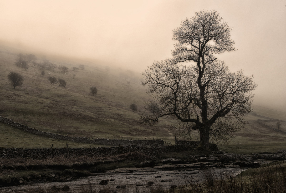
Commended: River Swale by Christopher Jones, score 16.
Highly competent landscape; I like the subdued/atmospheric lighting; good composition.
Commended: Reach for the Sky by Alison Stace, score 16.
I like this image - excellent selection and sufficient range of shades in the sky; my eye goes to top right third position which confirms strong composition.
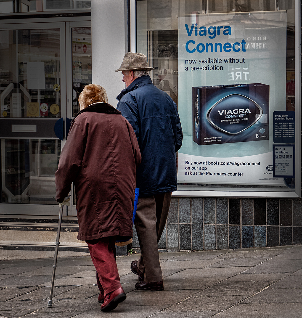
Commended: Connected by Lyn Sharples, score 16.
Good 'street photograph' with fantastic juxtaposition of the couple with the ad. Great to see humour in a picture.
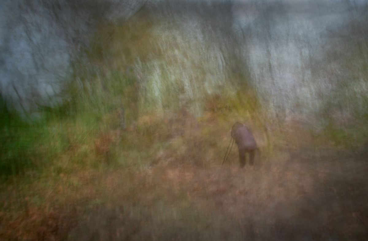
Commended: Impressions of a Photographer by Keith Sharples, score 16.
Impressionistic treatment, good composition and sense of movement in the photographer. Good colours. Foreground might have been sharper.
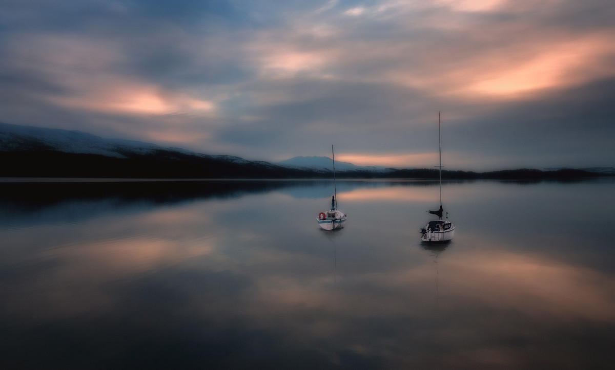
Commended: Early Morning by Lyn Sharples, score 16.
Atmospheric and great dawn colours. Good positioning of the yachts within a well selected/composed image.
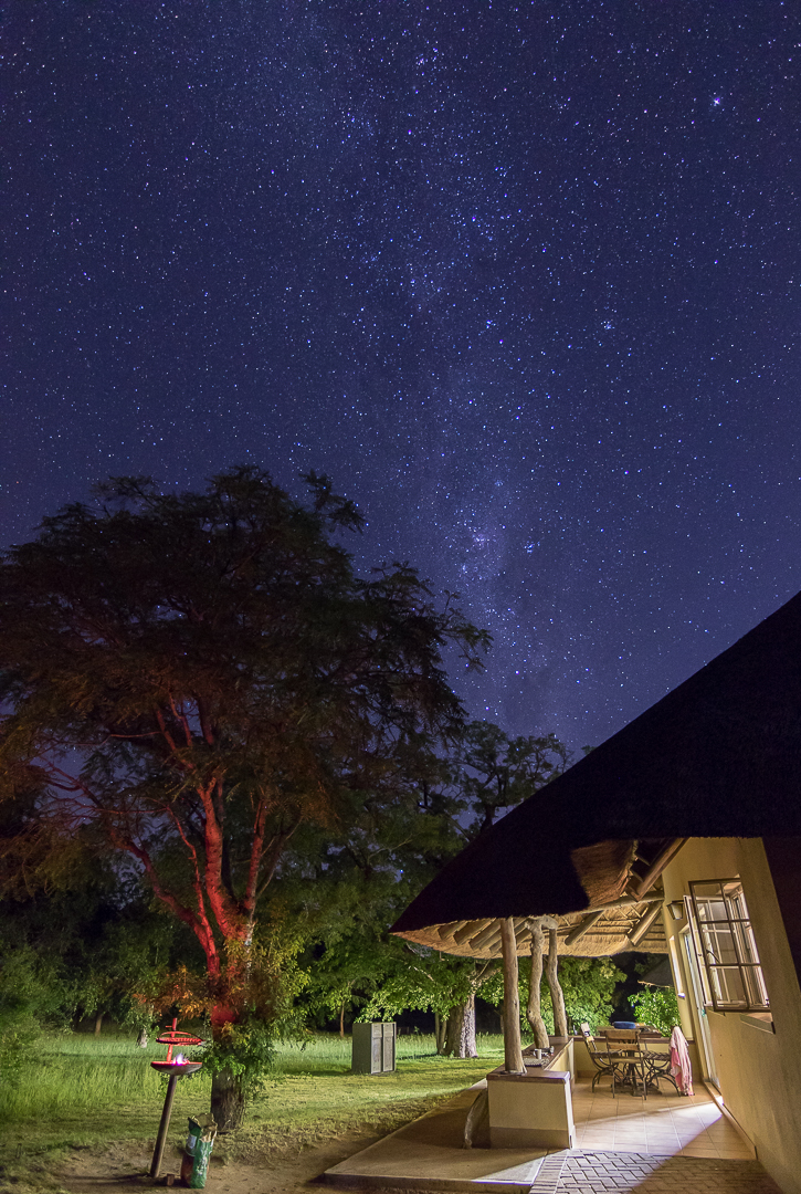
Commended: The Braai by Elisa Best, score 16.
Technically a very accomplished image - exposure, stars, colours, house light.
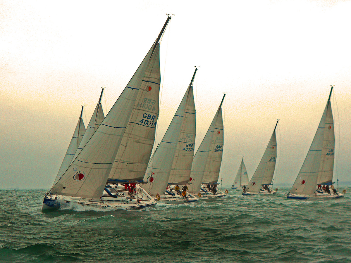
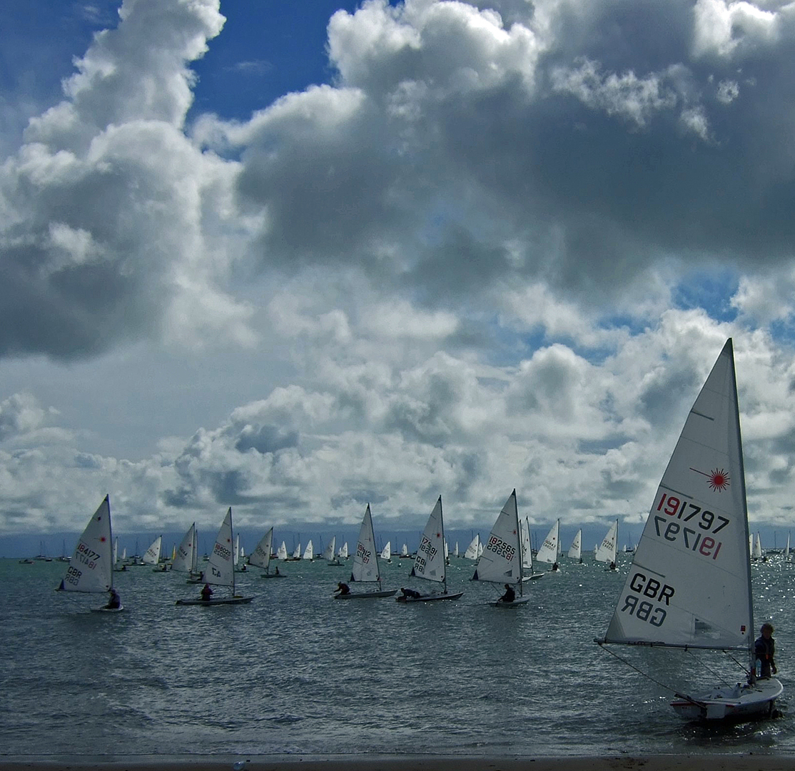
BUSA Sailing Upwind, score 15.
Atmospheric lighting & tight bunching, as well as clear sense of motion & pattern - good.
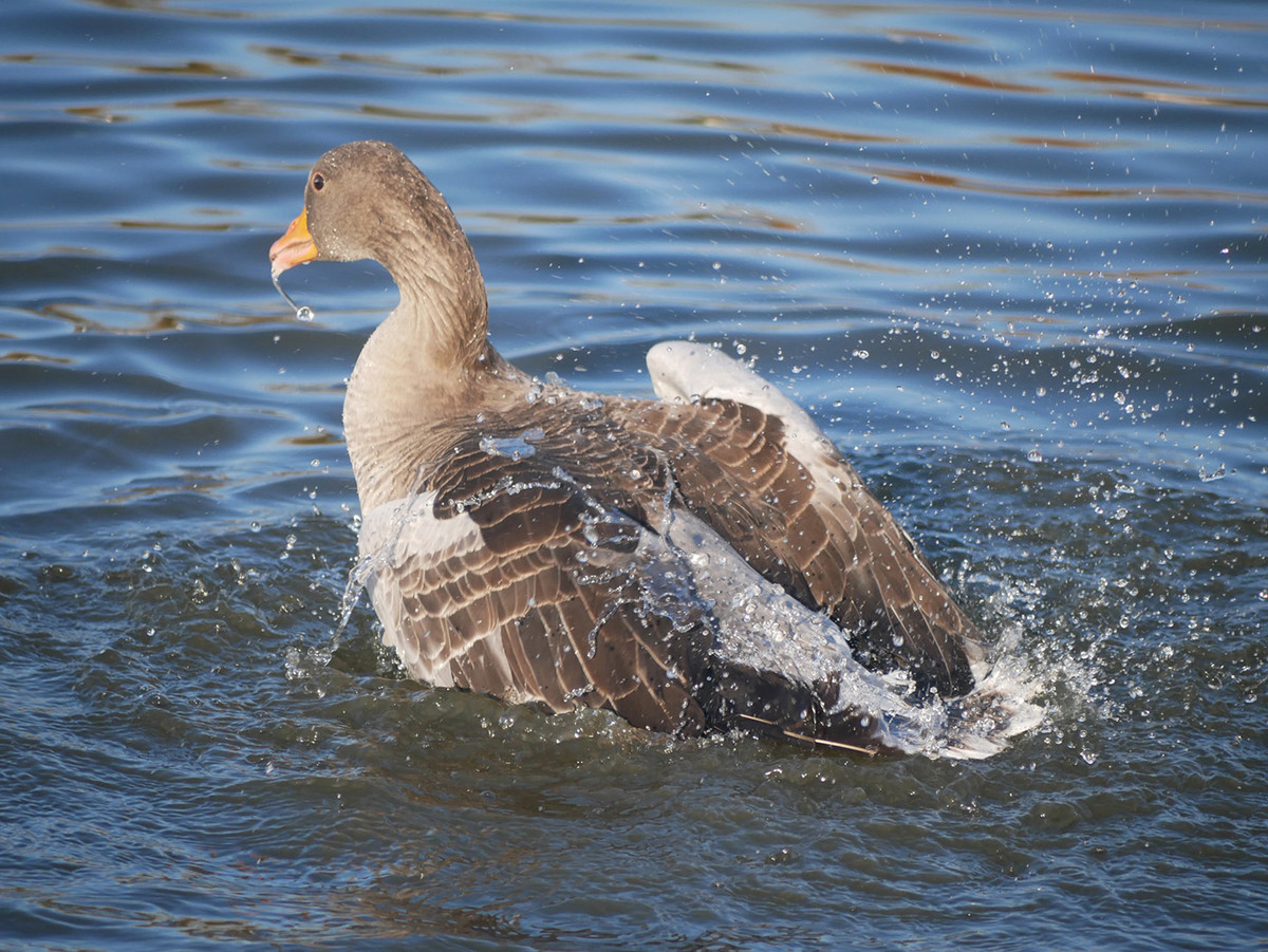
Greylag Goose Having Fun, score 14.
Needs to be more frontal and with wings outstretched to be effective; good choice of shutter speed.
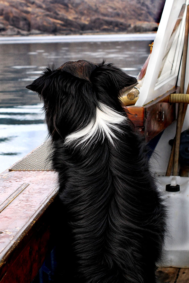
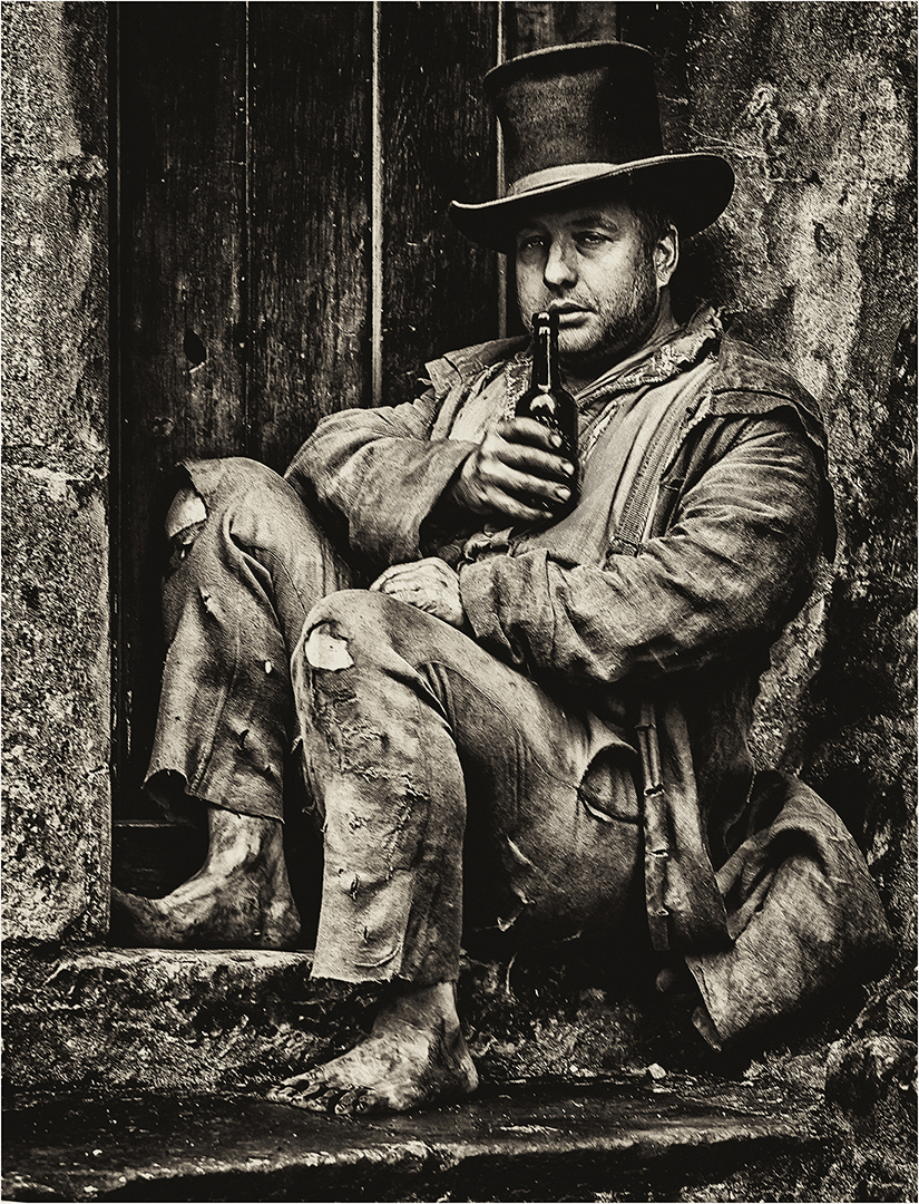
The Skipper, score 12.
Great fur definition on dog's coat but rear view and tight crop doesn't quite tell a story.
The Human Butterfly, score 14.
Amusing but quite a distance from the camera; pity he's looking away.
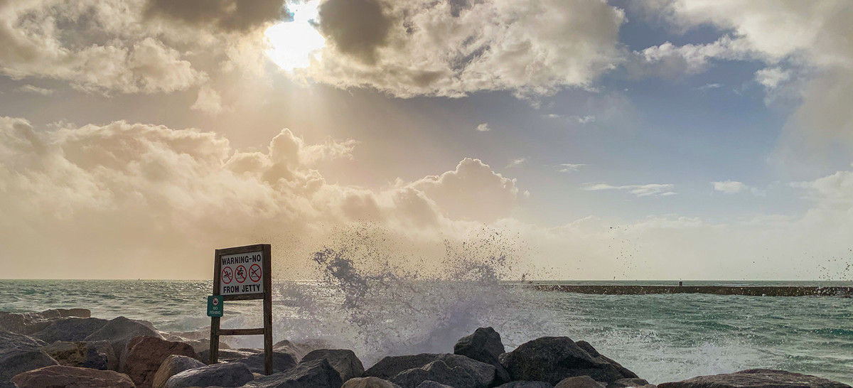
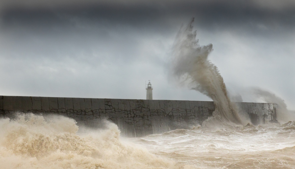
Crashing Onto Rocks, score 13.
You need to be closer and fill the frame with the breaking wave to have maximum impact; burnt out sky loses a point.
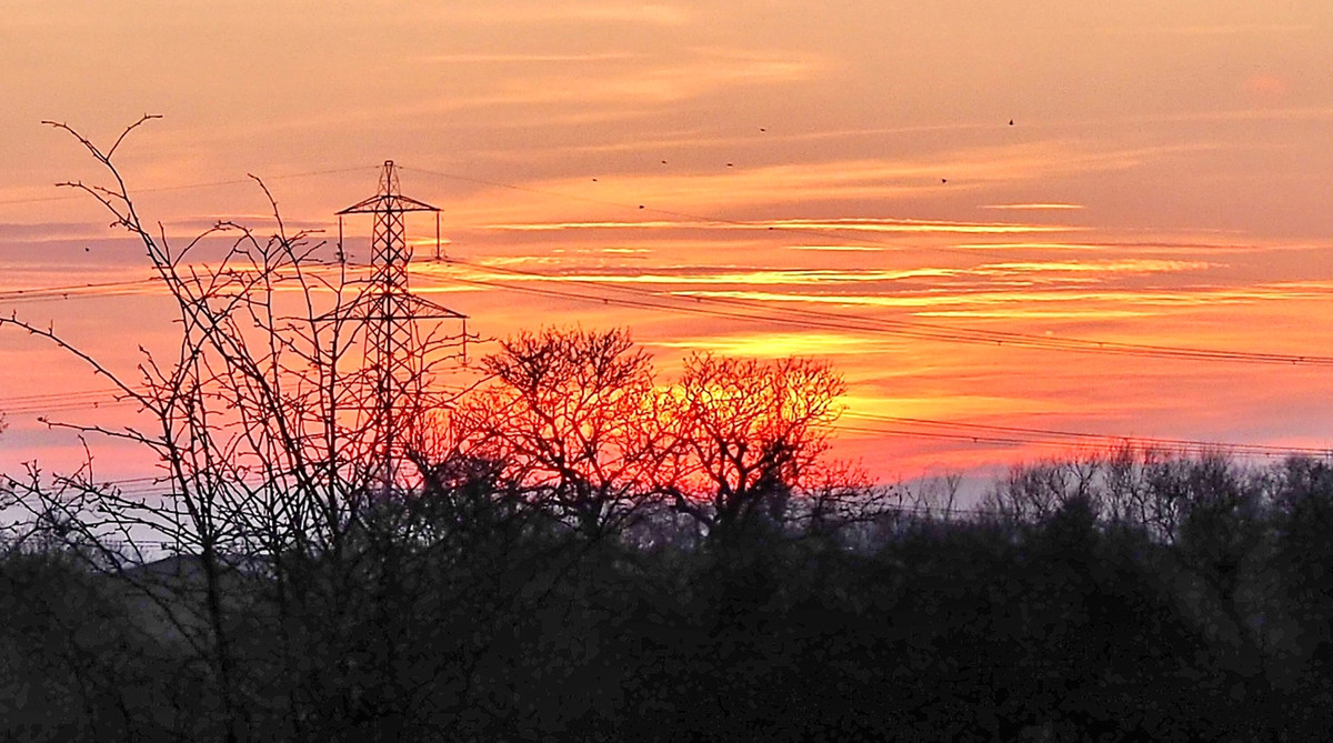
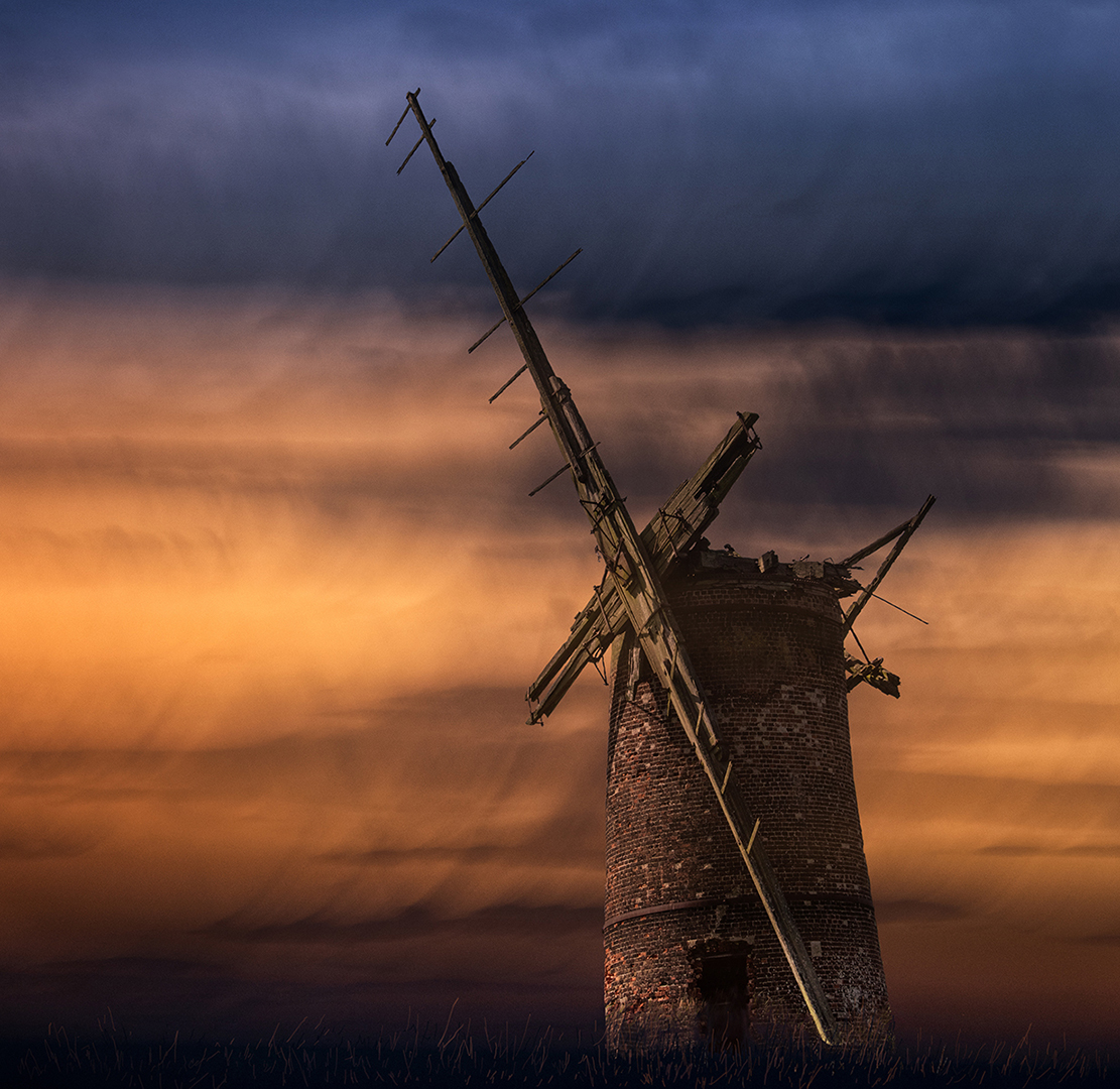
Pylon at Sunset, score 12.
Great sunset colours and good control of exposure but composition and point of interest weak.
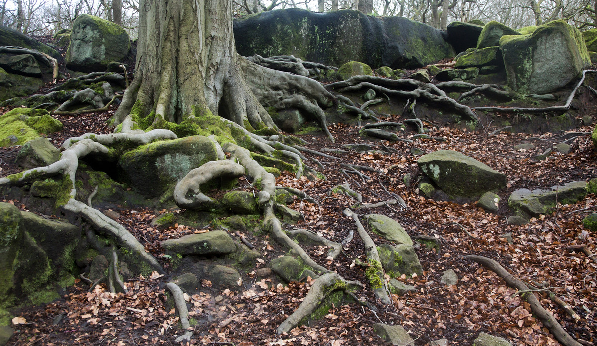
Roots, score 15.
Almost there; I would crop out the sky and get closer in to the roots around the trunk. Good exposure and depth of field.
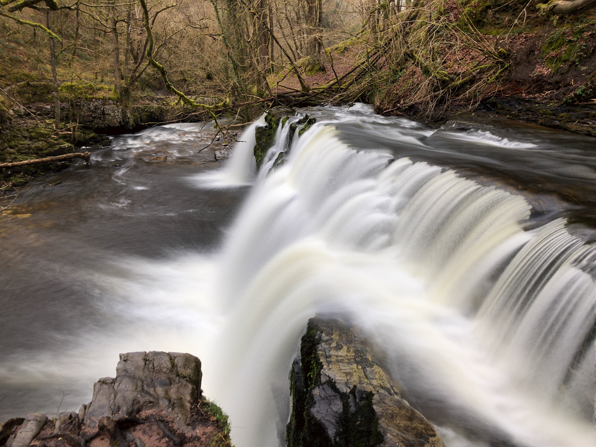
Silky Flow, score 13.
There is a good picture in the top third of the image; it would have been better to concentrate on trees and distant waterfall. Try a bold crop!
Abersoch, score 15.
A busy picture which is well arranged and controlled; I suggest you try different degrees of contrast/brightness as the image is a bit flat.
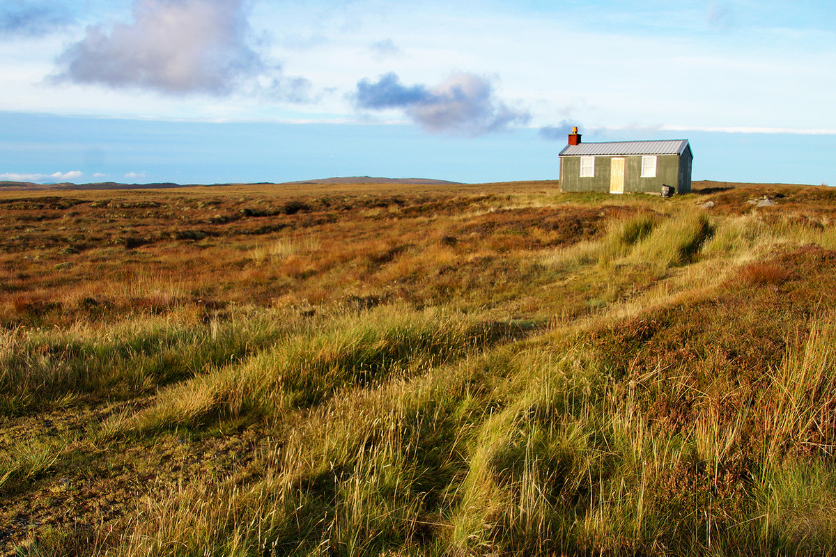
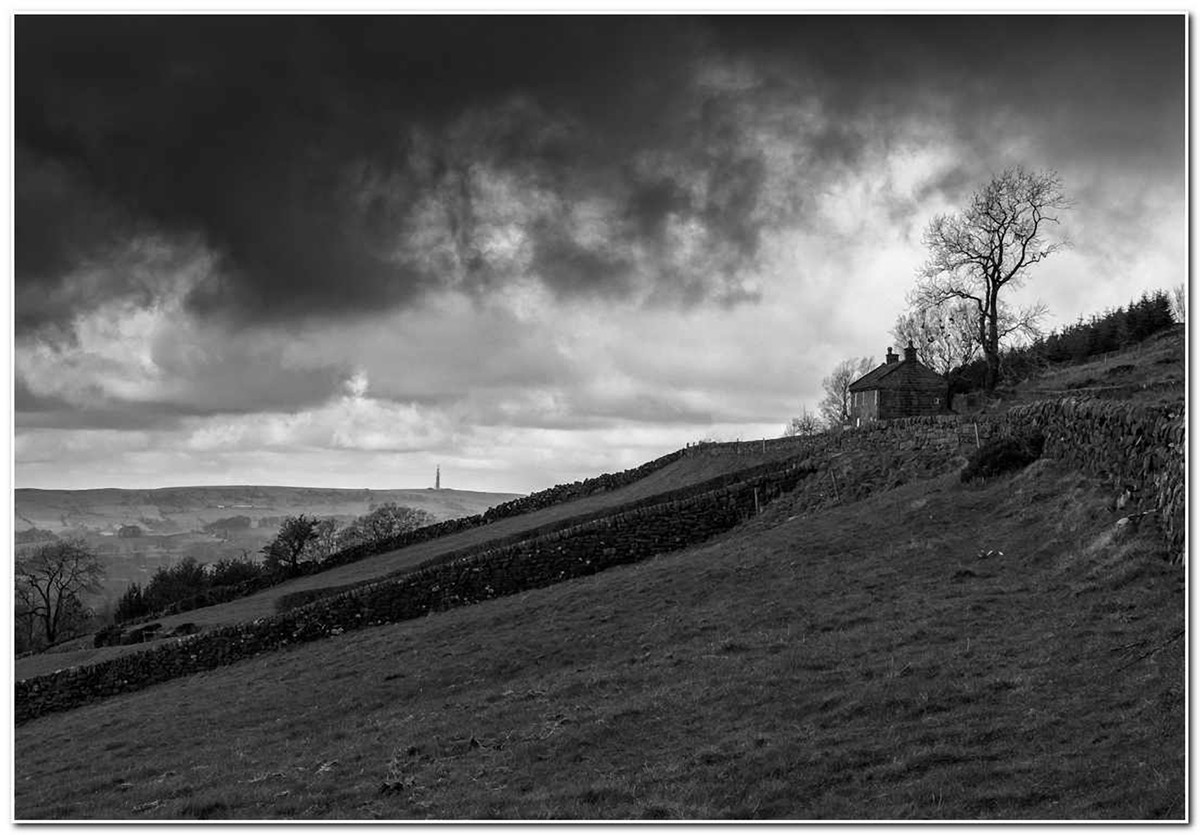
Little House on the Hill, score 15.
Pleasing but not very dramatic landscape; pity the clouds don't quite emulate smoke from chimney and bland sky lets you down.
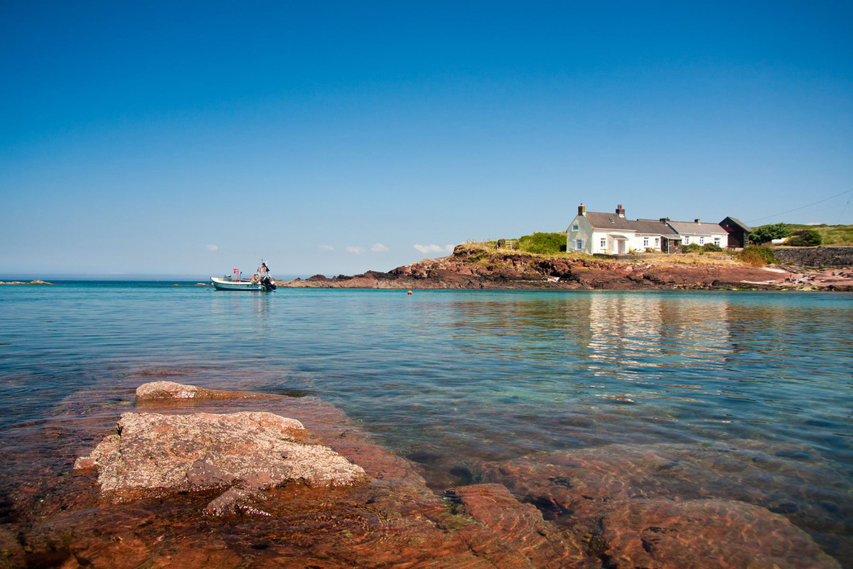
St Brides on a Summer's Day, score 13.
There is a good picture here: the cottages and their reflection; left hand rock and boat unbalance the composition; pity it's a cloudless sky.
Big Swell, score 14.
Good timing but the left hand part of the picture isn't necessary to convey the storm breaker. Could there be more contrast & saturation?
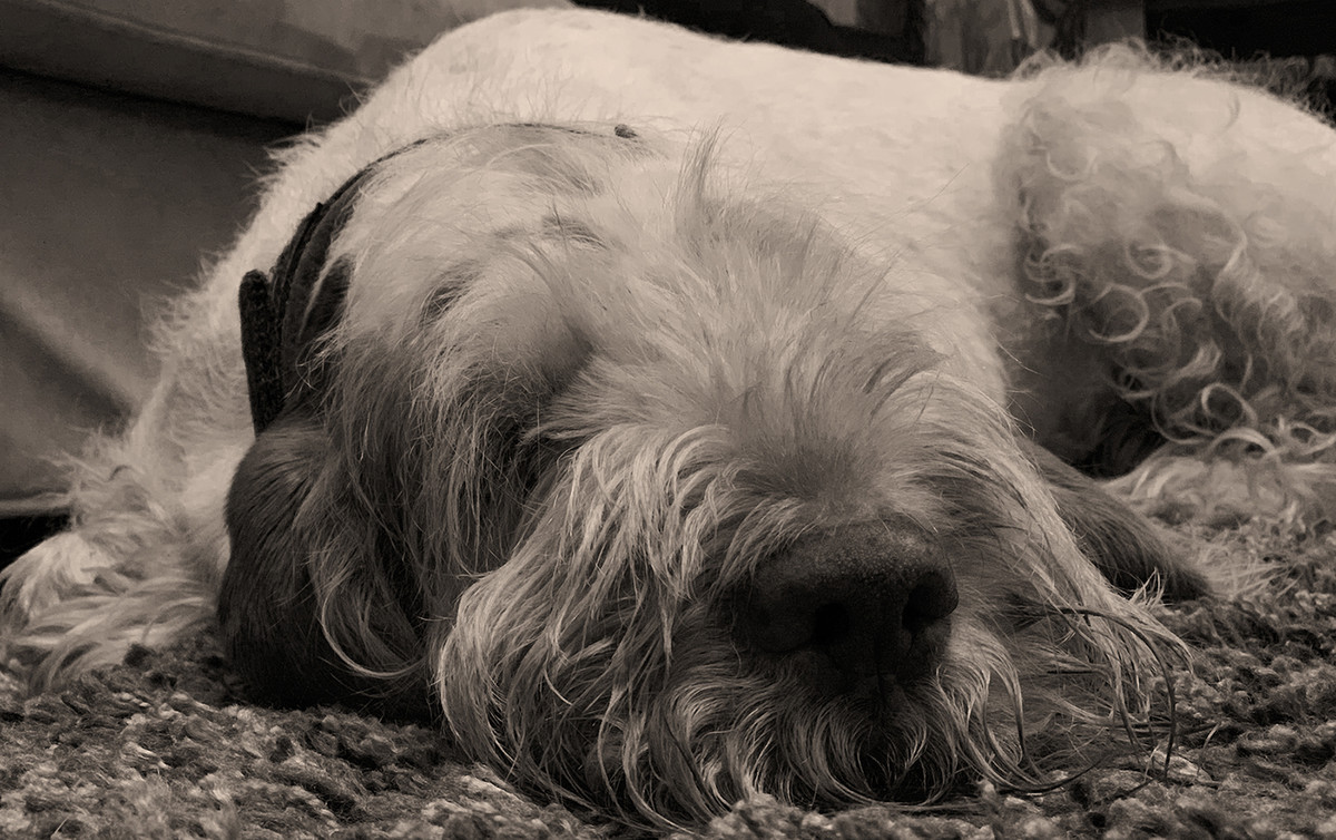
Sleeping Spinone, score 12.
Not really clear what the viewer is seeing - I think we need one or both eyes to work it out; need more detail in the shadows and highlights.
Lost, score 15.
Heavily filtered but has resulted in loss of shadow detail; eyes good as is composition.
Dark Satanic Barn, score 15.
Could you get a bit more contrast in the buildings and ground to match the brightness in the sky?
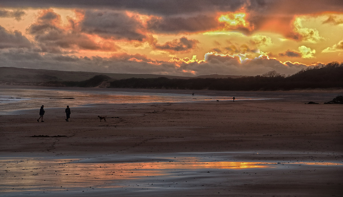
Beach Walkers, score 14.
Doesn't quite come off; greater variation of tone in sand necessary; sky isn't right and your burning of highlights is too obvious.
Farm on the Hill, score 14.
Getting in closer and more to the right would have helped improve selection and composition. Interesting light; more could have been made of house and tree.
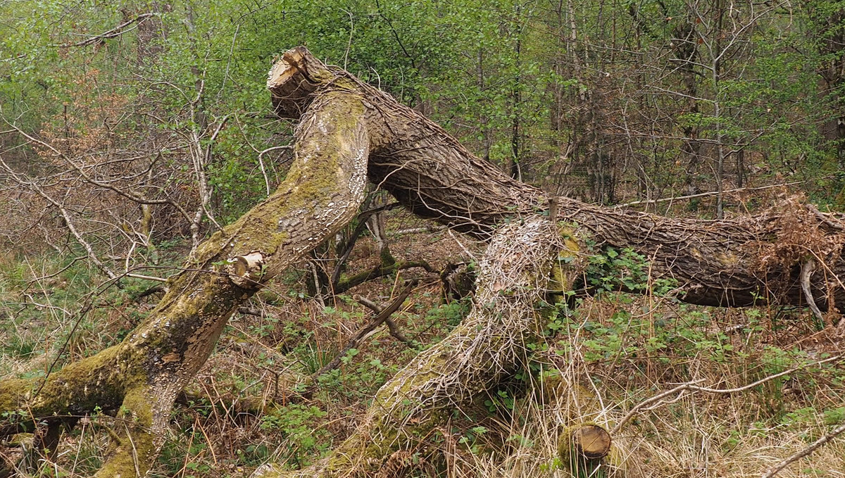
Komodoak Dragon, score 13.
Title suggests what was intended but the textures in the bark and ivy would make for a better point of interest for picture.
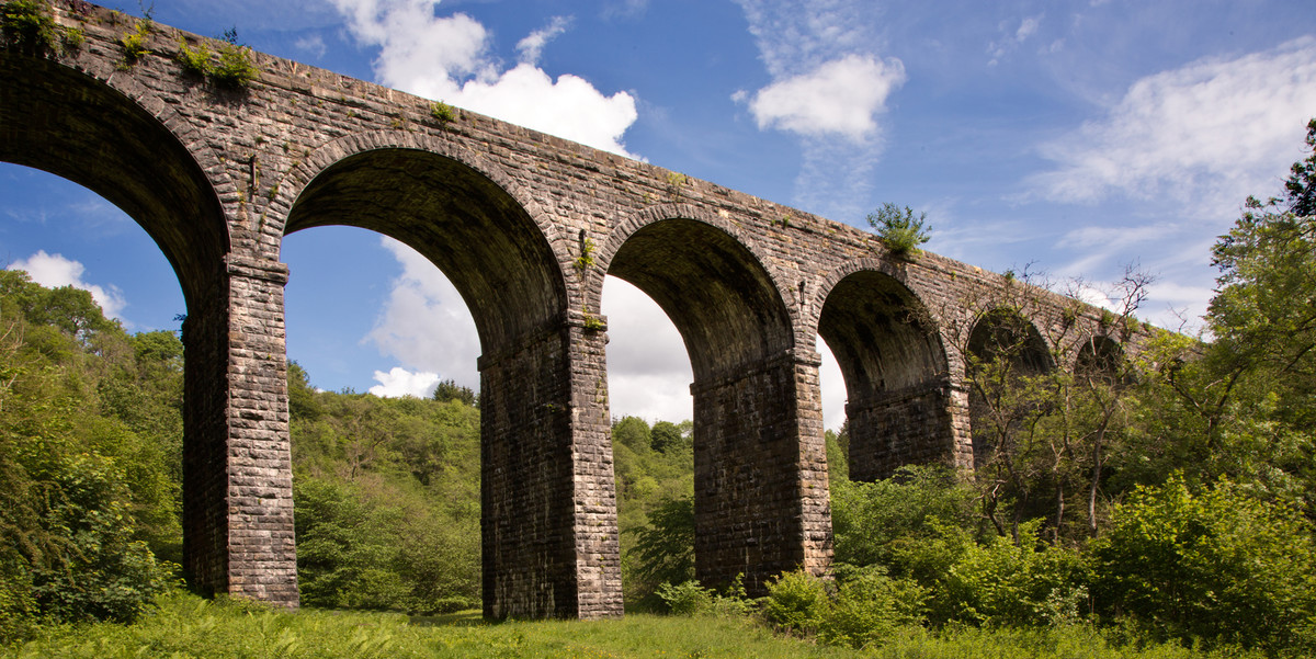
Pontsarn Viaduct, score 14.
Straightforward image - good exposure, composition but burnt out cloud lets it down; not much impact; needs something on top of viaduct?
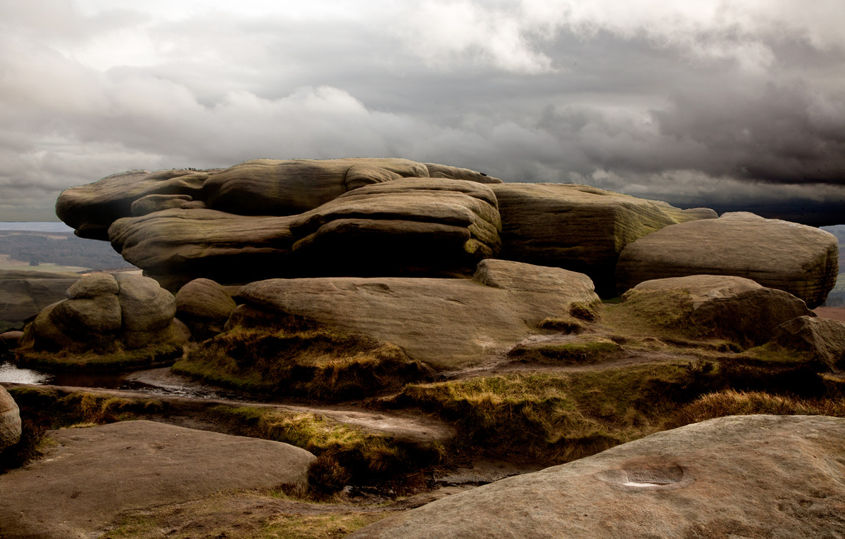
Stanage, score 13.
Not one thing or the other: either show more of the landscape for a setting or get in closer and concentrate on textures/colours in the rocks.
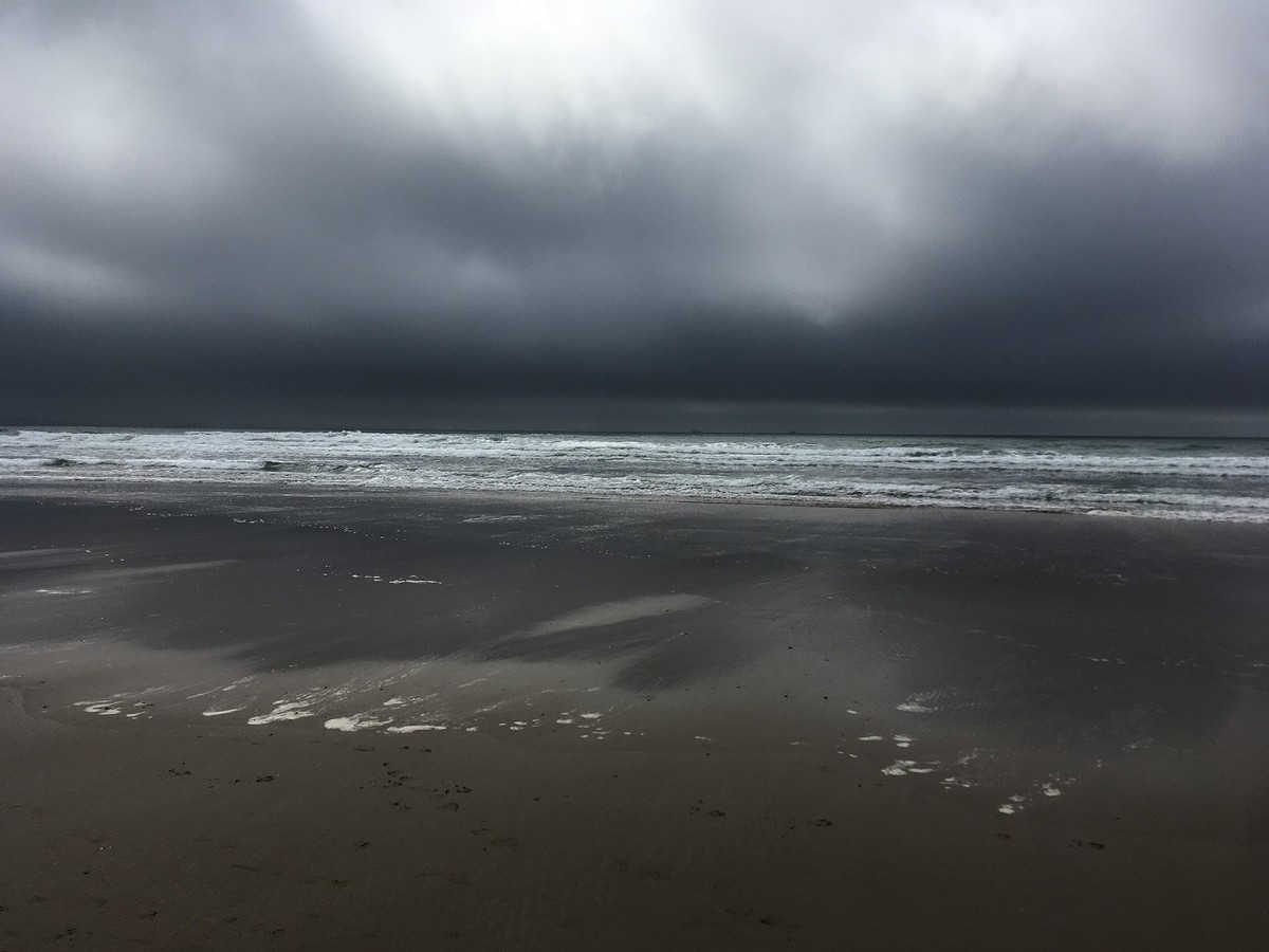
Sea and Sky, score 13.
Not sure you've made the most of the scene; a crop top and bottom would improve but there needs to be a point of interest; horizon not level!
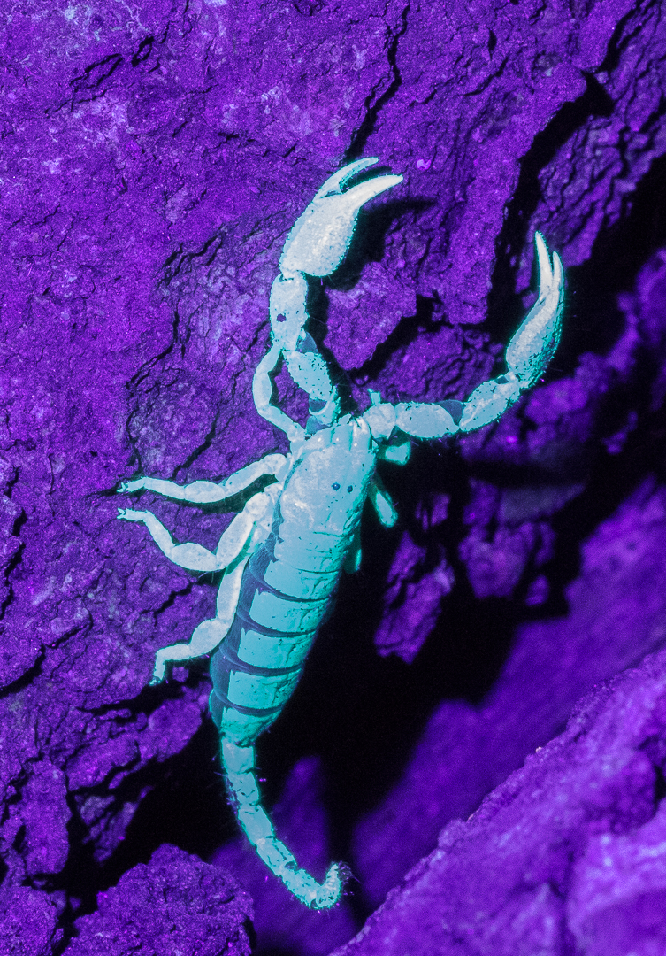
Tree Scorpion, score 13.
Is this colour infra-red? Only way to capture a scorpion at night I suppose; but I'm not sure this works for a competition. Scorpion needs to be sharper/clearer.
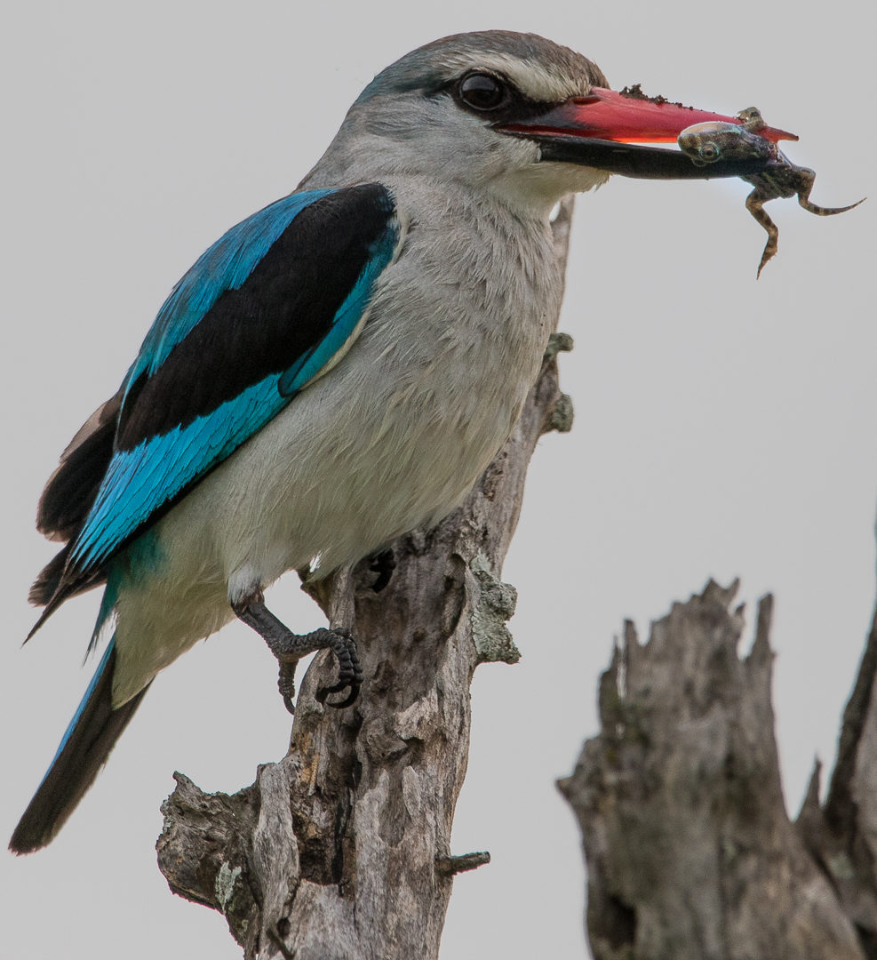
Woodland Kingfisher with Frog, score 15.
Very close in - too much so as we need some space round the bird and frog; good action and colour highlight on beak.
Guardian Angel, score 12.
A pity you didn't get closer to the angel with vines behind - that would have been a good picture; the pots are distracting. A bit too much going on.
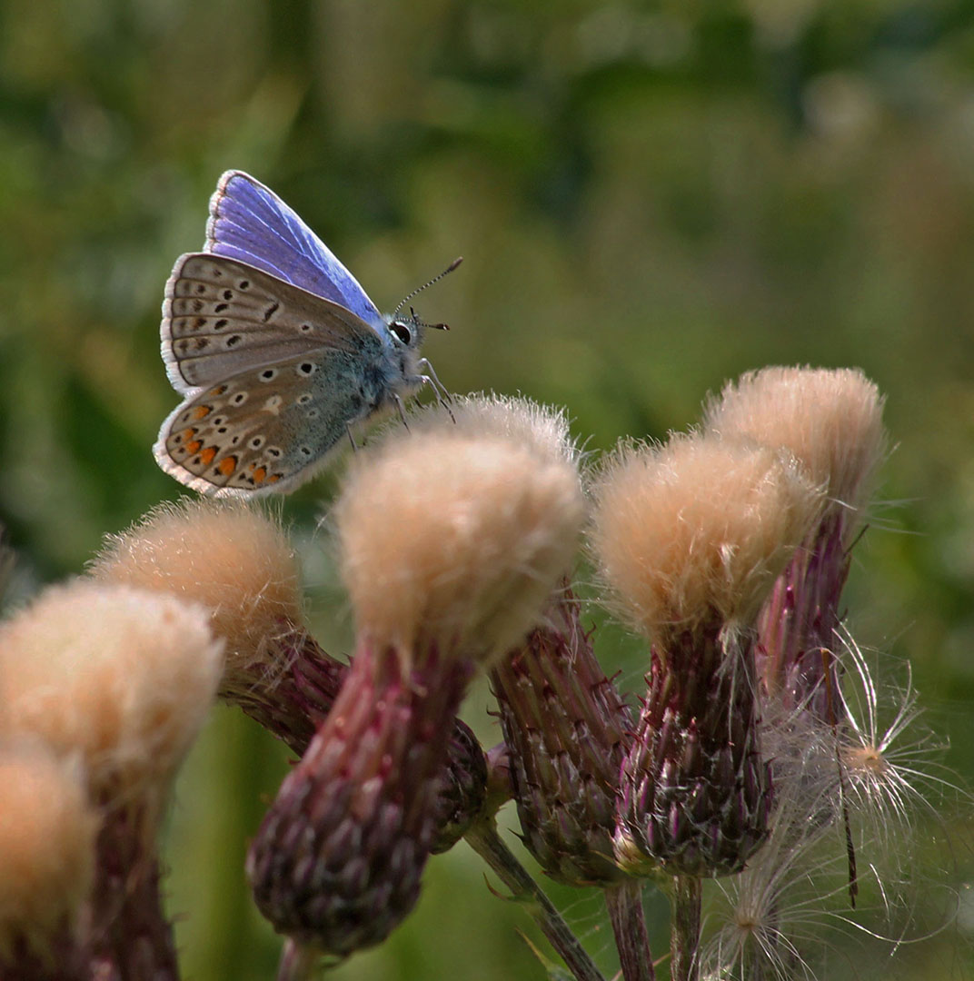
Common Blue, score 13.
The Blue is sharp on legs and antennae, but not the wings and the out of focus thistles are too dominant. Need to get in closer.
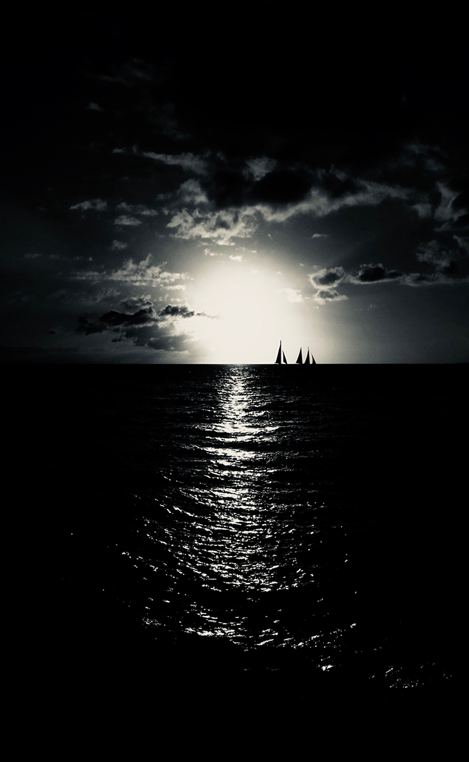
Midnight Sun, score 15.
Dramatic exposure and good composition with sails off centre.. A bit of detail in the darker areas would improve but maybe nothing on the sensor.
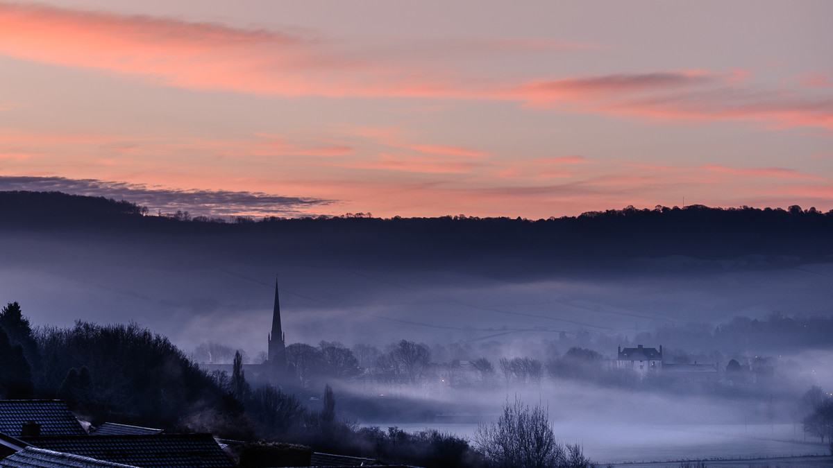
Sunrise, Monnow Valley, score 13.
There is a good image here: the spire, trees and house in the mist, but the dark left foreground intrudes and I'm not convinced the sky is necessary.
Lakeside, score 14.
My eye is drawn to the white area on the right; not sure why you've presented this image almost square. cropping some of the sky and foreground rocks would improve matters.
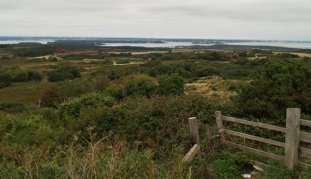
Towards Sandbanks, score 12.
My eye is drawn to the fence; there is a lot of featureless scrub which isn't very interesting. Dull lighting makes for a 'flat' image - try upping the contarst and brightness.
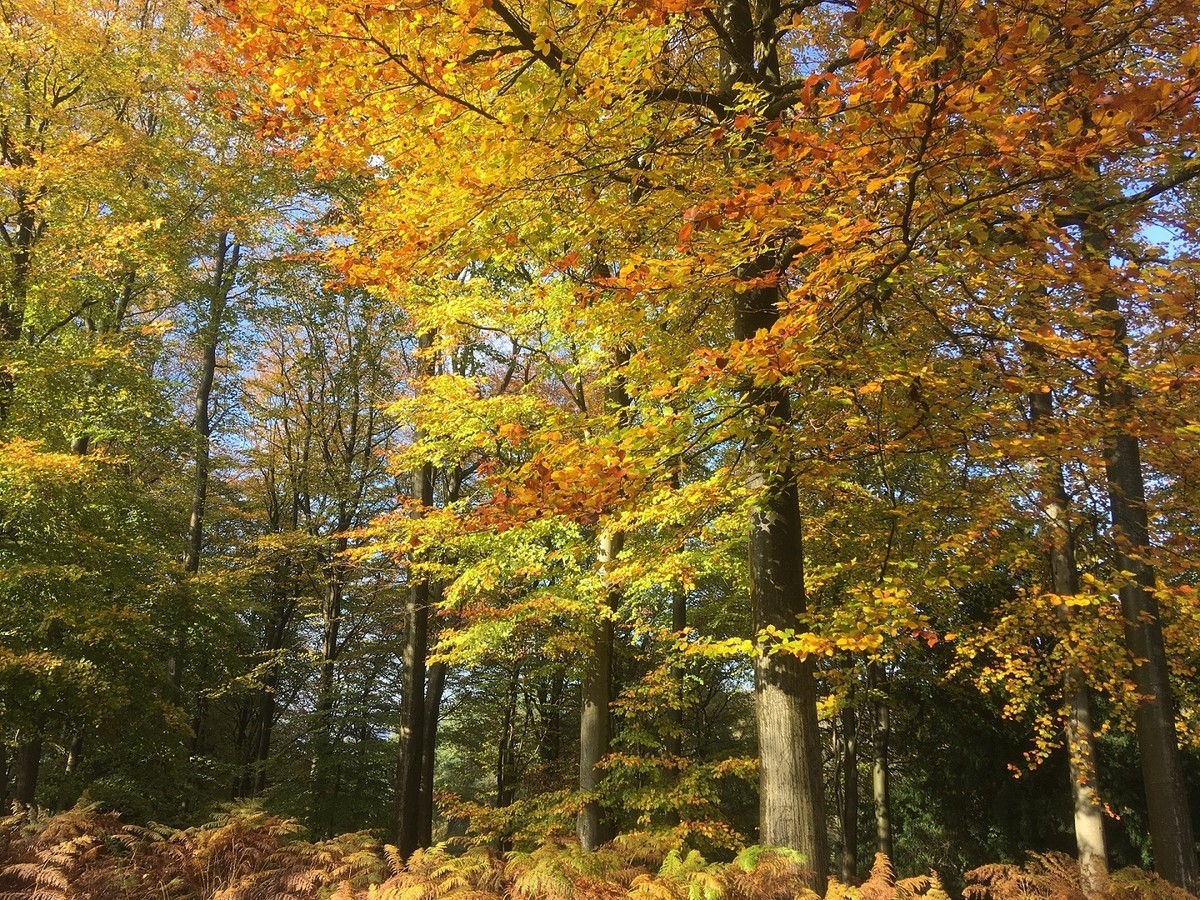
Autumn Trees, score 15.
Autumn colours are well rendered but I'm not sure where the main point of interest should be.
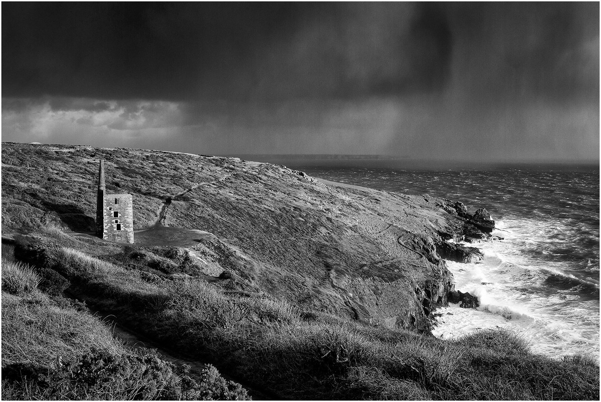
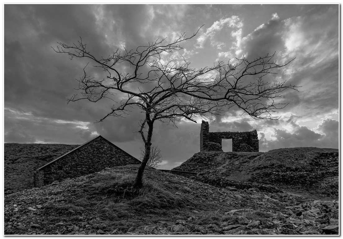
Rinsey Wheal Prosper, score 15.
It's a pity that the middle of the image is relatively featureless between the building and the surf. Good lead in provided by path. Lighting makes for a pleasing mono landscape w interesting rain & clouds. Greater pano w more sea would improve.
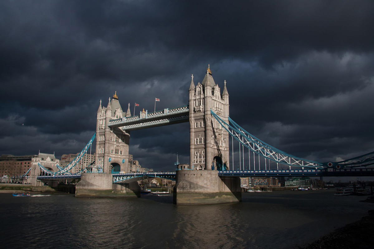
Dark Skies Over Tower Bridge, score 15.
A pleasing image of a much photographed subject; very lucky with the lighting (patience?) and breeze to animate the flags.
Trespass on the Railway, score 15.
Great 'story' in the picture which is let down by the absence of detail in the shadows.
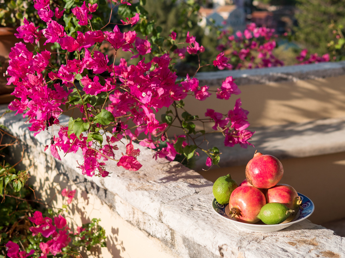
Pomegranates and Limes, score 13.
Simple and colourful but central part of image lacks sharpness. Perhaps concentrating on the pomegranates would have been advisable.
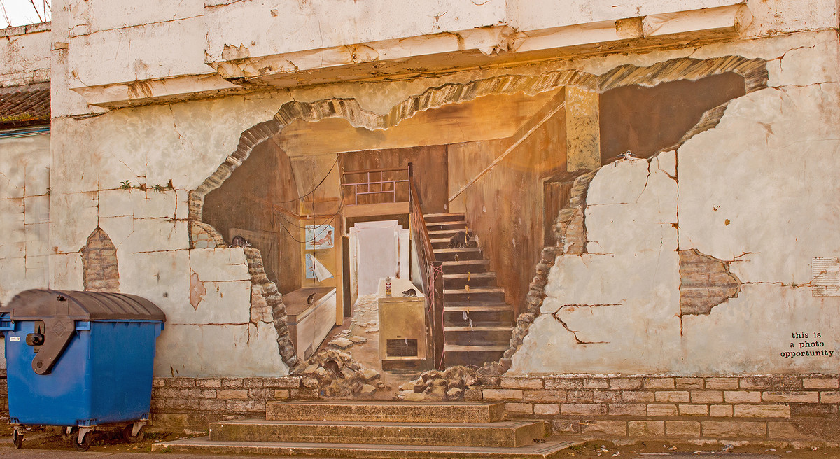
Poole Street At, score 13.
Humour provided by the 'slogan' but I'm not sure the wheelie bin helps.
Pride and Joy, score 14.
'Does what it says on the tin' picture. Pleasing on the eye but could do with a bit more detail in the darker areas - half a stop brighter.
The Mill, score 15.
Not sure whether sky has been adjusted or really was like that. A bit more contrast on the structure would be helpful.
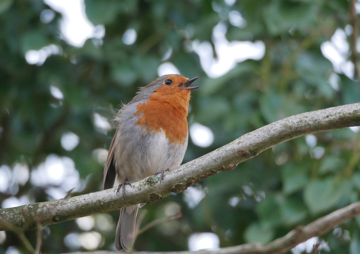
Robin, score 13.
Robin itself is OK but the lighting was rather flat. However the picture is let down by the white 'blobs' which might have been cloned out and/or darkened so as not to be so intrusive.
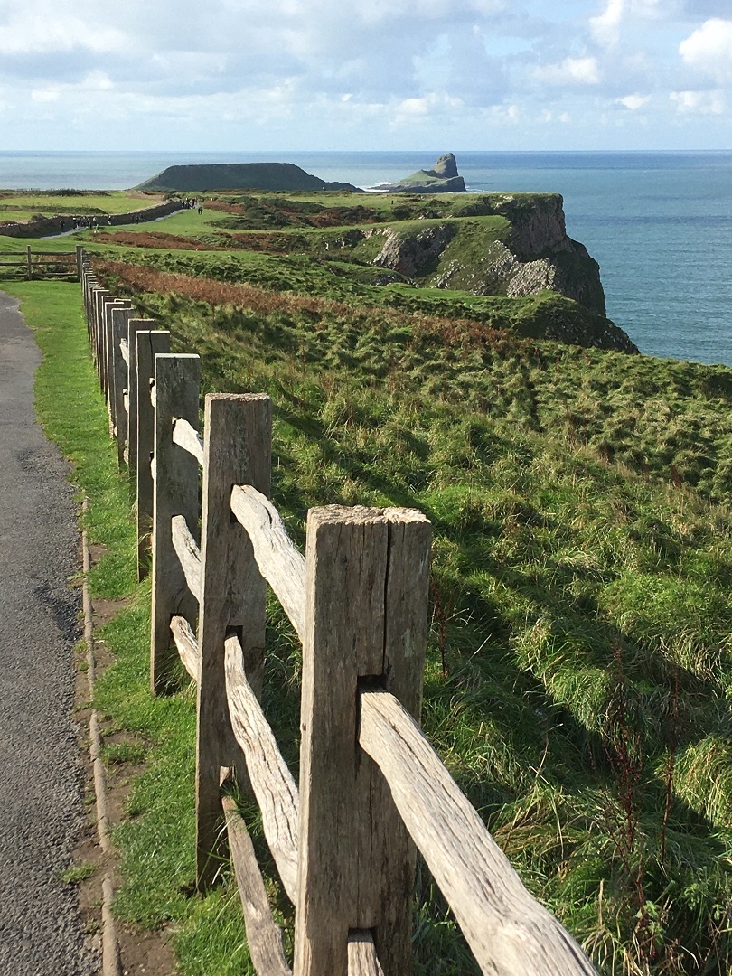
Worm's Head, score 13.
The title suggests that Worms Head is supposed to be the subject but the fence dominates the picture. I don't understand why you didn't stand more to the left or moved forward to the end of the fence to focus on the Headland.
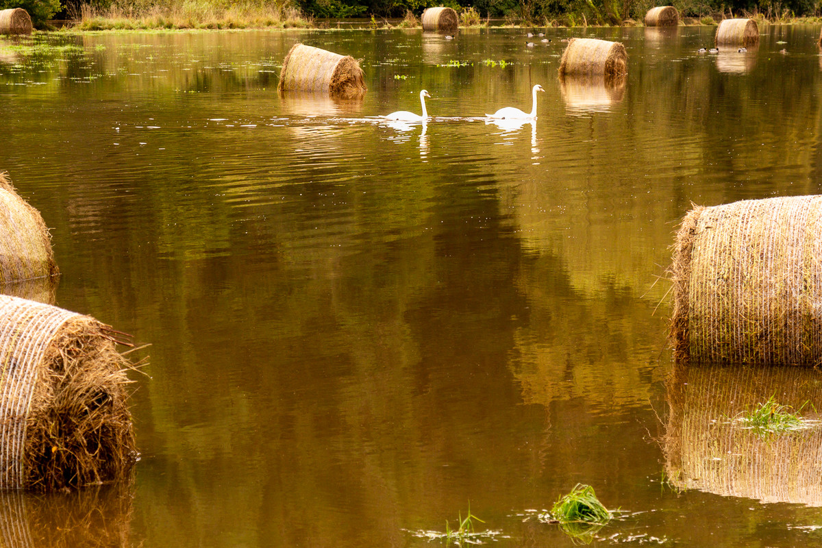
Swan Lake, score 12.
I guess it was difficult to position yourself in the floodwater, but too much of the image is water and the highlights are over exposed. There are interesting patterns/reflections in the water and these might have made for an interesting picture.
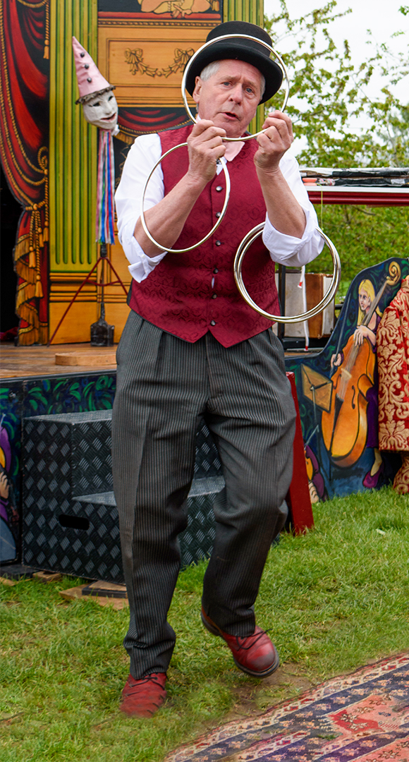
Playing to the Crowd, score 13.
The tight vertical crop and the posed nature of this image don't do justice to the subject, although your timing and getting the ring round the performer's face are good points.
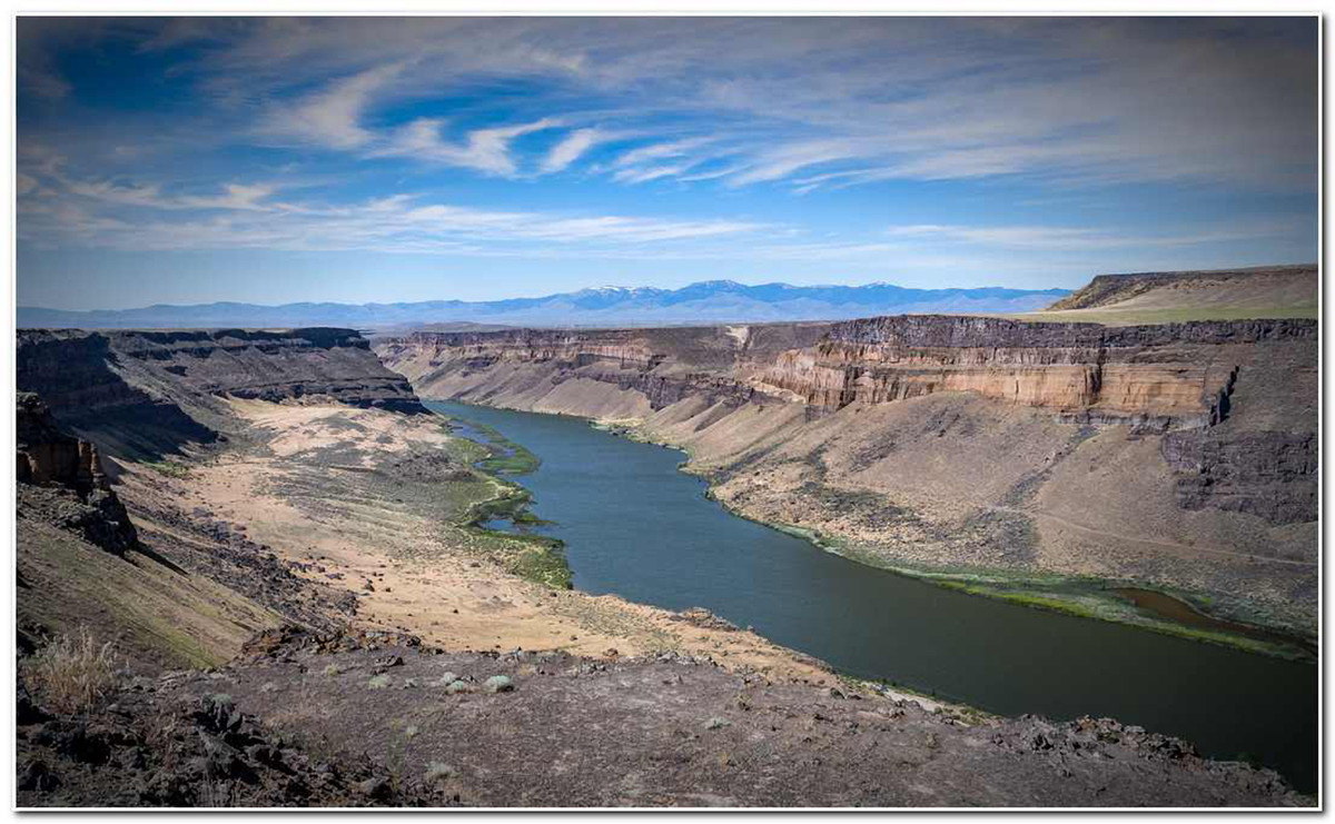
The Canyon, score 15.
Pleasing landscape with great sky - could crop off a bit of the bottom. Not as sharp as could be?