 |
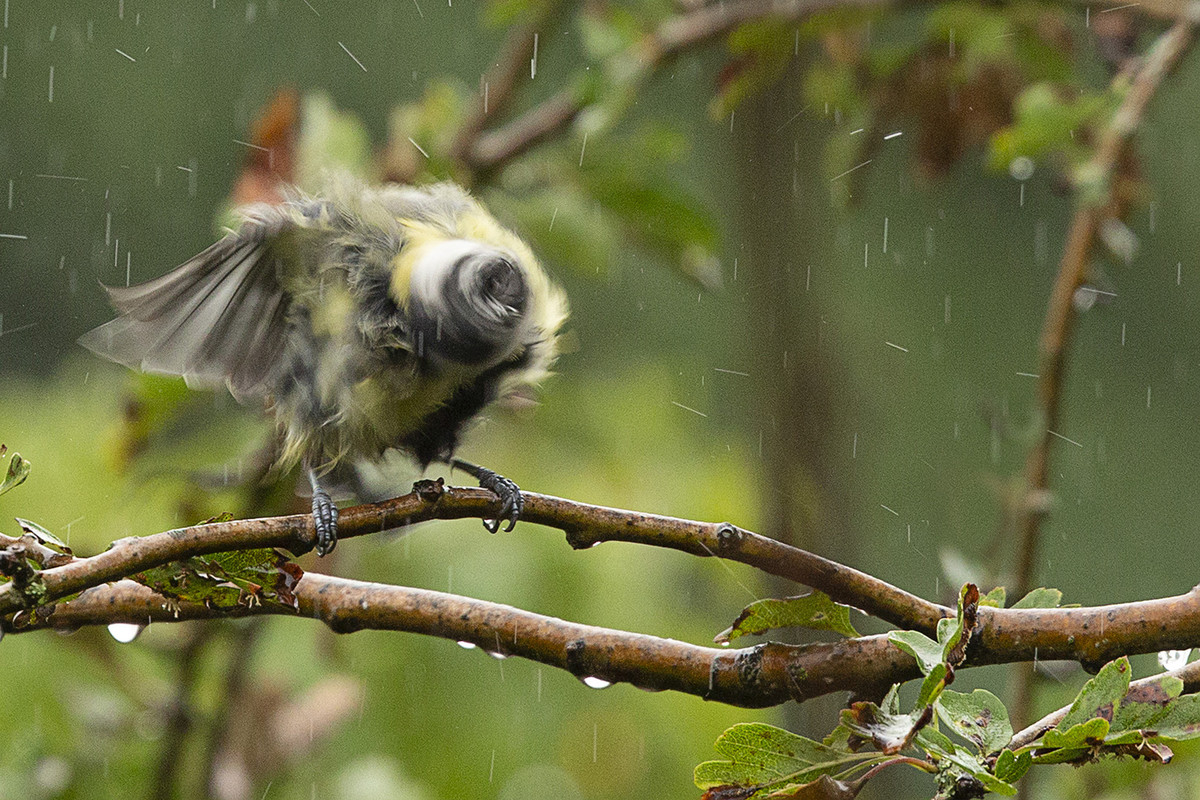
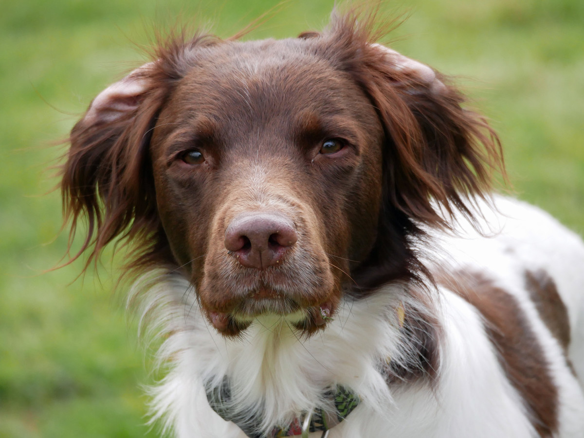
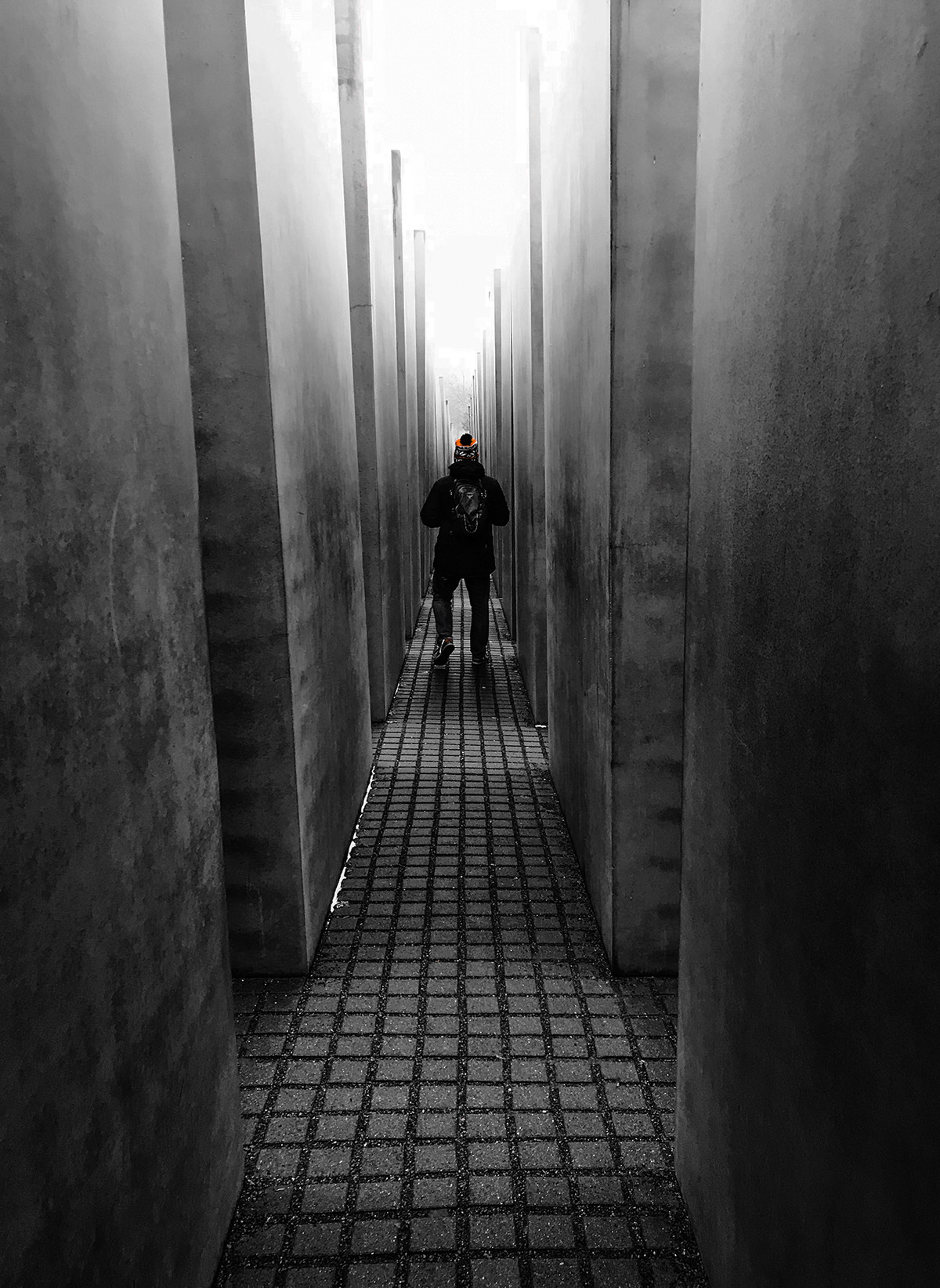
1st Place, Great Tit in the Rain by Sue Carter We know what it is … but we have not seen it like this before. Also, well composed and a pleasing de-focussed background. Excellent. |
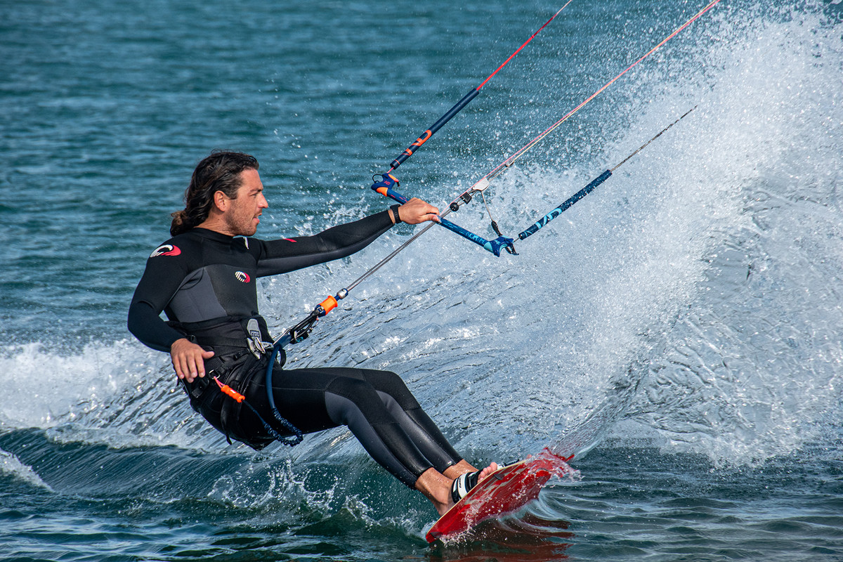 |
2nd Place, Windsurfer by Lyn Sharples Good tight composition and the water splash looks great. Maybe just darken the top left area to make it even tighter. |
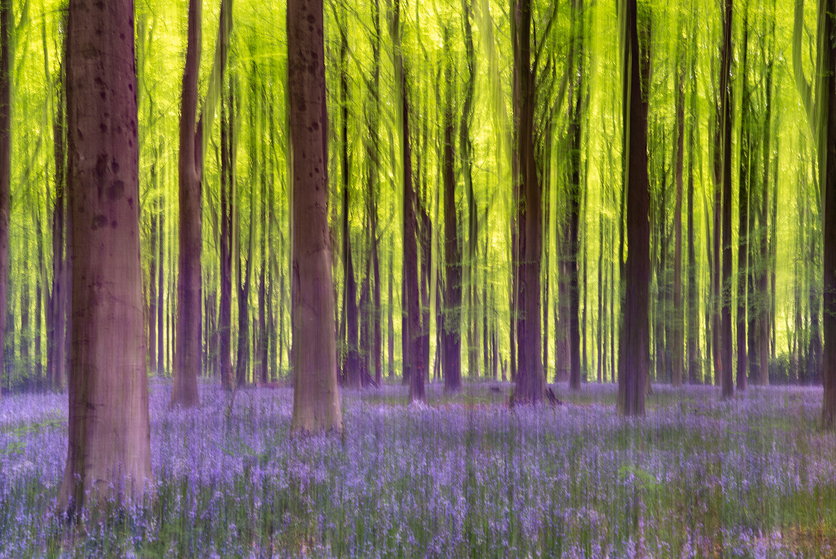 |
3rd Place, Bluebell Woods ICM by Adrian Butcher The composition and strong colours make this a very good image with the ICM not overdone. The only change I would suggest is to crop it a little, right and left, to remove the partial trees. |
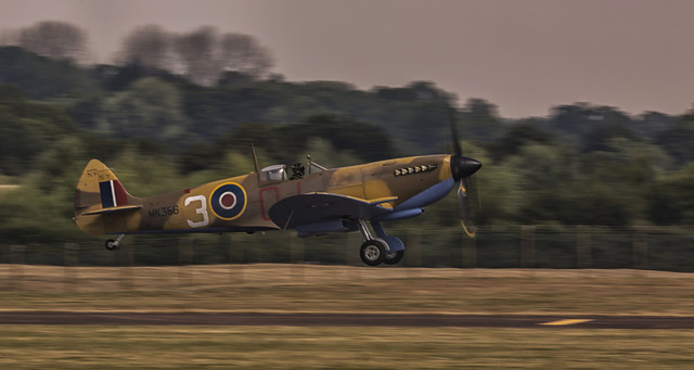 |
Highly Commended, Spitfire by John Crowland A slow shutter has kept the movement in the propellor and the pan has blurred the background. Very good. Just an increase in the brightness of the plane would make it standout from the background. |
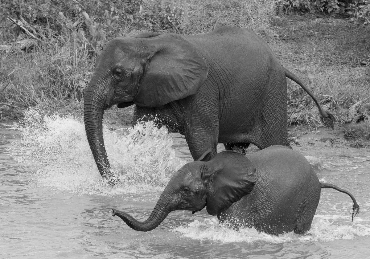 |
Highly Commended, Splash by Elisa Best This monochrome image certainly shows the texture in the elephants skin and the frozen splash their fun and games. The background foliage is a little distracting so a dark vignette would help stop the eye wandering away from the main subjects. |
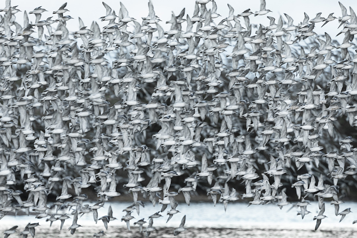 |
Highly Commended, Knot Returning to Roost by Sue Carter Black and white, some birds blurred and some sharp has made this a good abstract image. A slower shutter would make it even more abstract. |
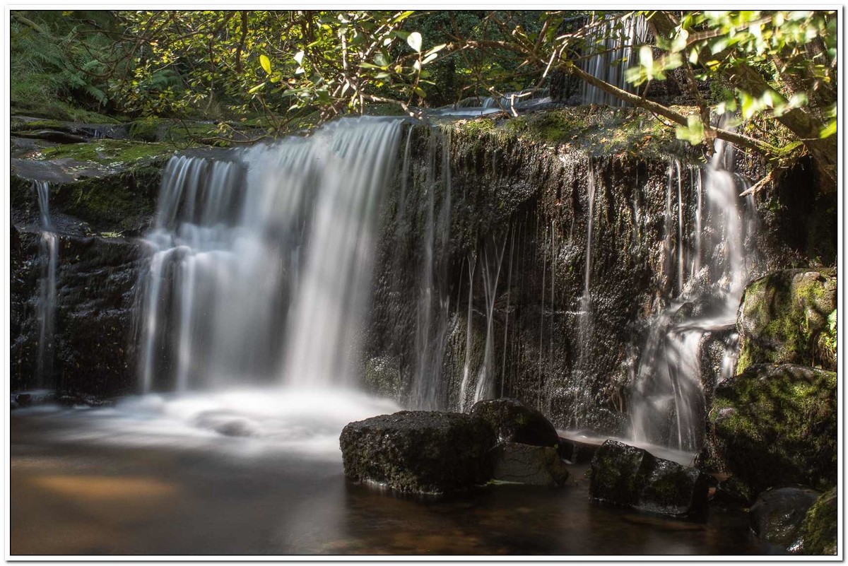 |
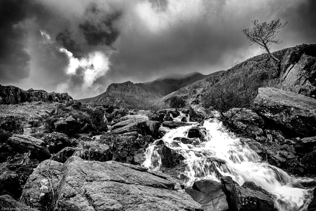
Commended, Fairy Pool by Chris Morris This is a good composition with the waterfall providing the mid ground and the rocks the foreground. The background foliage could be darkened down a little to improve the balance. |
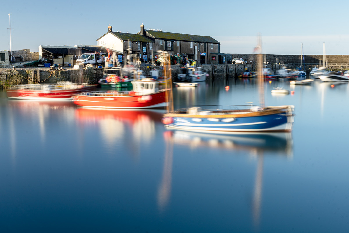 |
Commended, Bobbing About by Adrian Butcher The movement in the 3 boats has certainly improved the image over the standard record view. Cropping the bottom third would make the boats even stronger in the composition. |
 |
Commended, Snowdog by Elisa Best This excellent image is very sharp and revolves around the eye. Both eyes looking into the camera could be your next challenge. |
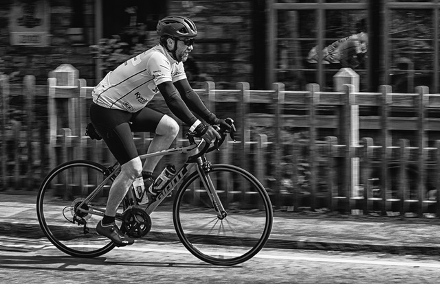 |
Commended, Tour de Gwent by John Crowland Panning good, position in the frame good and I like the reflection in the window. Monochrome simplifies the picture. Tour de Gwent looks an easy ride. |
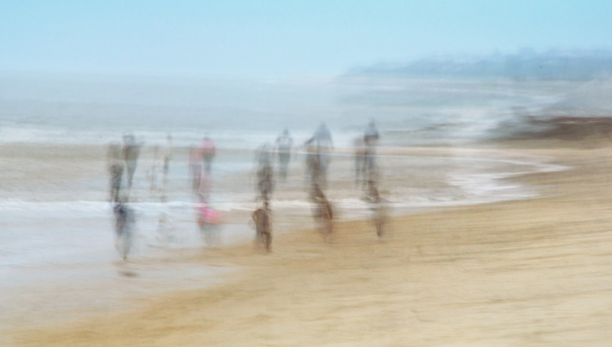 |
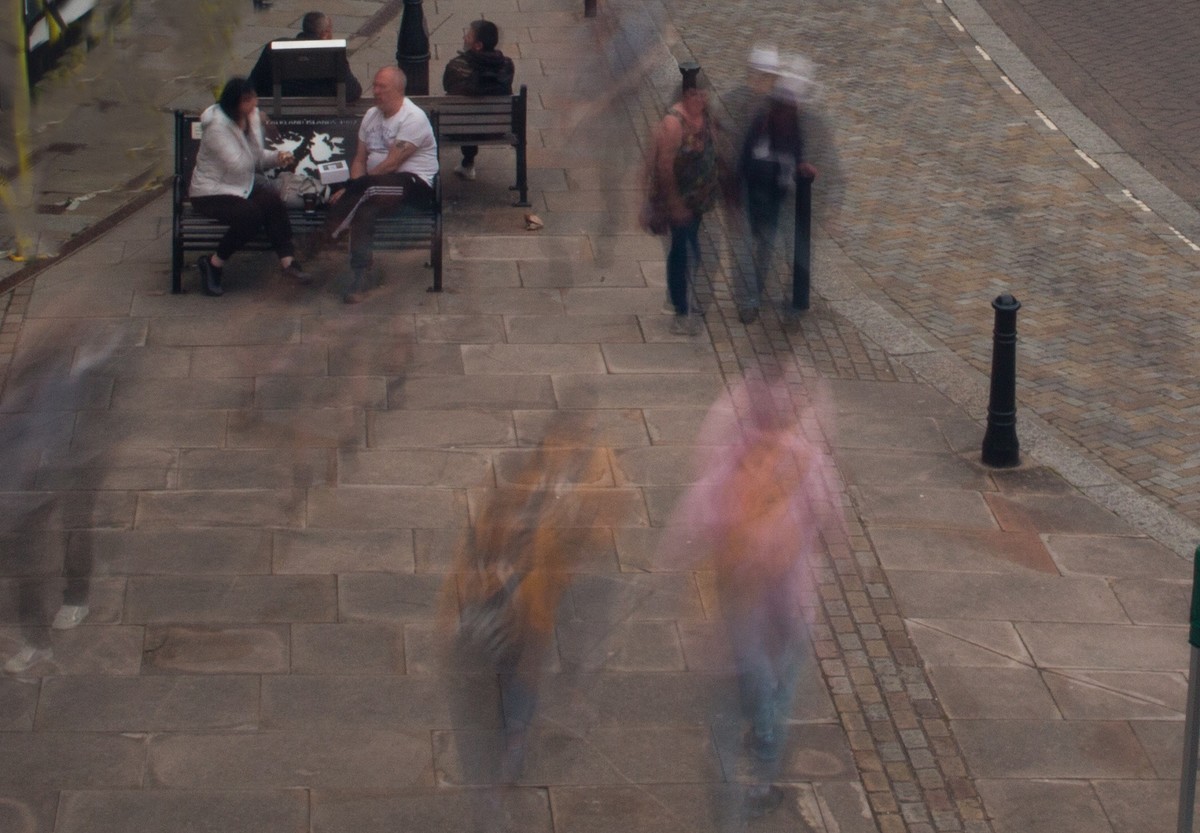
Commended, Beach Walk by Lyn Sharples The merging of 3 or 4 images and the slow shutter speed has given a very arty look to the image. The 3 copies of the walkers perhaps make this picture too busy where 1 copy would have been enough. Good idea. |
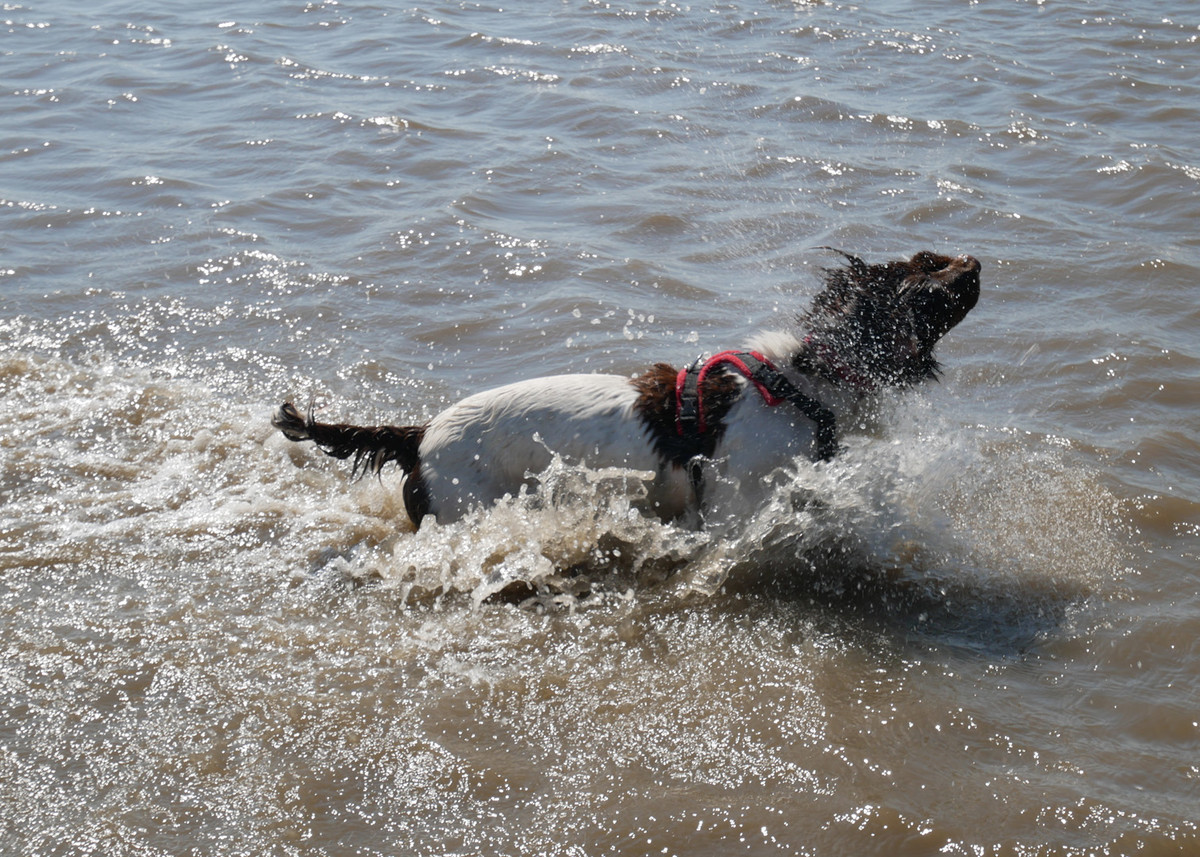 |
And Shake Dogs in water is a popular subject and the fast shutter speed has certainly stopped the water motion. I think the image could be improved by getting in closer and showing the dogs obviously joyous face. |
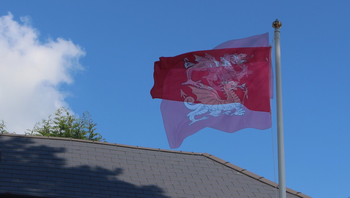 |
Fluttering in the Breeze A good idea to show the movement in the red flag against the blue sky. A longer shutter speed would have made it a more abstract image with the cloud and foliage cropped out. |
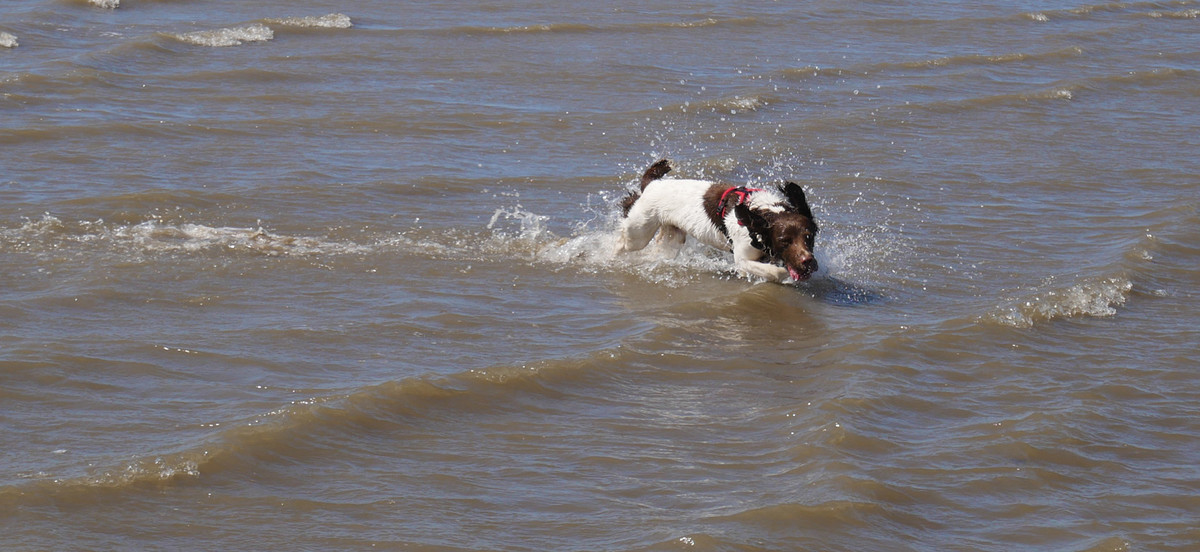 |
I Am Having Fun The dog is certainly having fun with the tongue out and the ears back. Just a big crop needed to remove most of the water. |
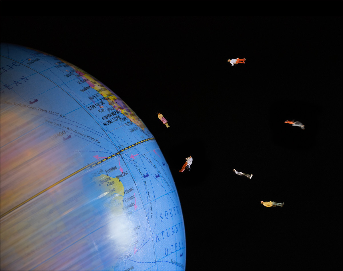 |
Stop the World I Want to Get Off Fun image and well executed. Perhaps the blurred earth rotation could be a little less and extended to the whole globe …but that would make it too real! |
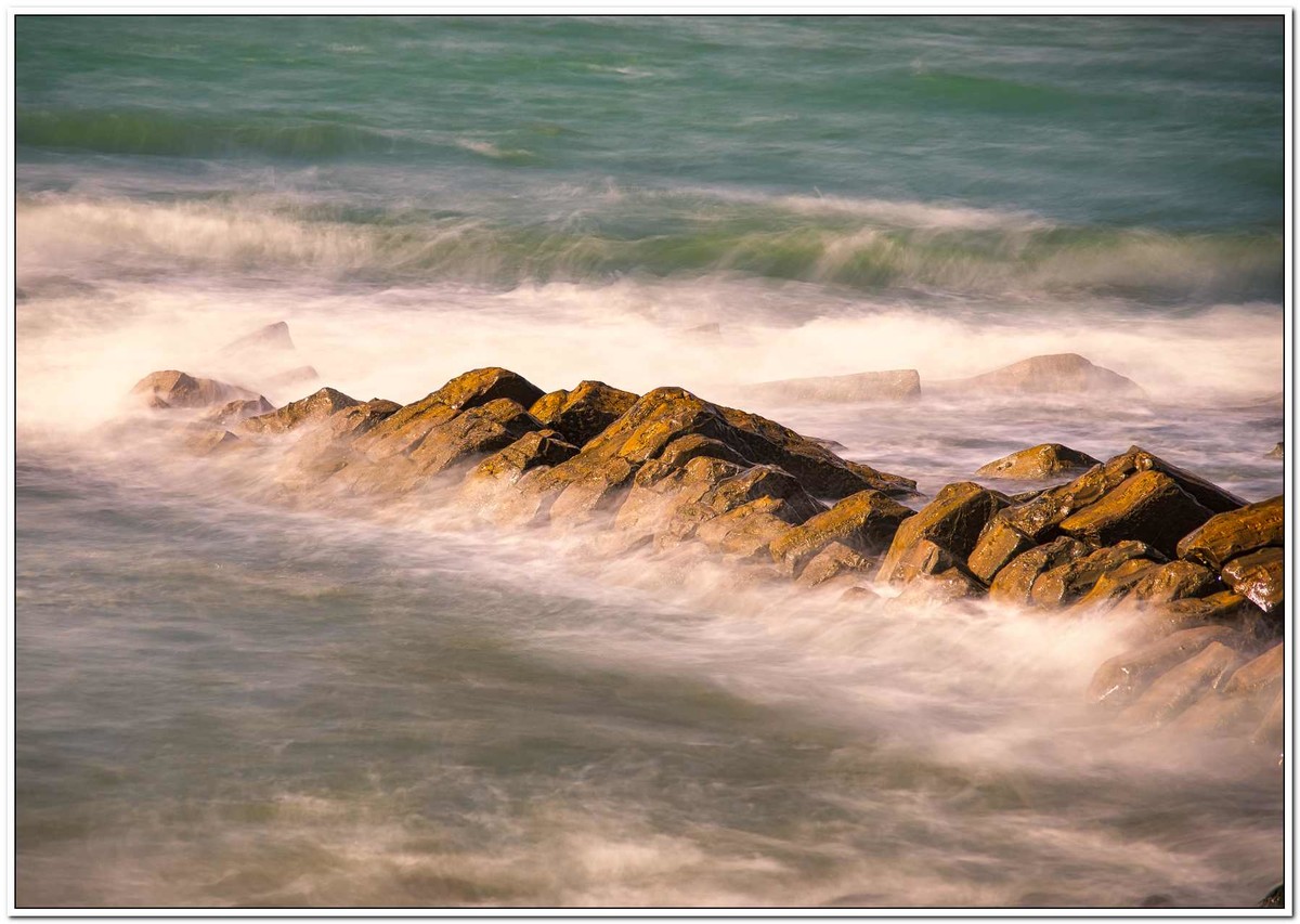 |
Surf's Up The lighting is really nice and the shutter speed is not too slow to make it abstract. Maybe crop a little off the bottom to excentuate the green and orange. |
 |
Watching the World Love the idea behind the picture Maybe the shutter is open for too long making the figures ghostly. Have another go but keep it simple and a tighter crop. |
 |
Water Splash Very abstract that works well in black and white Maybe try the image turned 90 degrees clockwise? |
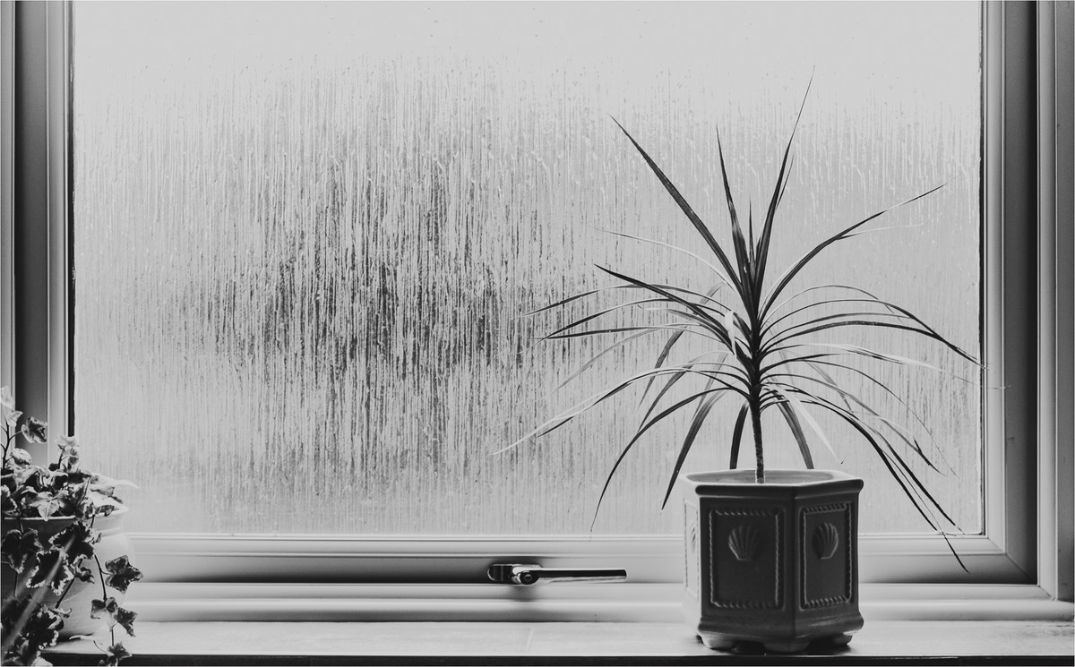 |
1st Place: The Plant in the Window by Brian Challis Lovely mono image, very simple, a slight vignette added to take your eye to the plant and the window is slightly open creating a shadow. Good tonal range too. Only point I would make is to remove the plant on the left but I really like this due to its simplicity |
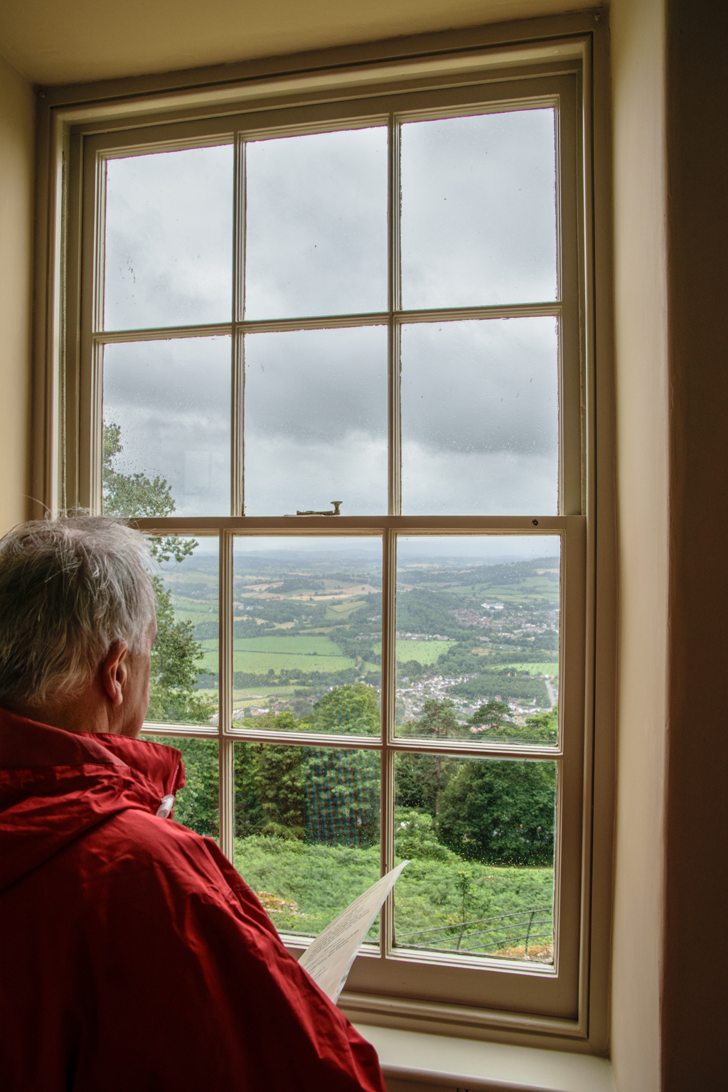 |
2nd place: Monmouthshire Countryside by Bill Stace A cracker of an image, simple, perspective is good. Person in red jacket what’s not to like. Sharp well exposed image. Great work. |
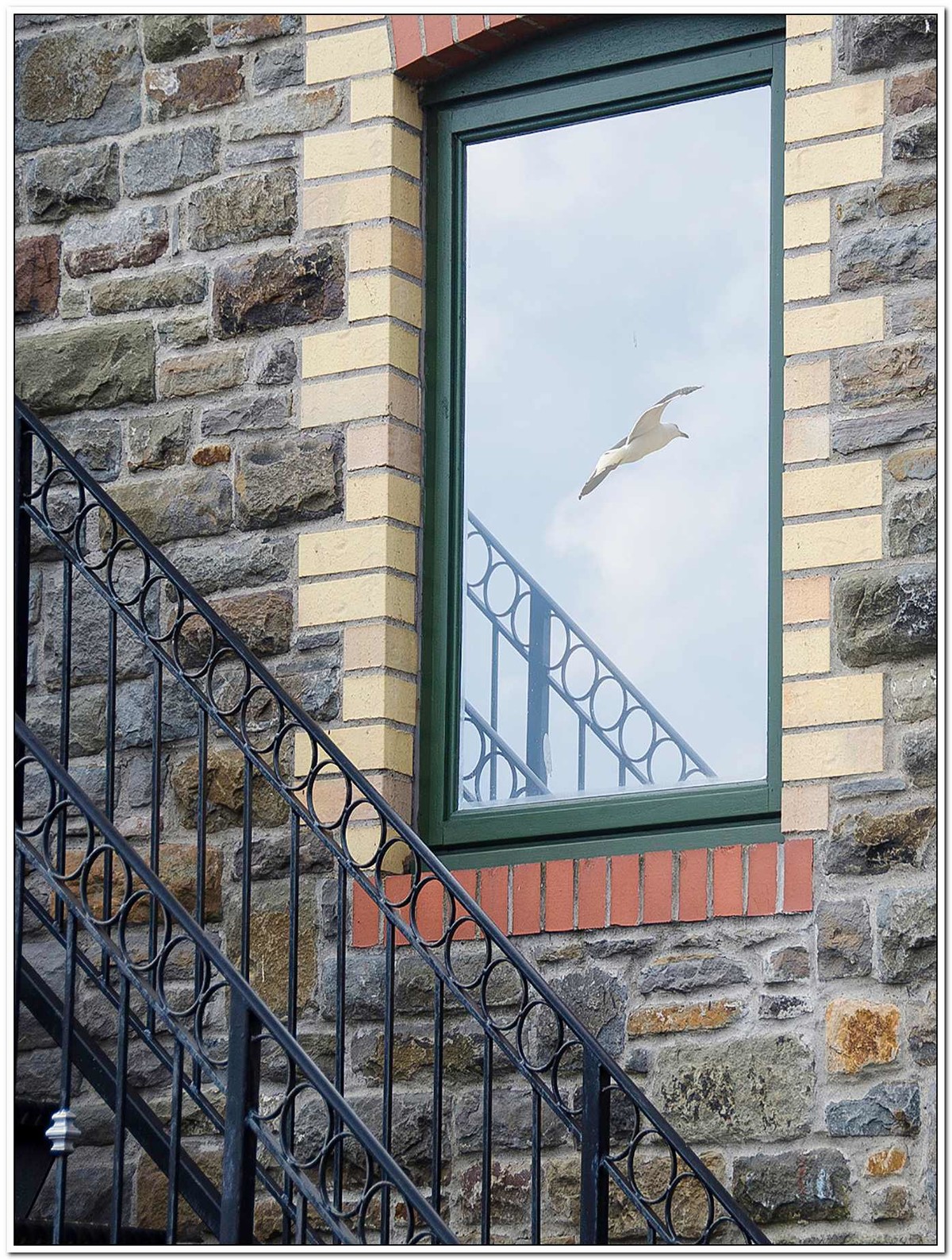 |
3rd Place: Newport Window by Chris Morris A lovely image especially with the gull being captured in the window. Lovely and sharp, colours are spot on, but you have just cropped the top of the window off and in the bottom left there is something that is rather light on the ironwork, Maybe clone that out or take the exposure down as my eye is drawn to it. Really like it. |
 |
Highly Commended: Church Windows by Janet Cox The treatment is subtle, with a vignette and a nice feel to the image, but I would like to have seen the perspective corrected. I tried it and I feel it works much better. |
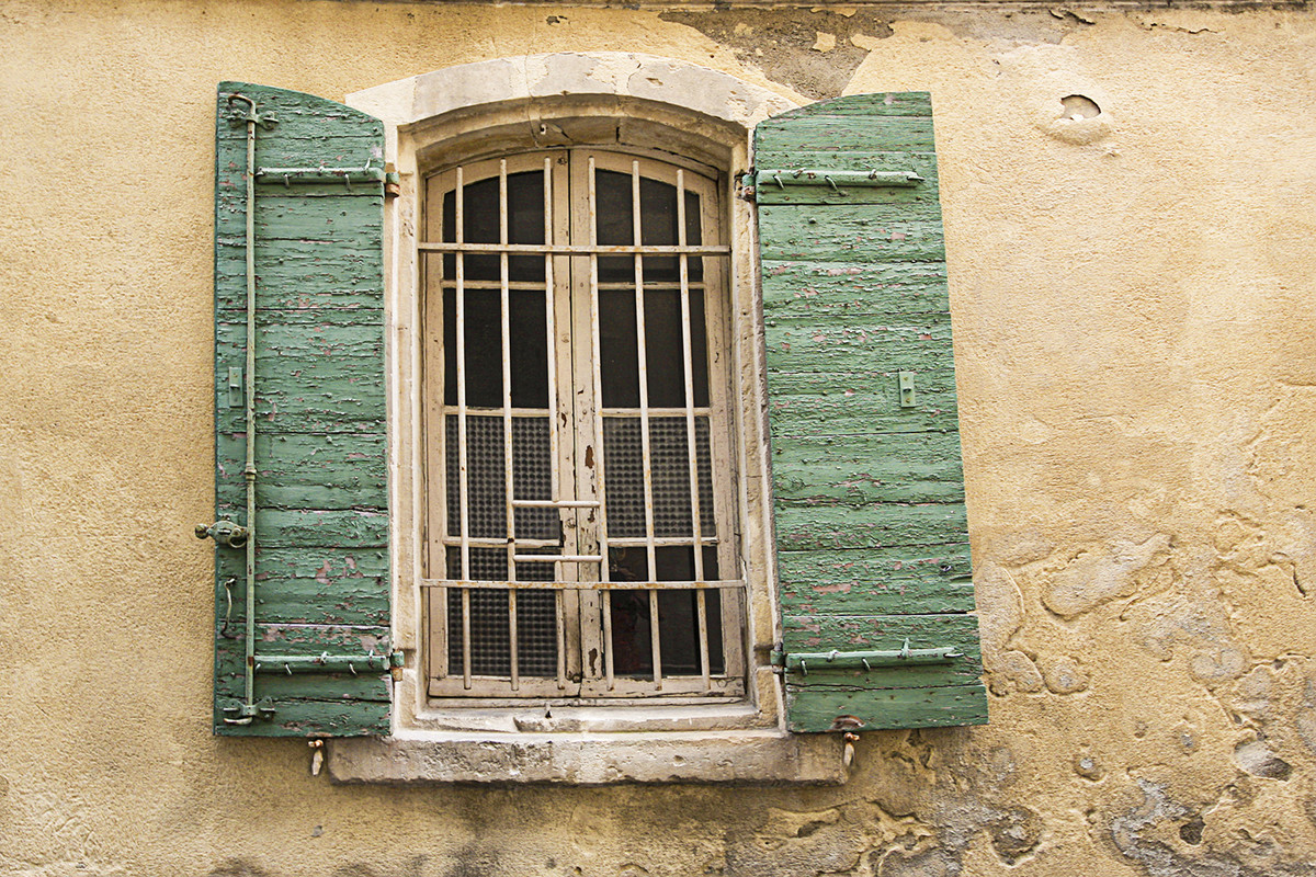 |
Highly Commended: Green Shutters by Sue Carter I like the colour in this very much. Sharp and lots of good detail, but its the perspective for me. If you had corrected this and made a square crop, this would have been in the top images for the competition |
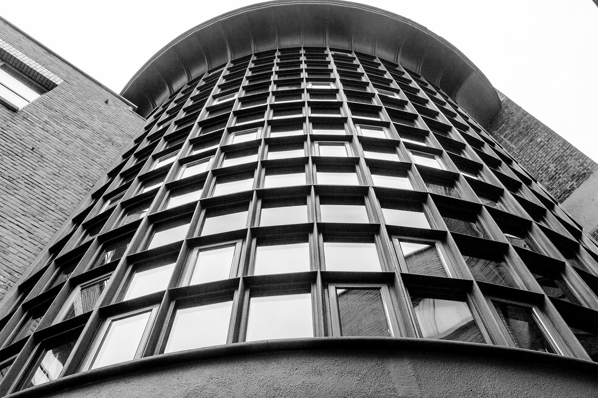 |
Commended: Window Boxes by Adrian Butcher Ok, I’m not going to mention perspective as you probably couldn’t get back far enough. However, you have just clipped the top and that spoils it. Good tonal range for a mono image and the reflections are not intruding in the image. |
 |
Commended: Window Service Only by Keith Sharples This made me laugh, I guess he’s not having a pint! If it was possible I would have moved slightly at the point of capture to avoid the pole in the left hand corner. I would also have perhaps tried to brighten the ladies face inside the building as she looks as though she has a body with no head. Great capture. |
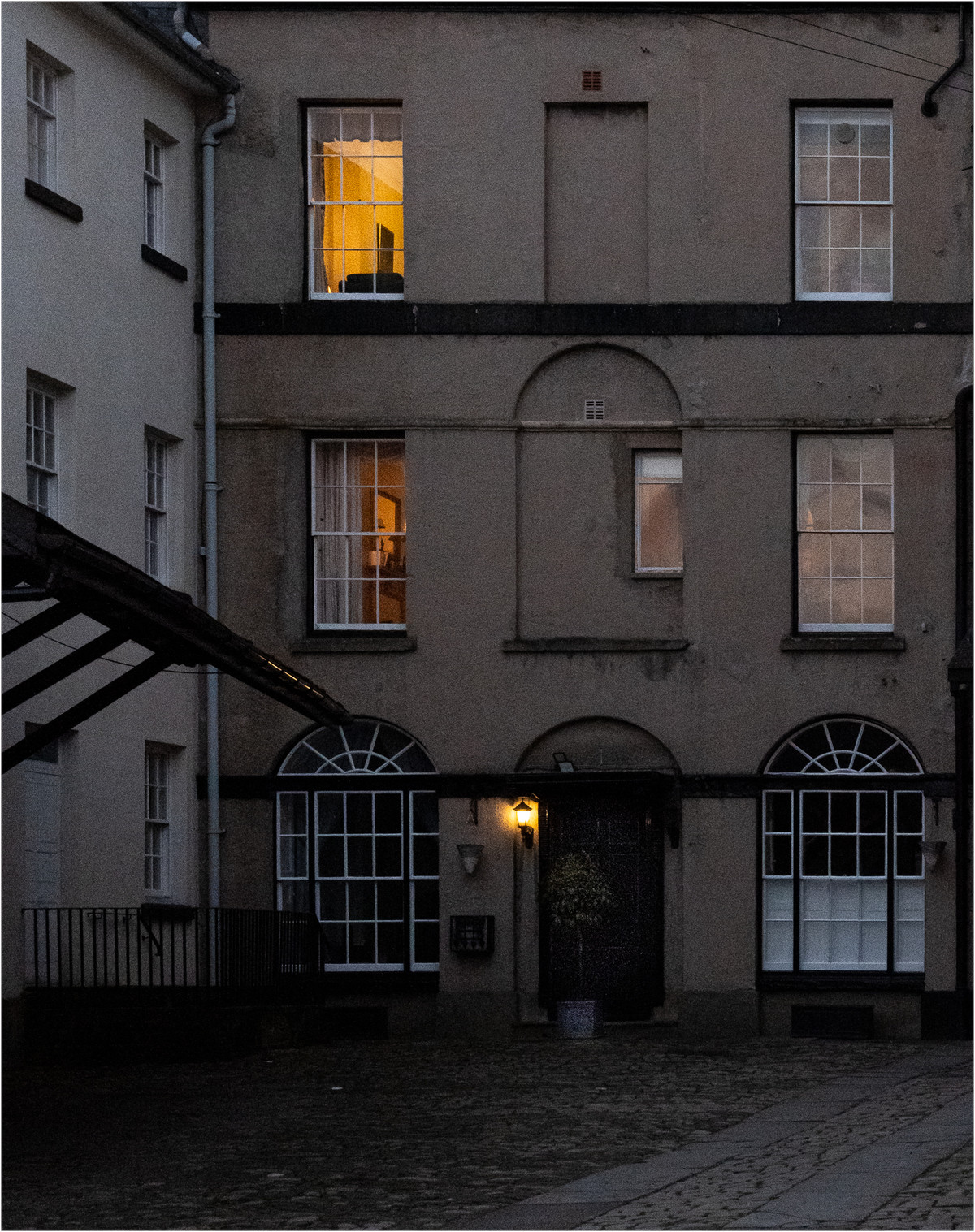 |
Facing the Courtyard A nice idea, rather dark though. Maybe if you had just concentrated on the windows on the right of the image and made it into vertical letterbox with the lovely colours in the top two windows it would have been much stronger. A shame that a canopy is interfering on the left. I think less is more with this image. |
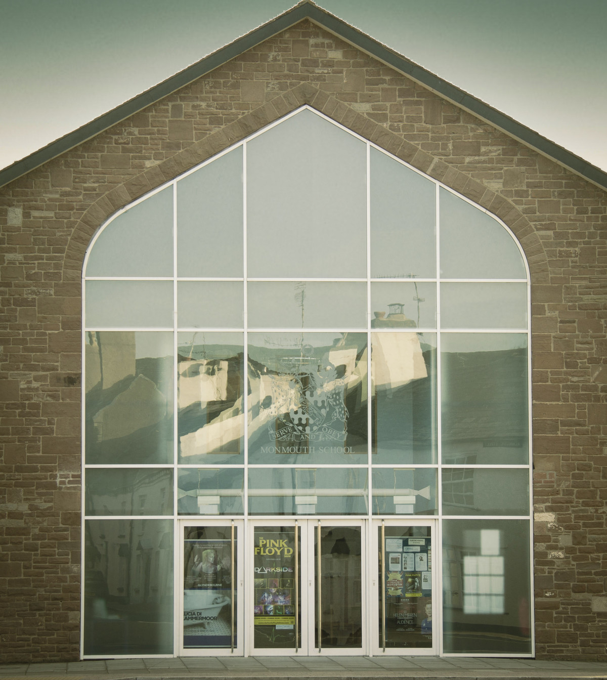 |
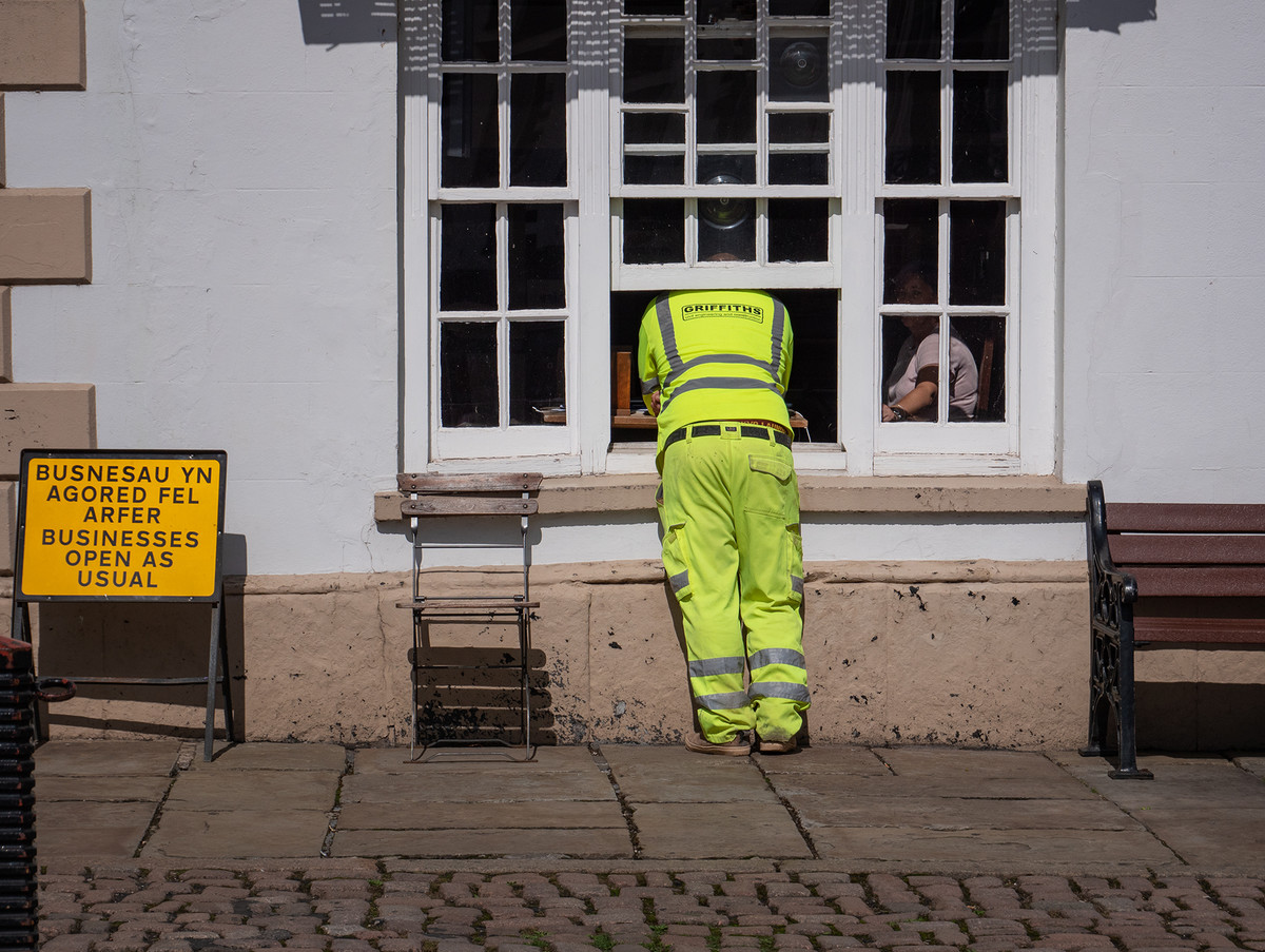
Monmouth School Hall Window Perspective yes! A shame you have just cut the top off, maybe a step back to get it all in. Not sure about the reflection its ratter confusing along with the crest of |
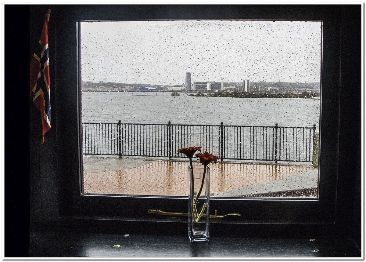 |
Rainy Day in Cardiff A good take. I like the fact that we are on the inside looking out on a pretty horrible day, but the raindrops add something to the story. I think I would have cloned out the white ‘blobs’ on the shelf and brightened it up a little. A slight correction on the perspective would have helped too. Great idea, just needs a bit more work. |
 |
Reflected Delivery A difficult shot to take, but the title doesn’t quite fit the bill as the delivery van is a long way into the image. There is quite a lot of noise and colour fringing which could be dealt with quite easily. Again the perspective is just a small correction that would have made such a difference. |
 |
Windows at the Church Well exposed image but I felt that there are two pictures here. If you cropped it to just the big window there is something white that would be obtrusive. The small window - I want to see all of it, but the bike is rather dominant. Maybe revisit this and just take the window with space around it and turn it to mono if the light isn’t playing or go inside and get a reflection of colour as the light comes through. Good luck. |
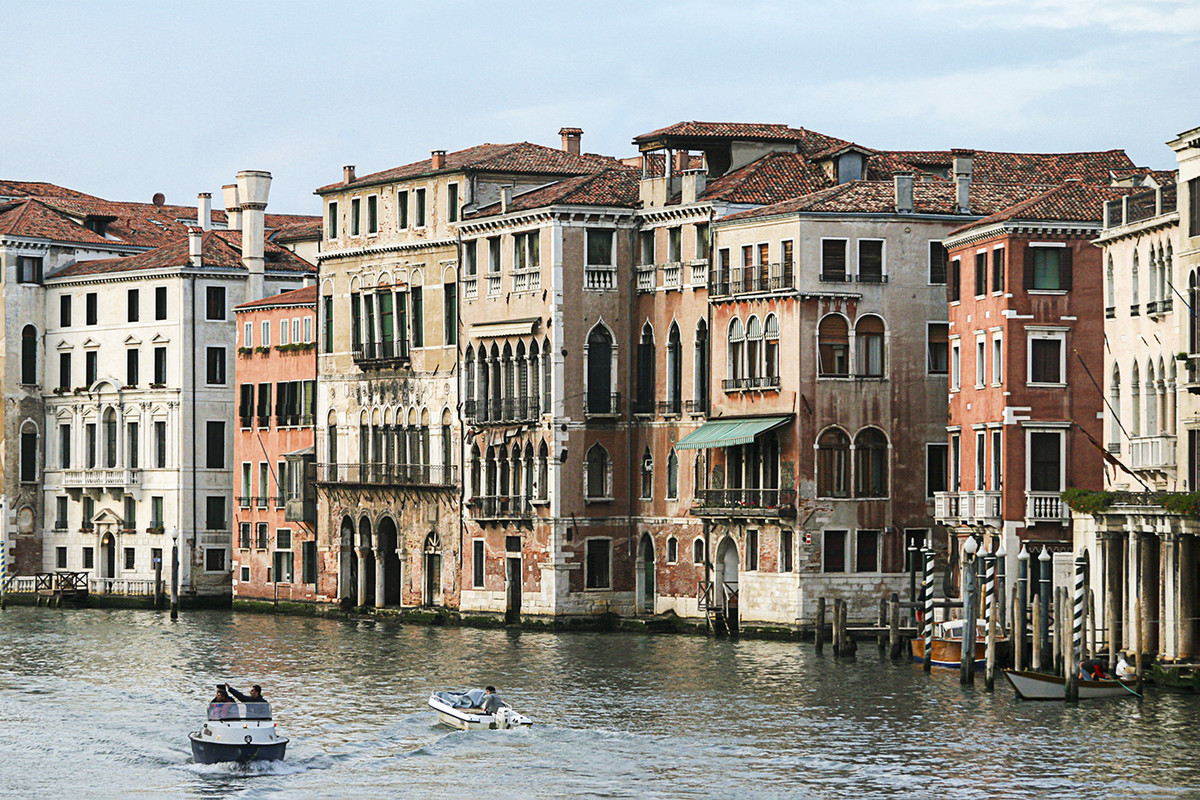 |
Windows on the Grand Canal This is more of a landscape shot rather than just of a window which makes it quite different. It looks a bit flat, shadows need to be lifted and the vibrancy not saturation pushed up. I think it would have been better if you had concentrated on a small area of windows as there is some fantastic detail in the architecture around the windows. |
 |
1st place: End Game by Chris Morris A set up shot, who cares! It has a great background, it's sharp where it needs to be. This image is kept simple but conveys the message that is unfortunately a sign of these times. My only critic is that the key line is too big, you only need about 3 pixels also it's white and draws the eye away from the image. But I like this immensely, it's simple and conveys the message. |
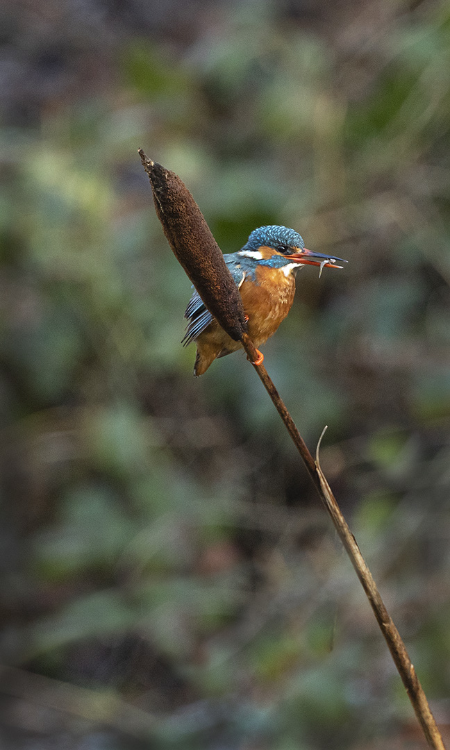 |
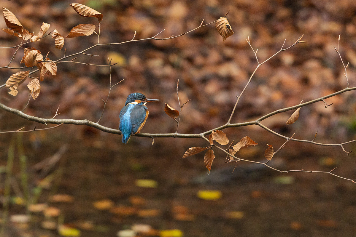
2nd place: Fishing on the Pond by Sue Carter Superb shot of this kingfisher sat on a reed with a fish in its mouth. A very hard to catch moment and I love the way the reed itself is positioned diagonally across the frame. Great bokeh to the background, kingfisher on the thirds, just wish it was a little larger in the frame. |
 |
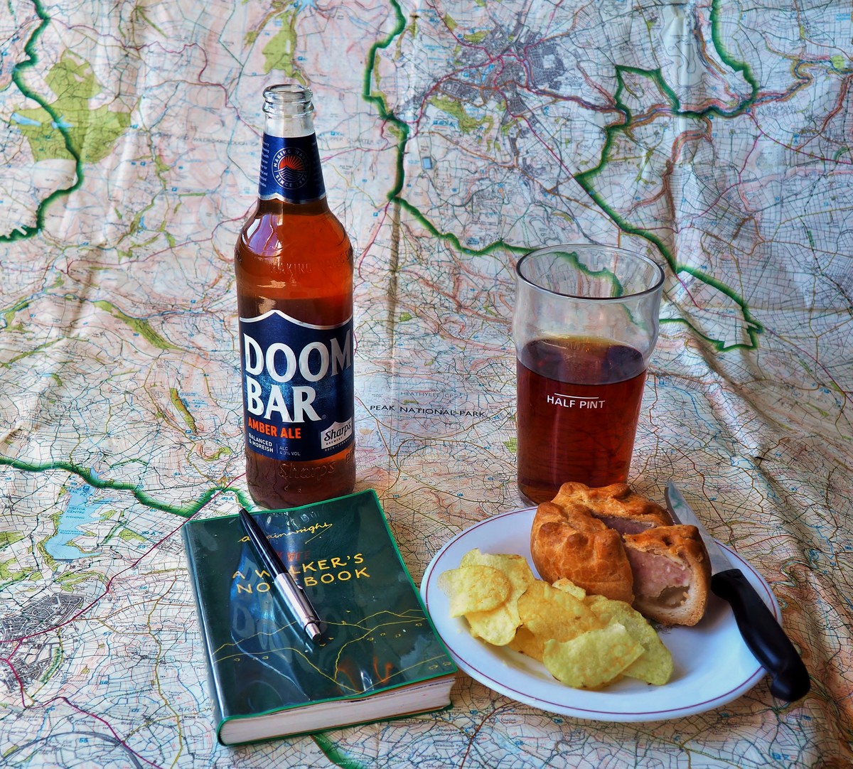
3rd place: Future Plans by Lyn Sharples Good well thought out still life, nicely put together and is something we are all hoping for. My problem with this image is that it is a set piece image, but although the map in the centre does hold my eye as it is text, making me want to read what it says, the other items in the image go out of the frame taking my eye with them. If you do a still life you have plenty of time to arrange it and most important keep everything inside the frame. |
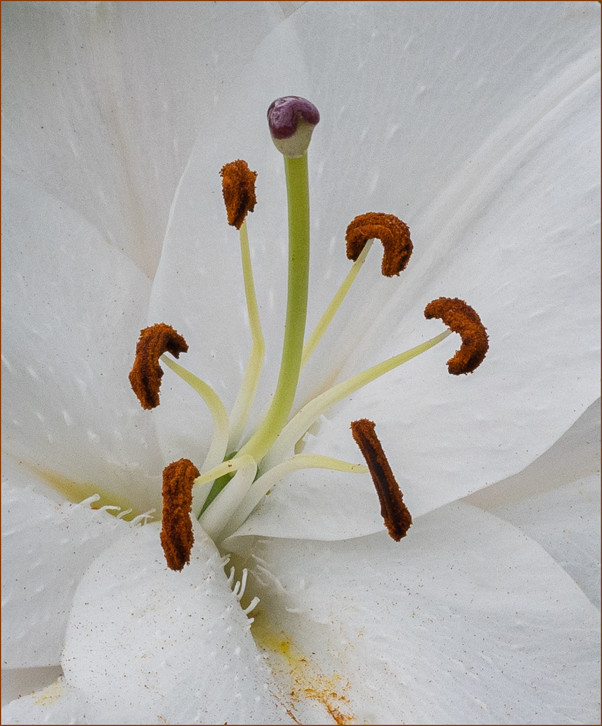 |
Highly Commended: Loving Lillies by Brian Challis Beautiful macro shot of the stamens of this lily, very sharp indeed and the eye can thus concentrate on them and enjoy them. Possibly just a little dark. |
 |
Commended: Spring Beckons by Chris Morris This is a lovely image using the magical three items in the image, and they look sharp. But my attention is constantly being drawn away from them by the white light created by what looks like a window. Perhaps if the author had waited for a while or come back on a duller day the white area would have gone. White in a background attracts attention once you see it will always attract your attention. |
 |
Adoration Beautiful picture of this dog showing that it loves you. While the picture is very good, I find on my screen that it lacks a little sharpness around the eyes which is where it needs to be. Also, the dog is a little too tight in the image with the hair on the top of its head going out of the frame. |
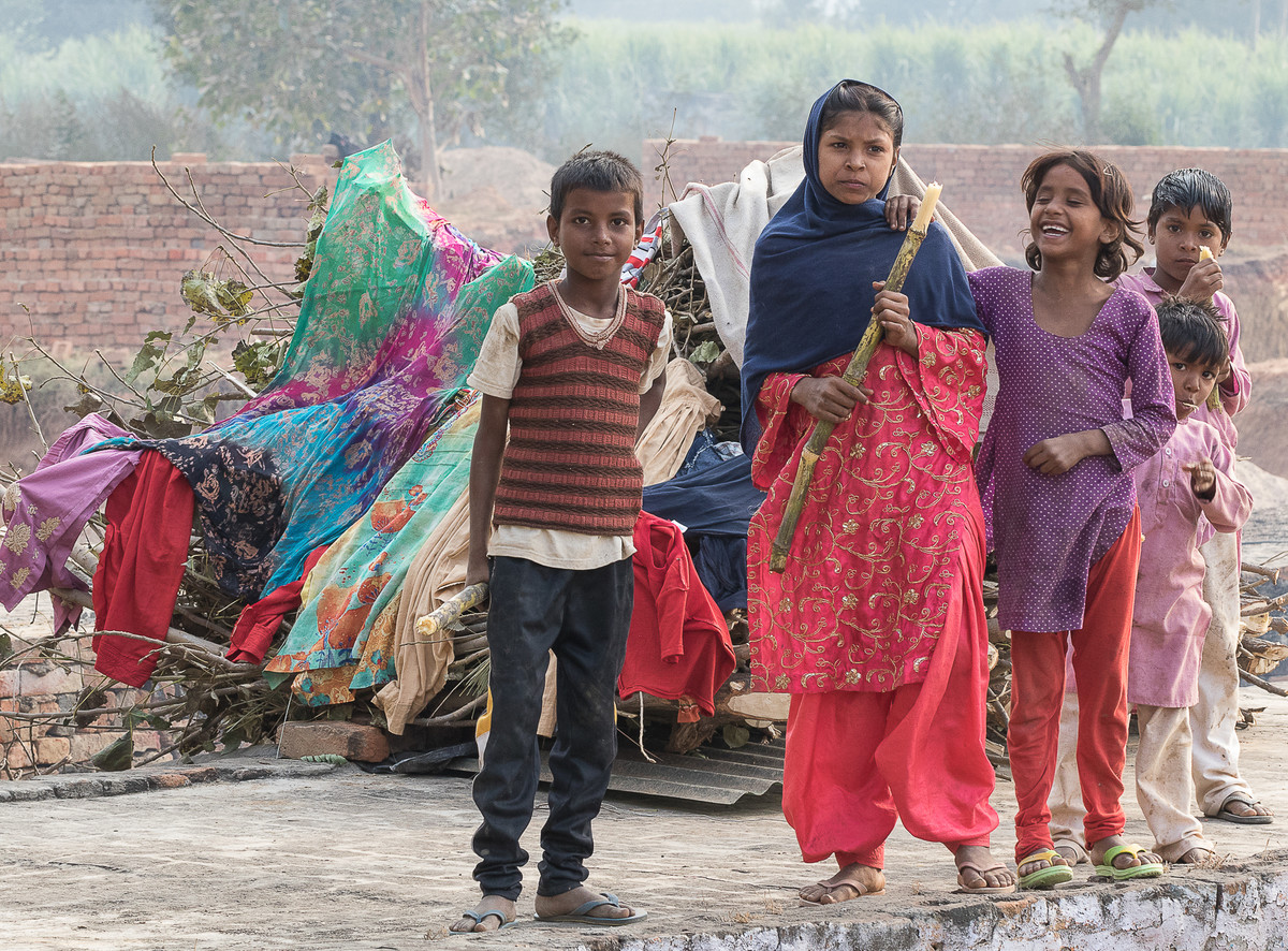 |
Eating Sugarcane A beautiful and colourful scene, perhaps in |
 |
Parties are Coming Back A good reason to be cheerful indeed. I love the idea behind this and good positioning of the bottle in the background, but this is let down by the fact that the background is too colourful and bright and draws your eye away from the subject. Always be careful about your backgrounds, they are the most important part of the image. Don’t include: 1 strong colours 2 text or words, as we all want to read them 3 faces, as we always want to look at them. 4 the colour white which will always attract us. |
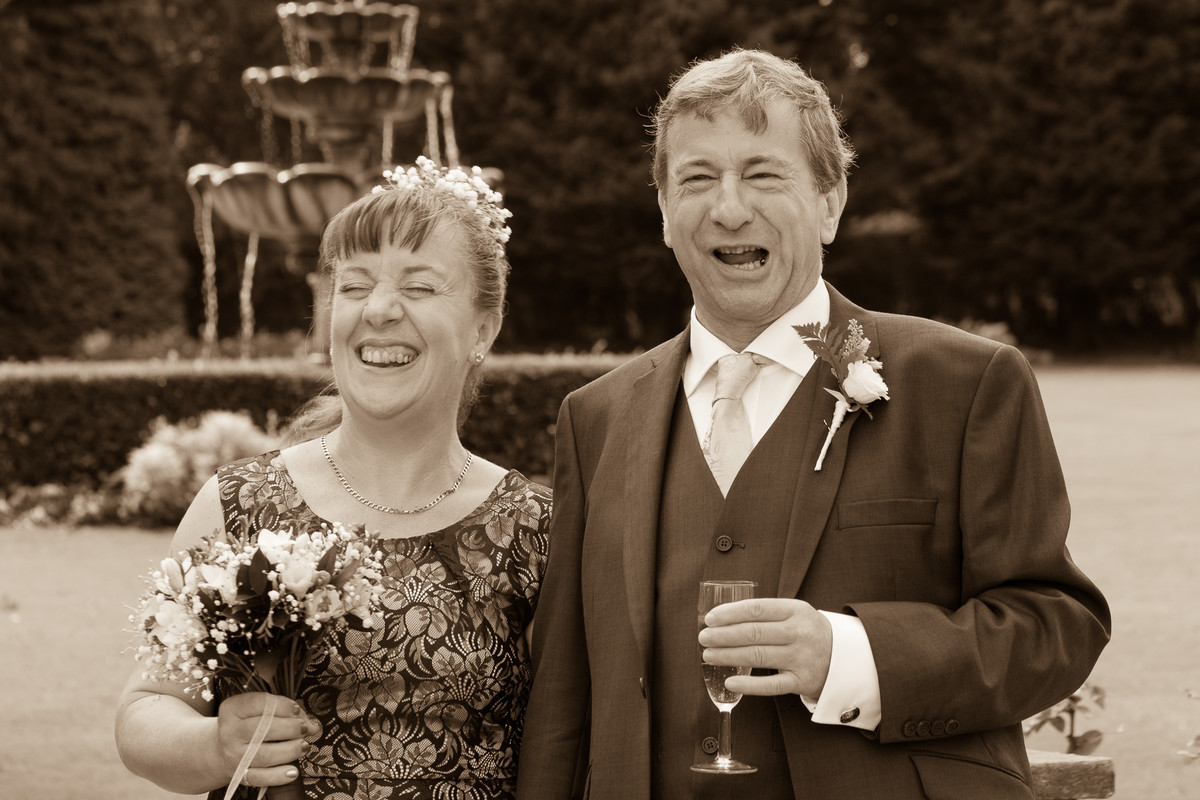 |
Happy Couple Another reason to be cheerful especially when there’s alcohol around! Lovely image of this couple, I like the sepia tone to it, but it’s a classic background mistake again with the fountain or whatever it is coming out of the woman’s head. Again, I will say watch your background, a step to the left could have easily avoided this. |
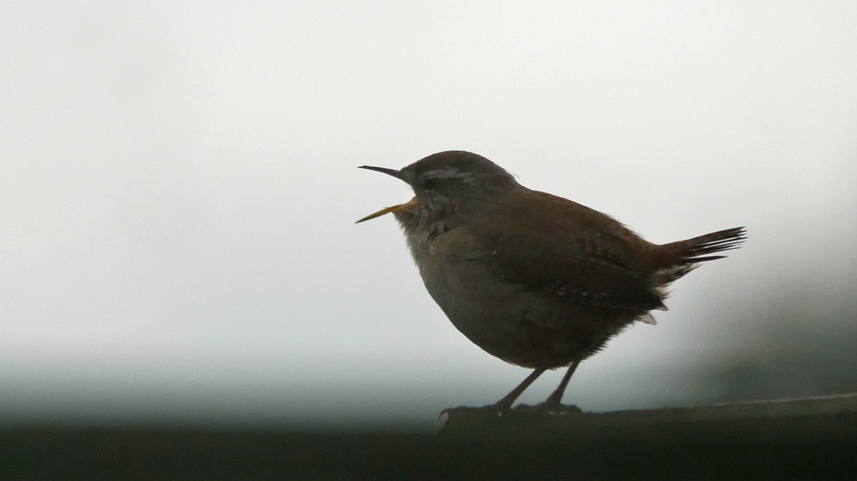 |
I am Singing my Heart Out Lovely image of this wren singing, large enough in the picture but the bird is in shadow and does not look sharp, while the background is too white and becomes overpowering, white attracts and my eye travels away from the bird to the background. The background is also too bright and strong and therefore makes the bird seem darker. |
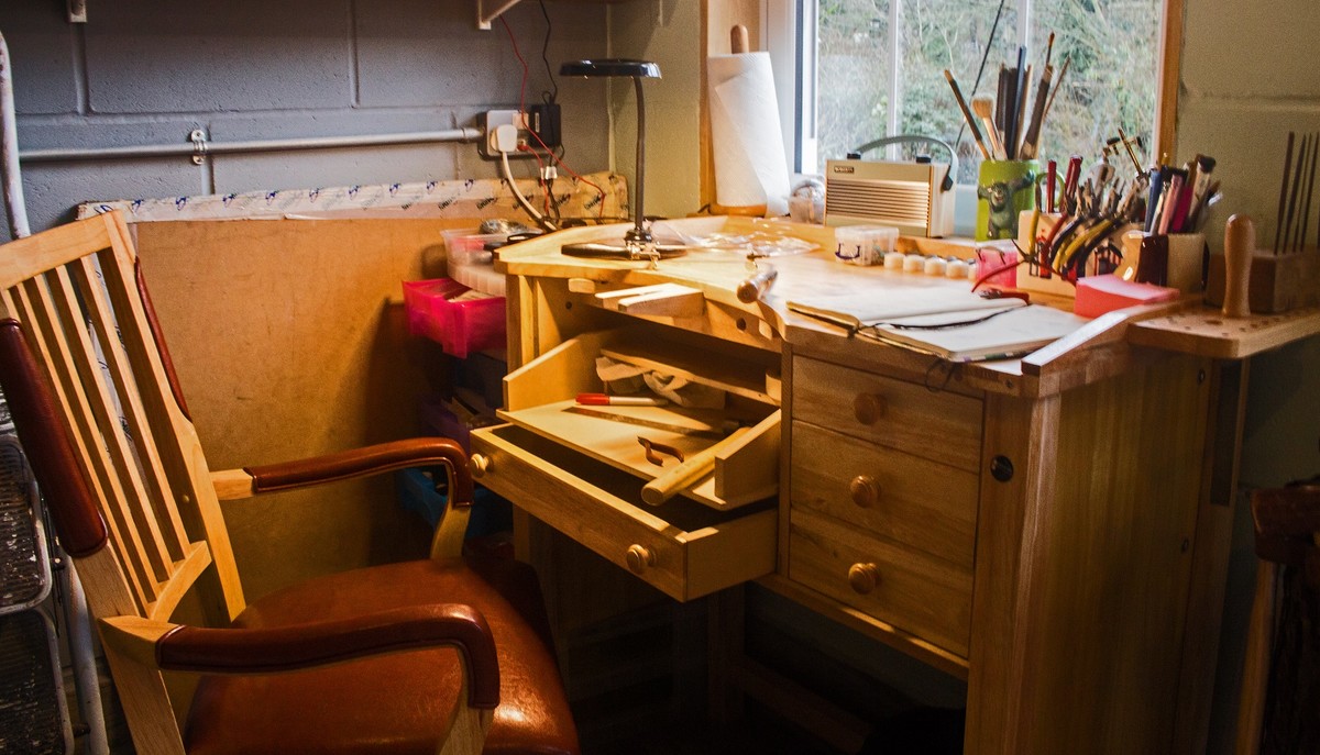 |
Lockdown Workshop Wonderful image of someone’s work bench where you could idle away the long hours of confinement. The exposure is good the light from the window does not overpower the scene. Again, this image for me is too muddled, the tools at the back are out of focus and there is just too much going on. If the author could have narrowed it down to a set piece coming a little closer, it would stop my eye wandering around the image looking for somewhere to stop. |
 |
Time for a Walk Great image of this dog although I am unable to check the sharpness of the eye ,and it’s a little too tight in the frame with part of the dog being obscured by the flowers. |
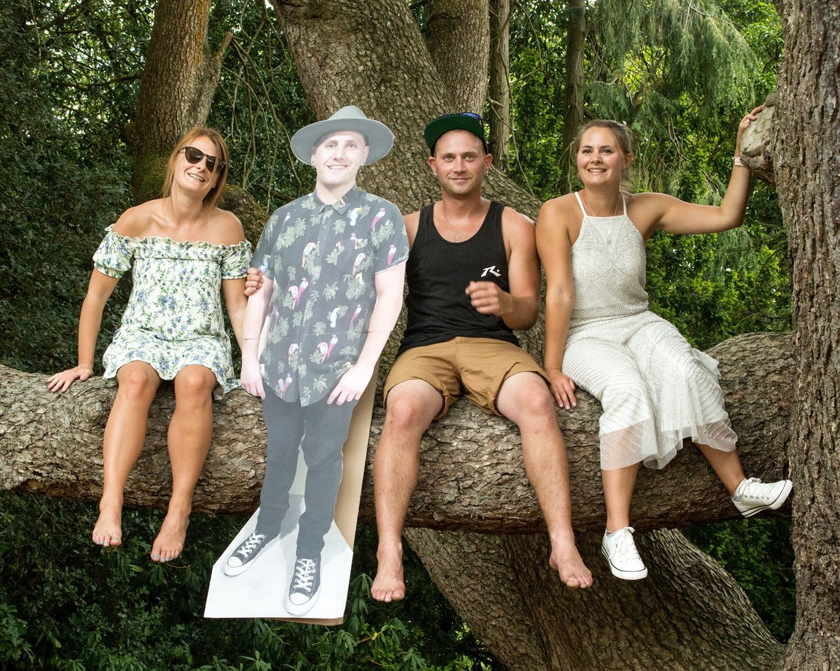 |
Precious Family Days Great scene which has comical value added to it, with the cut out image. I cannot really understand the message here and because there are four figures in this image, my eye keeps going from left to right trying to get some balance between the two pairs. There is a good reason why 3 items or 1 are used in an image, as it stops the eye going from side to side trying measure up the distance and looking for an imbalance between the two halves. Although perhaps taking out the cut out image, having three people in it would be much better, that then would perhaps lose the story. |
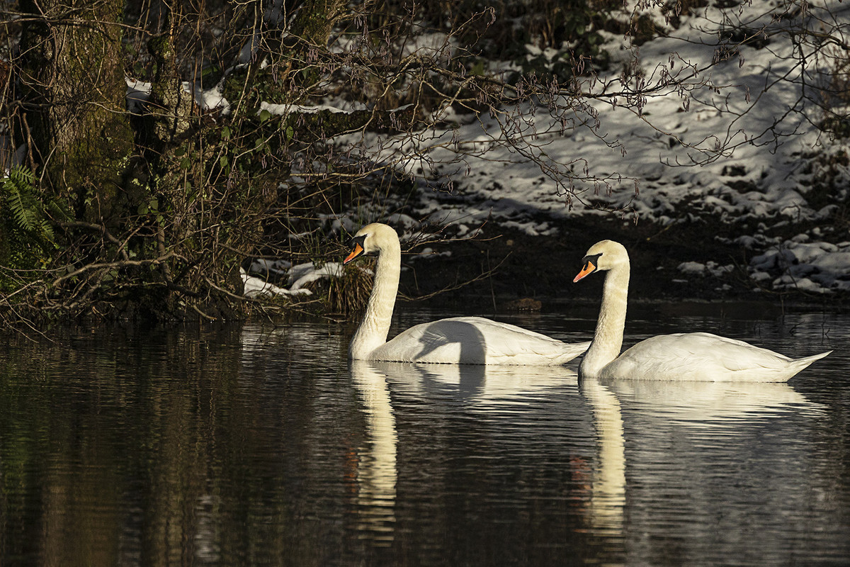 |
Swans Pairing A good scene created with great evening or morning light; the swans look sharp but unable to see the eyes to check. I find the shadow of the second bird on the first a little troubling and the background is a little too muddled. |
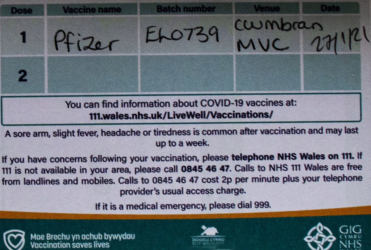 |
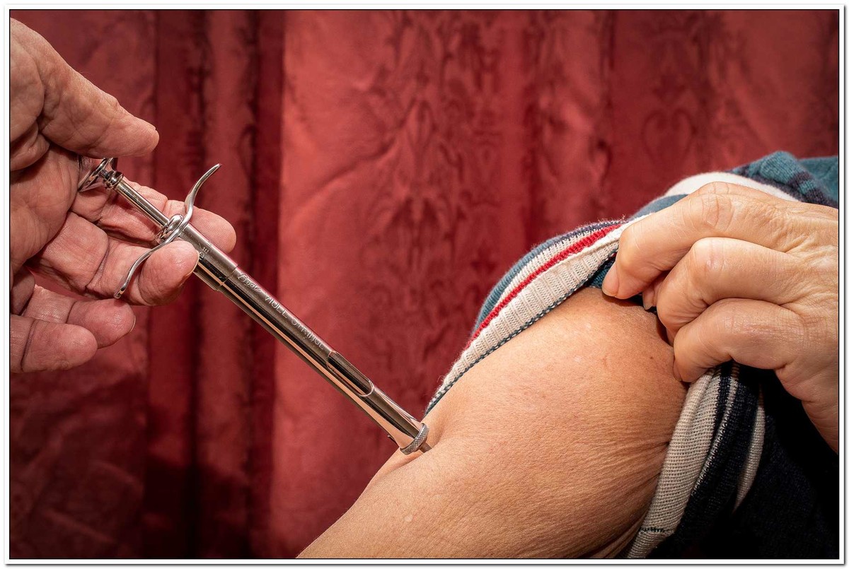
Vaccination Covid A great idea. It's sharp and tells you about the symptoms of the injection and which one you received, but just lacks the impact of the other one portraying the injection itself. |
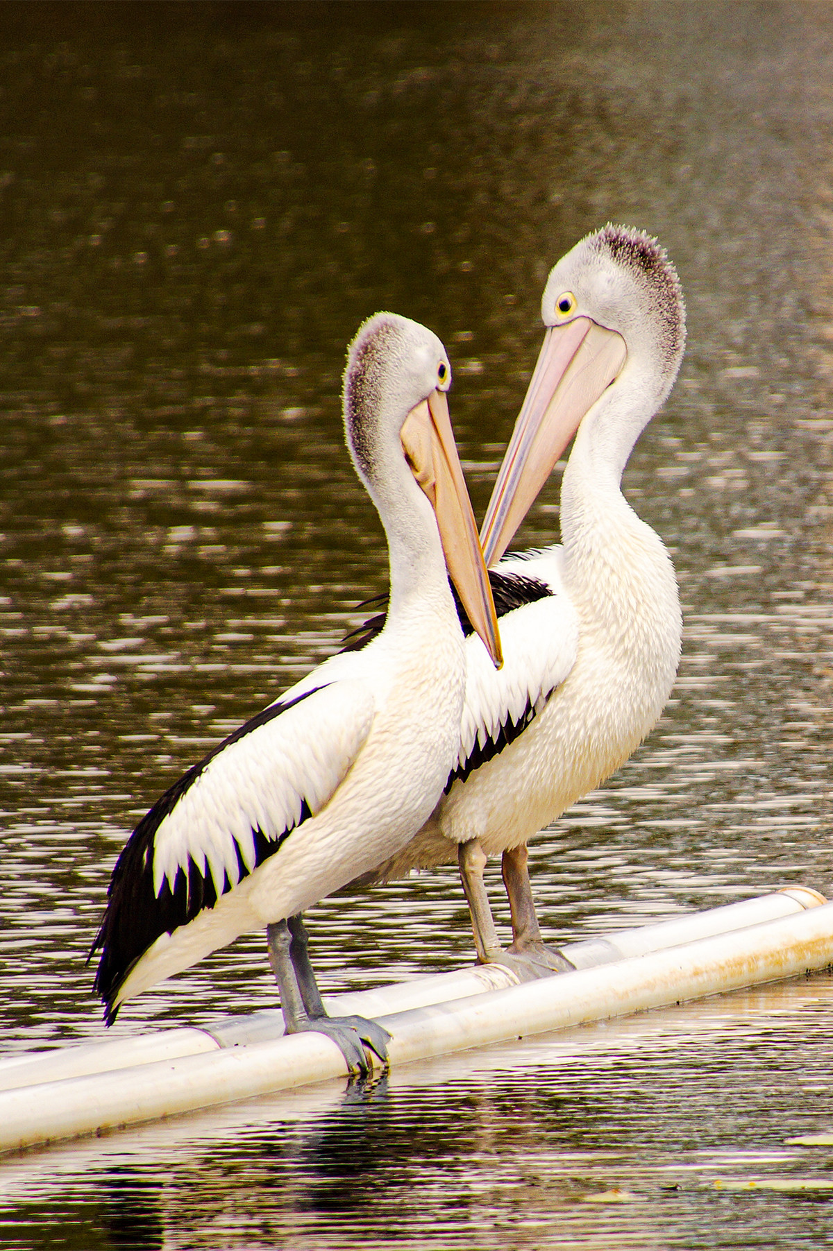 |
We Still Have Each Other Great image of the two pelicans together, but it needs a little more interaction between the two birds if they are a pair, or separation if they are not. Also, although trivial one of the beaks of the two birds is hidden behind the other bird. But it’s a great idea, just needs a little extra in it. |
 |
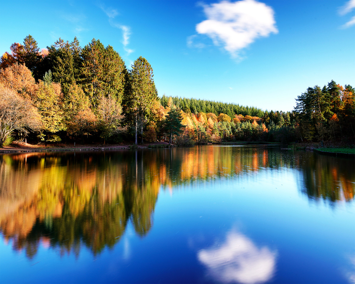
1st place: Island of Beauty by Keith Sharples I love this image, very simple and well exposed, the trees fill the frame but there is still space around them, super reflections in the lake, the bottom dark corners help to hold the picture in. |
 |
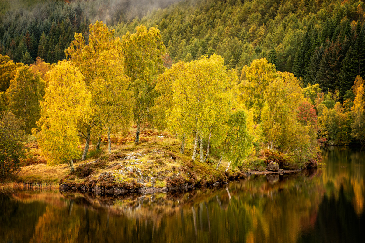
2nd place: Autumn at Blaen-y-Glyn by Janet Cox Lovely Image, soft muted autumn colours, the water has just the right amount of blur and the rocks at the bottom frame the image. |
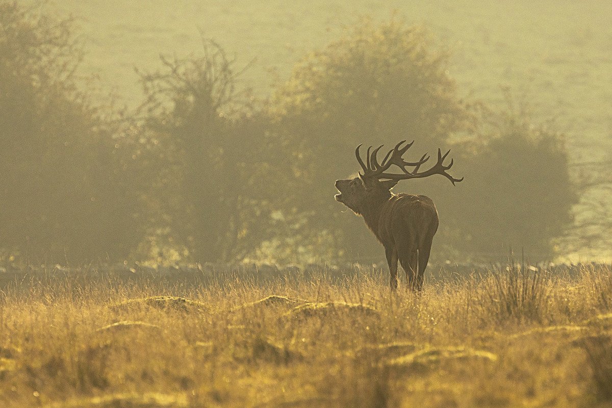 |
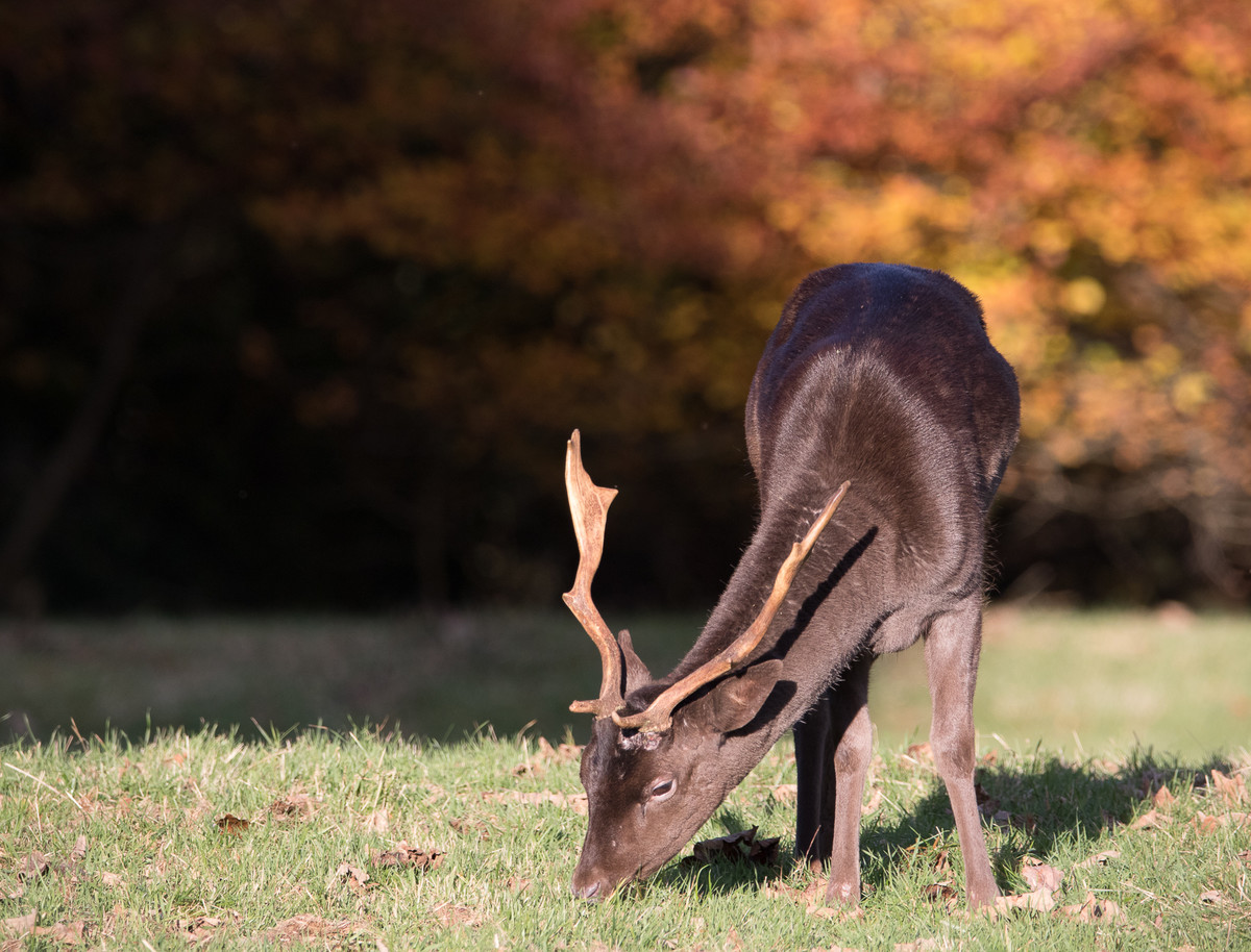
3rd place: Deer Rut, Early October Morning by Sue Carter This is a very well seen image. Deer are notoriously shy and to catch one in a perfect surround is a bonus, the mist adds atmosphere to the shot, what a lovely set of antlers. |
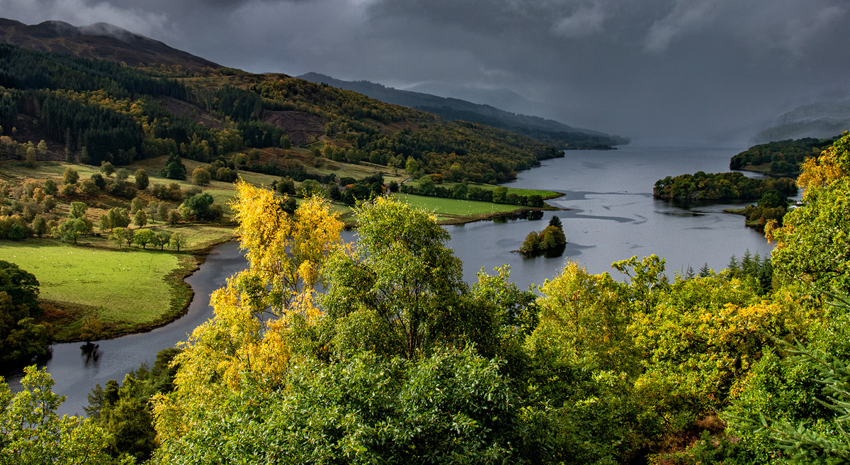 |
Highly Commended: Autumnal View by Lyn Sharples A beautiful landscape, I love the stormy sky and the mist in the far distance, I also like the way the sun has caught the autumn yellow of the tree. The lake leading in from the left takes your eye through the image. Super |
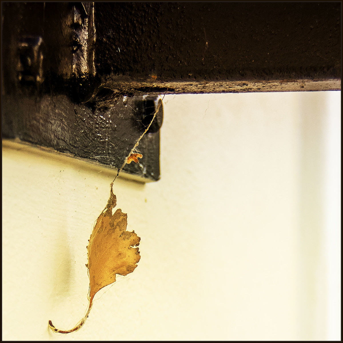 |
Highly Commended: Hanging by a Thread by Janet Cox This image fascinated me, a photographer’s image, this yellow leaf just caught hanging by a thread from a beam is a very clever image. I am undecided as to whether it should be cropped from the right hand side up to almost the dark timber to make a vertical image, I do not know. I think the very dark timber at the very top could be lightened a little. |
 |
Commended: Autumn Fire by Fintan Healy A great view point, the title describes the image perfectly, there are no other colours to distract and the main tree has been nicely positioned. |
 |
Commended: Kingfisher Amongst Autumn Leaves by Sue Carter Well taken, a different take on Autumn, well exposed. I think you could crop the bottom to get rid of the coloured leaves that have fallen into the water, I find these detract from the beautiful bird, also maybe a bit off from the right hand side so that the bird is not right in the middle. |
 |
Autumn Reds, Greens and Orange Trees in lovely autumn colours I love the contrast between the dark orange leaves and the light Acer, I personally think you could crop some of the dark green leaves on the left so that you can concentrate on the autumn colours. |
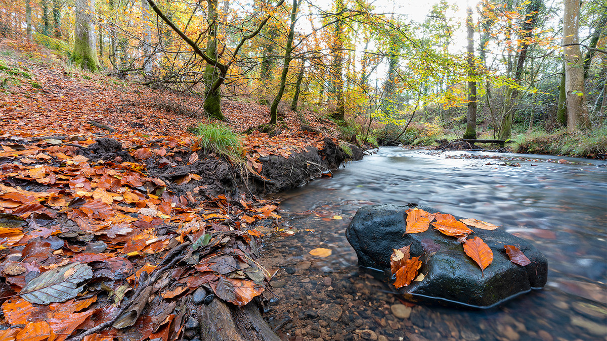 |
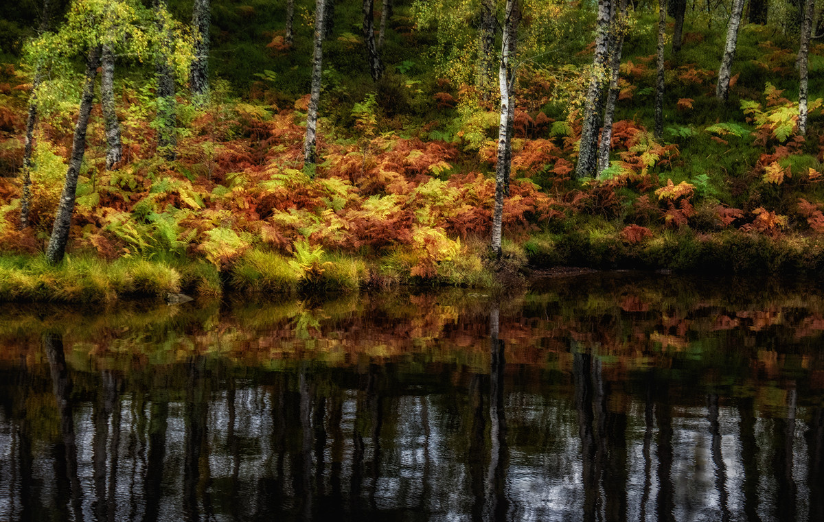
Autumn Carpet What a super autumn forest view, the rock in the foreground is in a good position and the water has been gently blurred, the leaves tumbling into the water and being blown onto the rock add another interest. |
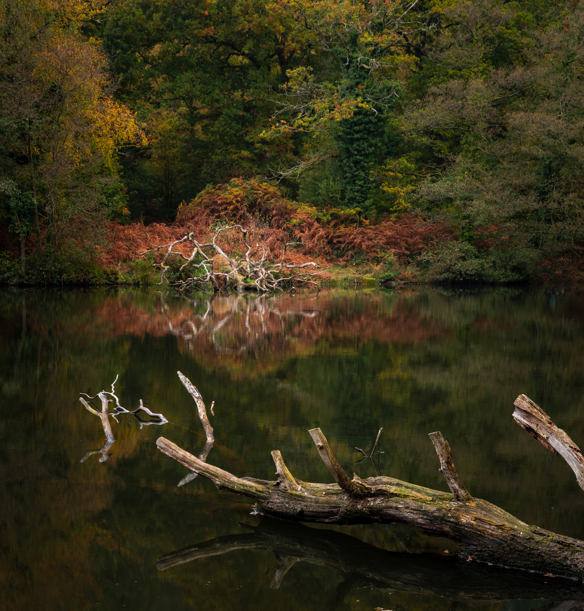 |
Autumn Reflections I can see what attracted you to take this image, the lovely autumn colours make a good backdrop for the log in the lake. My one thought is perhaps you could have included a bit more of the log so that we can see where the branch on the right joins the main trunk. |
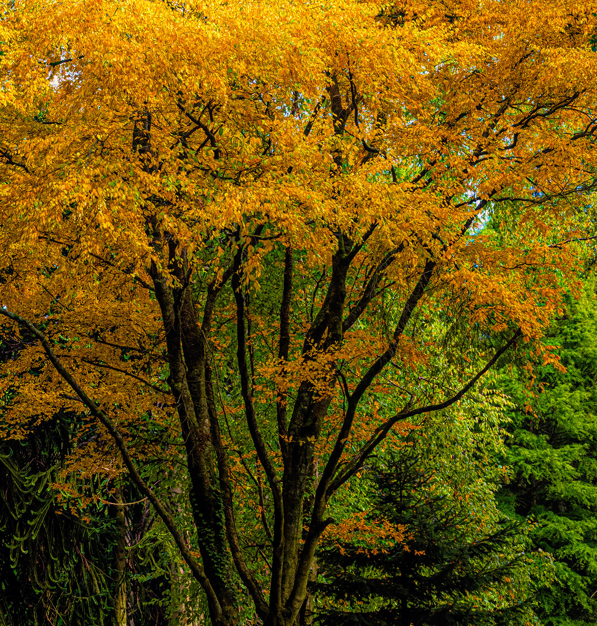 |
Autumn Yellow Autumn is such a wonderful time and this one tree stands out against the green background which shows it off to perfection, a lovely image. |
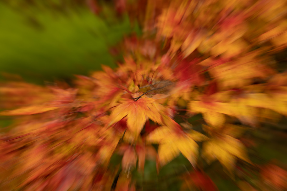 |
Awetum Exploxion It is nice to someone try something different, these coloured leaves really lend themselves to this zoom effect, my one thought was perhaps it would have added more impact if one of the leaves in the centre could have been a little sharper, but well done. |
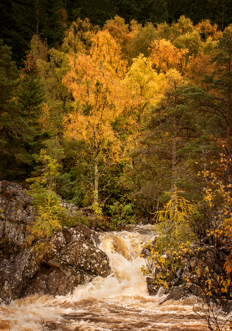 |
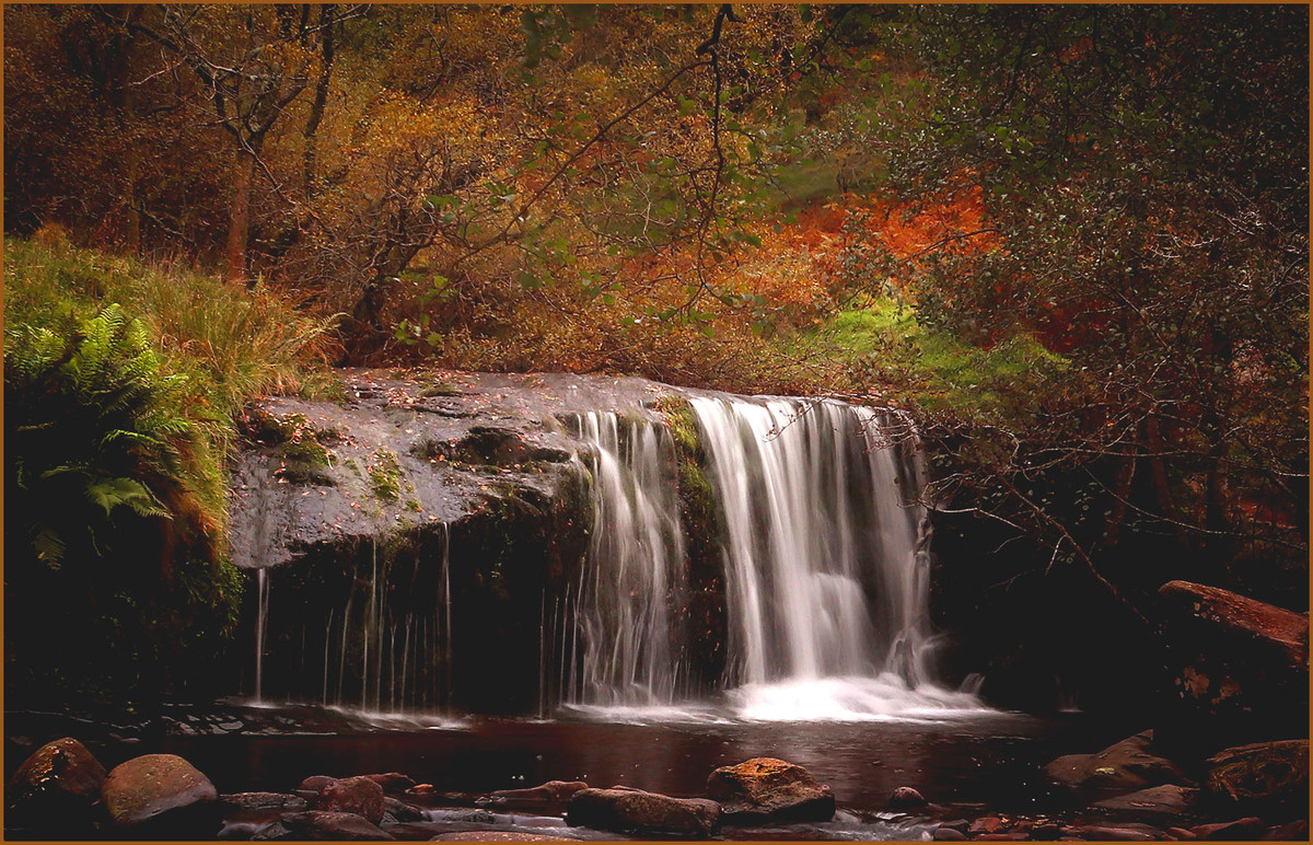
Beauty and Torrent Nicely framed image you can just hear the noise from the torrent of water rushing over the rocks, and the one dominant tree holds your eye. |
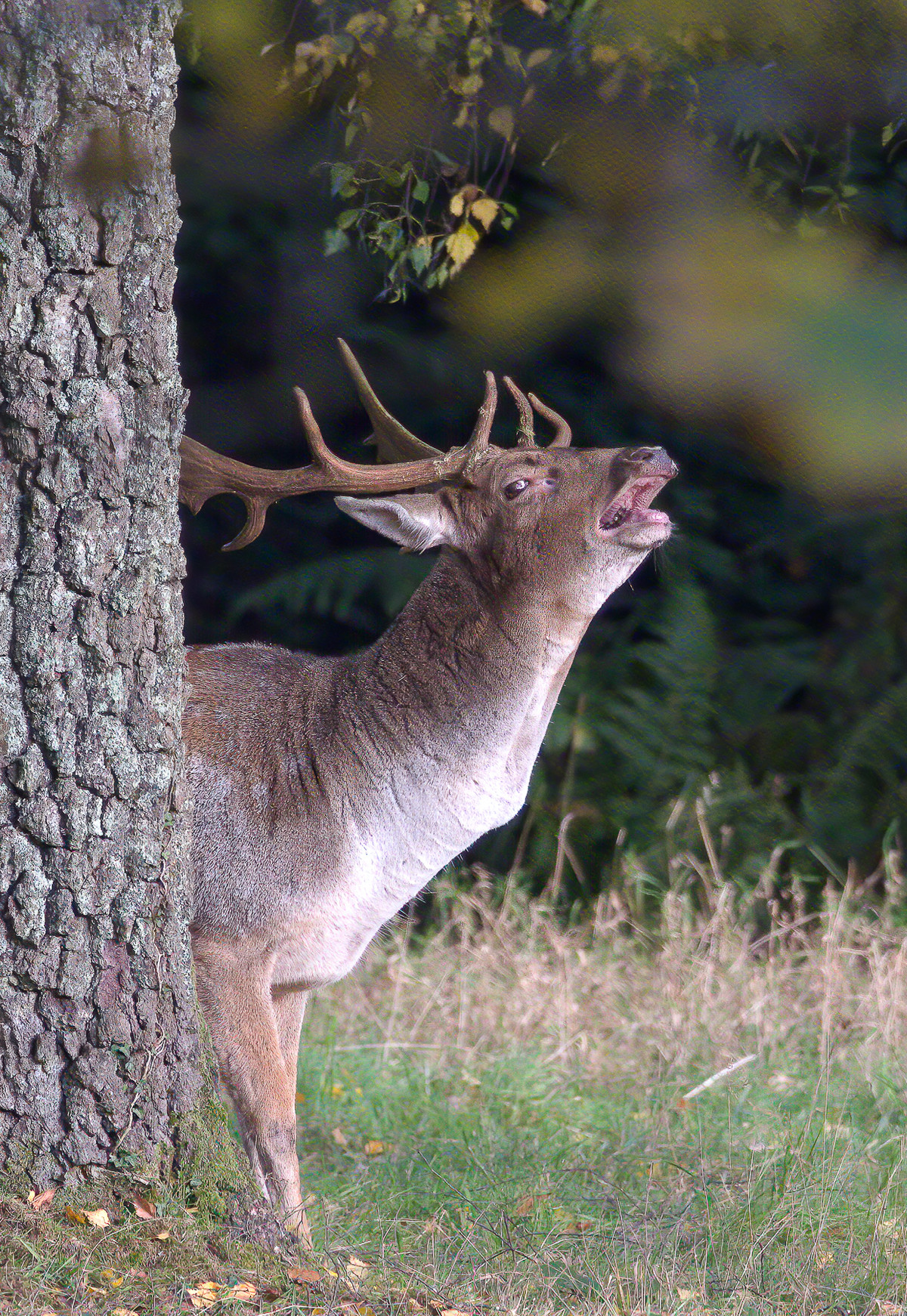 |
Bellowing Stag You have caught this stag in a good position and it is super sharp, perhaps you could tone down the rather distracting patch of yellow and green on the right. To actually catch him bellowing is a bonus. |
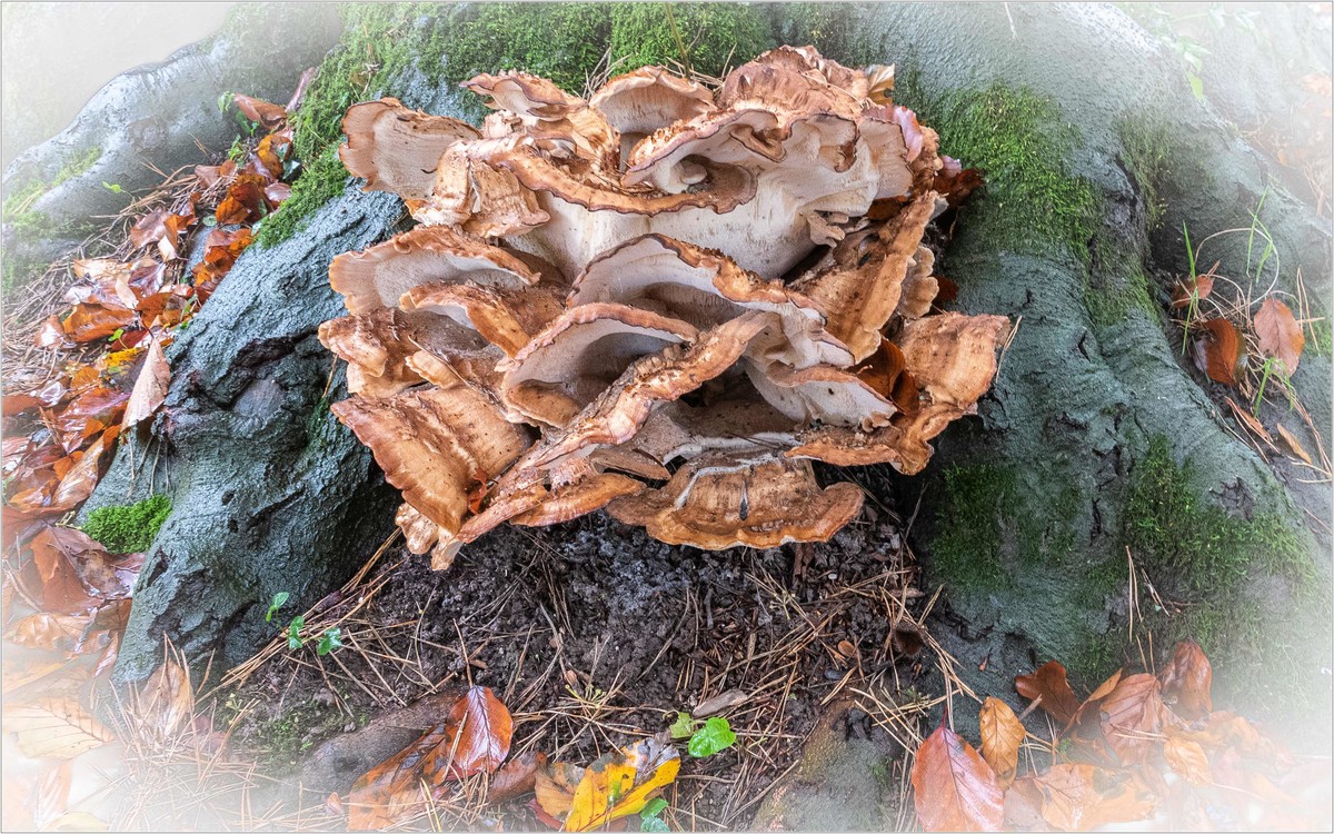 |
Bracket Fungus This is an interesting specimen of bracket fungus showing its habitat growing on a tree stump, I think a dark vignette would have made the fungus stand out a lot more. Have you noticed the animals head in the top right of the fungus and snake in the bottom right? |
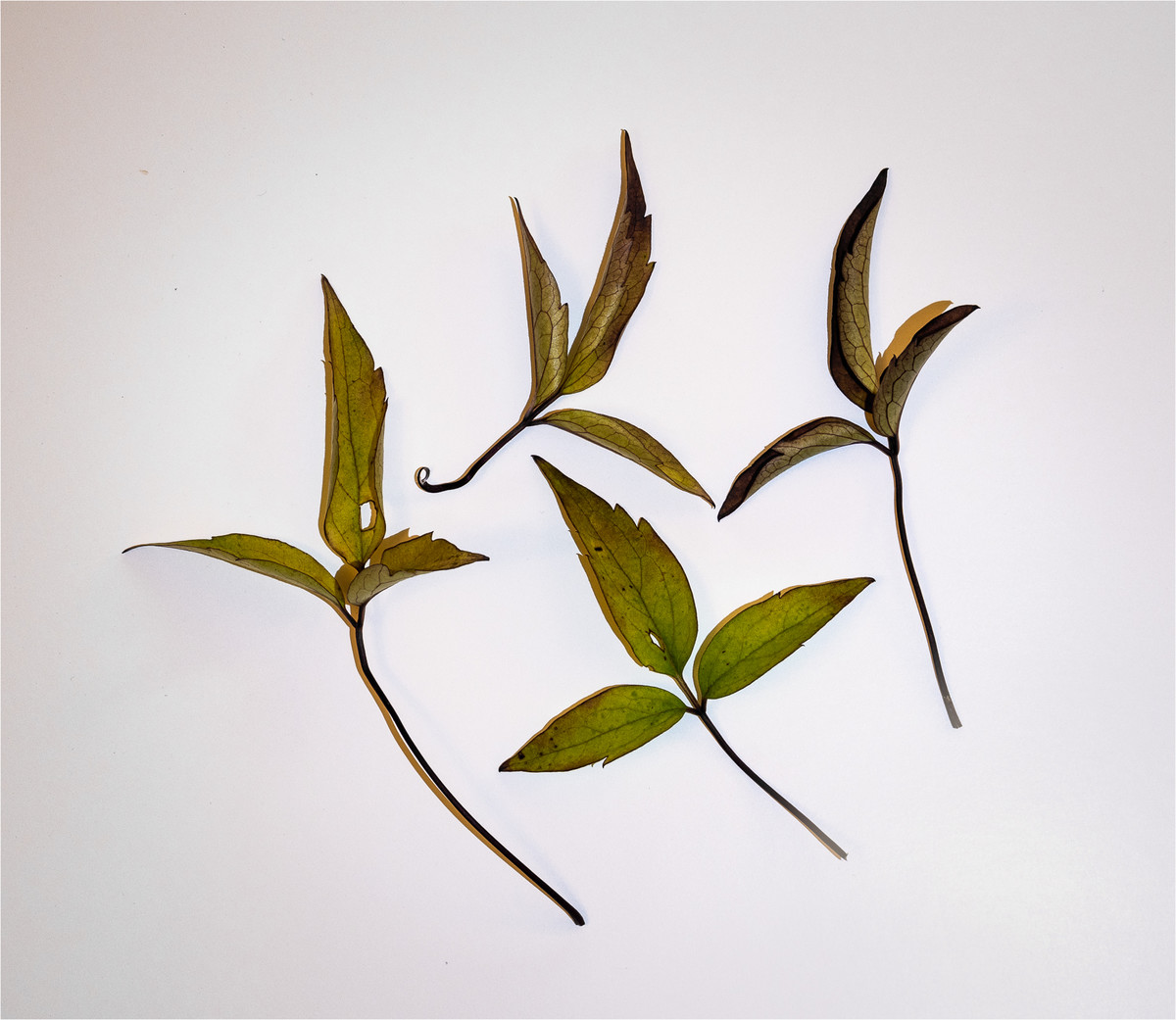 |
End of Season Clematis Leaves A very simple image of a nicely arranged set of Clematis leaves. I like the way you have positioned the three stems all pointing to the right hand corner, and how all the leaves are different shapes, the damaged leaf on the right could have a gentle clone just so the damaged hole does not stand out so much. A nice idea and something different. |
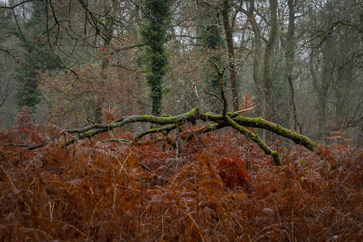 |
Fallen Tree I can see what attracted to this tangle of branches from the fallen tree set against the golden bracken, perhaps another viewpoint taking in just a few of the fallen timbers would have simplified the image. Also the trees in the background with just the bracken could have made another picture. |
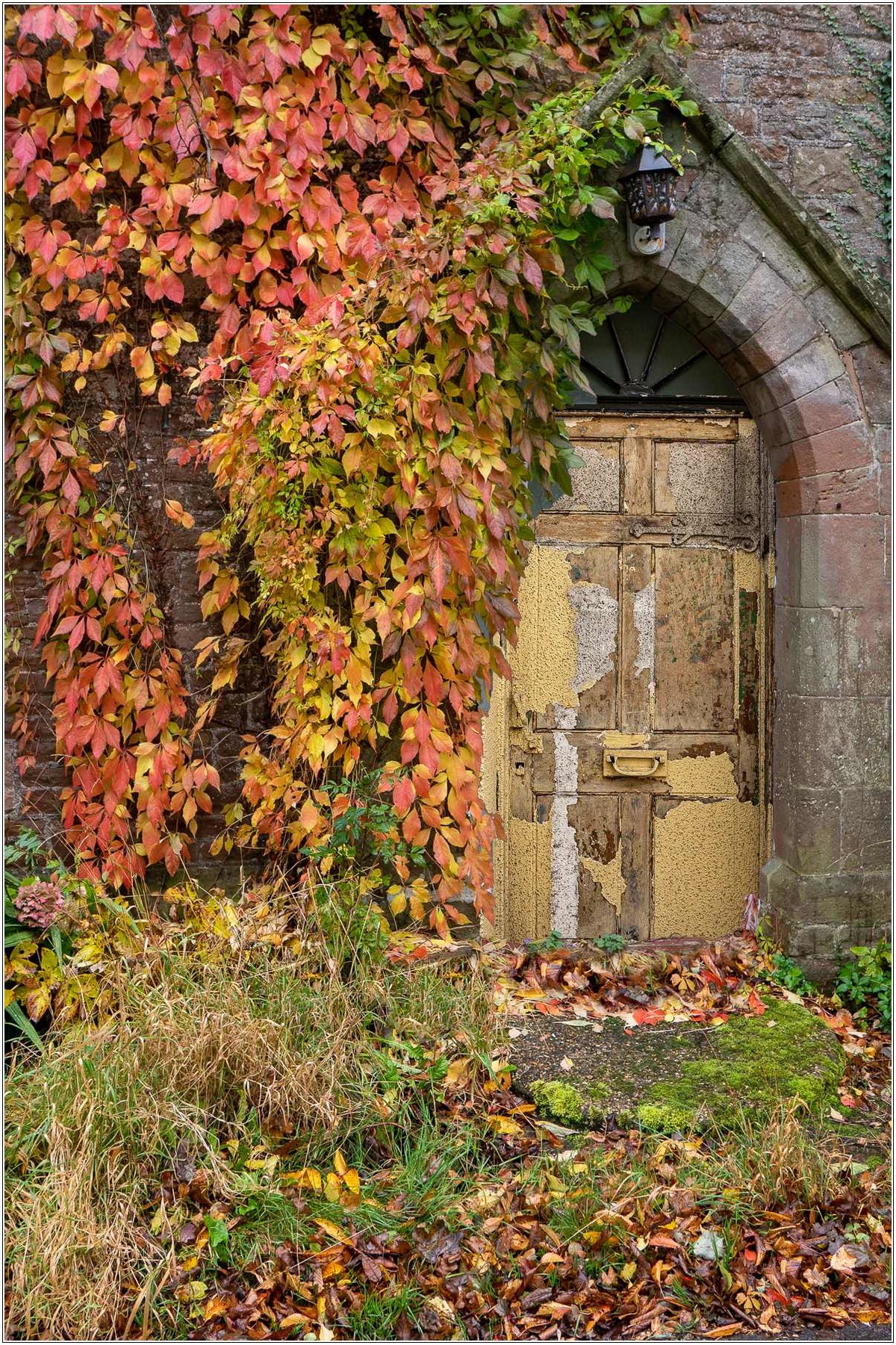 |
Hidden Door Very nicely composed image, what an interesting old door, surrounded by red Virginia Creeper. The interesting building looks very neglected as does the garden. |
 |
Lake Shore Beautiful reflections in the lake, the variegated colours of the bracken make a lovely splash of colour. I wondered about cropping the right hand side to take away the two trees on the edge, so that you are left with just three of the silver birches, I like the fact that the horizon is set low in the picture. I think you have another picture here if you were to crop tight on the reflections and turn them upside down and make a letterbox shape, it might be interesting. |
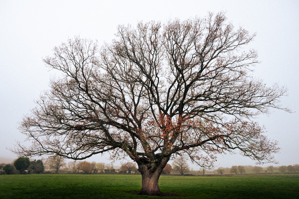 |
Last Autumn Leaves I love the shape of the tree which is seen to advantage with just a few leaves left to fall, the subtle colours of the trees in the background add to the image. |
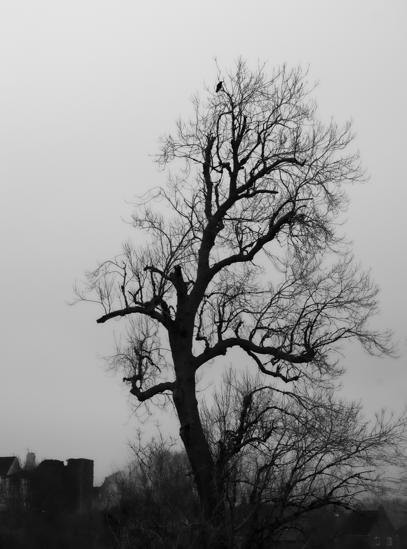 |
Lone Crow This one crow perched on the bare tree branch makes an interesting image, your eye goes immediately to the crow even though it is so small, I love the shape of the tree leaning to the right. I do not mind the white sky because it makes the tree stand out, white fluffy clouds would not look right. The only thing that worries me a little is the buildings on the left, perhaps you took some more at the time maybe without the buildings. |
 |
Melanistic Deer How lucky to get such a beautiful sharp image of this deer, I love the way the sun is catching on his / her coat and the way the deer is silhouetted against the lovely autumn colours. I might think about cropping some of the dark area on the left hand side. Lovely image. |
 |
Ready to Drop A simple picture full of interest, the lighter leaves have been positioned in just the right place with the darker leaves in the background. Well thought out image. |
 |
Reflecting Autumn Who could walk past such a beautiful view without stopping to take a photo, the trees and the reflections are wonderful. The cloud in the water and the bits of clouds on the right hand edge I find are a distraction, I think you could make a good image just using the trees and reflections on the left hand side. |
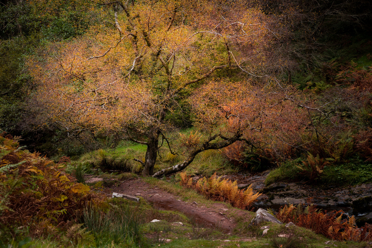 |
The Surprises of Autumn Another simple image with no distractions, the path leads you into the picture and the tree in the middle makes a stopping point so that you can then explore the stream and the rest of the image. Nice subtle colours. |
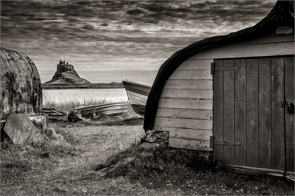 |
1st Place: Boat Sheds by Keith Sharples Because this image has all the elements of a true monochrome. A sepia image with a full range of tones from black right through to white and this range of tones provides all the light, shade and contrast it needs. The image takes you on a journey through the sheds and over the water to the hill and castle/fort opposite. Its pin sharp throughout and full of texture, detail and depth. And what a sky! |
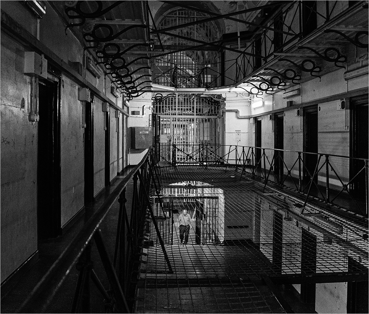 |
2nd Place: Cell Block by Brian Challis Full of mood and tension! The angle you’ve taken this from is perfect, you haven’t given into the temptation of taking it square on. Again, a full tonal range which really accentuates the drama of this image. There’s a graininess to it which gives all the texture it needs and no more. The moving human element adds to the overall feel of the image, one of confinement and the square crop works well here. If it were mine, I would tone down the white bar bit top left and a few white spots here and there. But overall a great image. |
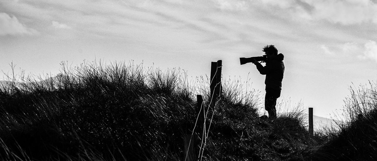 |
3rd Place: The Photographer by Lyn Sharples Almost a silhouette and silhouettes do make for good monochrome/B&W imagery. Again, a full range of tones, mostly black and white with varying tones of grey in the sky. Subject matter – very prominent! Light and shade as can be seen by the light on the grasses. Details/texture can be seen in grasses on the bank edges and in the sky. The whole image tells a story, no confusion, no fuss. I liked it. |
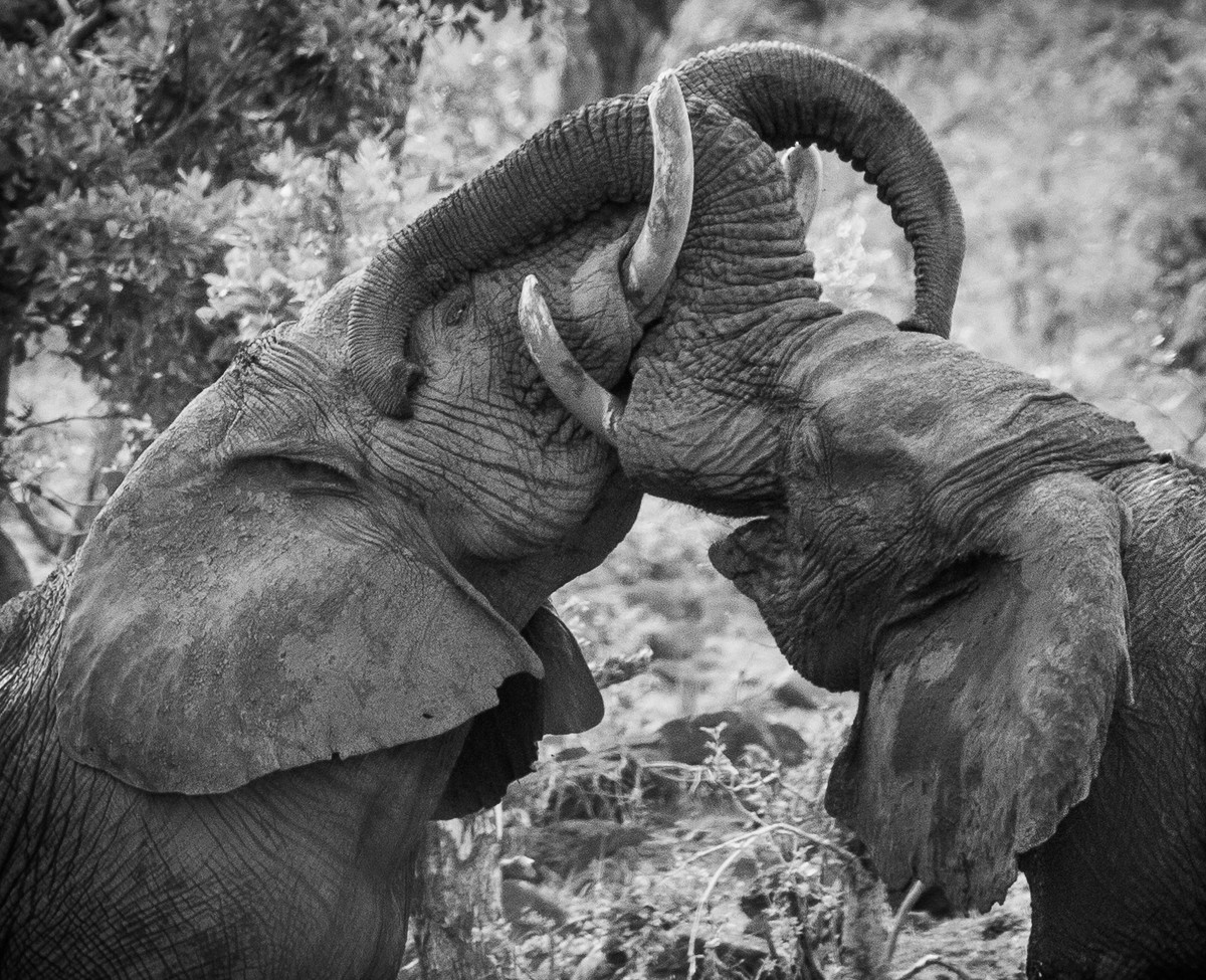 |
Highly Commended: Battle of the Giants by Elisa Best Power in the subject matter. Well caught action shot and the angle of the shot has given a good aspect with the two elephants making a triangle shape. Full of texture on the hides, you can almost feel the dirt on their ears! Love that there’s a little catchlight in the one eye which gives the image feeling. Could have done with a little more contrast I feel on the elephants and I would tone down the background a little – good depth of field. |
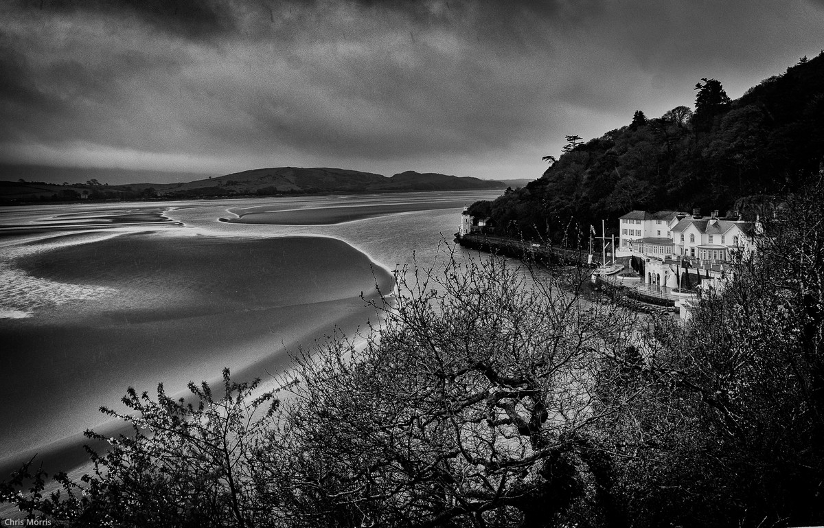 |
Highly Commended: Brigadoon by Chris Morris There’s a dark, moody serenity in this image with the sweep of the bay, the differing levels of sand making glistening curves and lines taking your eye on a slow journey through the entire image. A full range of tones adds to its moody calmness, the dark sky and bushes holding your gaze in the scene. I did think that the horizon was out but when I looked at the building, I realised it was just the shape of the bay and hills making it seem that way. If it were my image, I would have ‘trimmed’ the bushes especially to the left of the building. Also scan for dust spots (I counted 4 in the sky) and the bottom right edge has a shaft of white? |
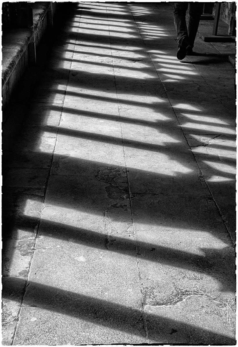 |
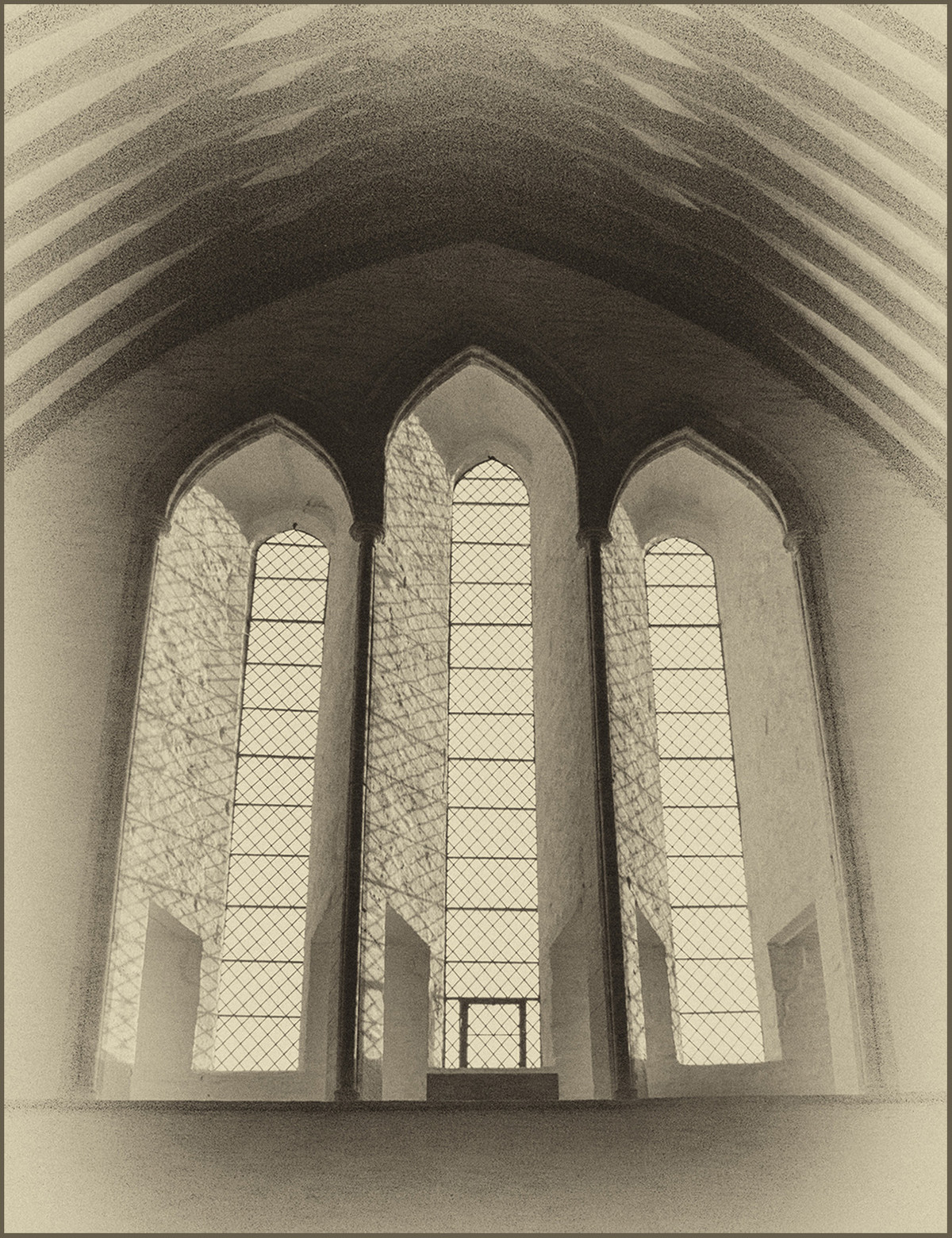
Highly Commended: Cloister by Lyn Sharples Almost full range of tones in the image, blacks, greys, but no pure white that I could see. However, it does have a subject matter in the form of patterns and shapes made by the light coming in from the windows producing these lovely shadows. Good leading lines and again the moving human element adds meaning to the image and there’s just enough of him. Lots of good grain and texture on the floor. I just felt it could do with a little bit more contrast to bring out those shadows and create a little more interest. |
 |
Highly Commended: Rhondda Hillside by Brian Challis The diagonal makes this a strong image, a light half, a dark half image, all on the diagonal. The forces of a dark top left opposing a dark bottom right gives the image a real sense of mood. Lots of detail in the landscape and trees with graininess in the sky. I do think that the land section could have done with some lighter elements, even if this meant adding them in post processing. This would have given more depth and interest in this area. |
 |
Highly Commended: Old Barn by Keith Sharples A true monochrome image! The sepia tint really suits this image – that’s how you would see an old barn, tones of brown and mottled looking. There’s a subject matter and the dark vignette holds our attention to where it needs to be. Lots textures and layers taking you up through the image and yes again a good range of tones. I do feel the barn, the subject matter, fades into the landscape a bit – it has all the same lights and darks as the landscape around it. It needs to be brought out, either by making it lighter than the landscape or lighting the landscape and making the barn darker. Either way this make it a stronger image. |
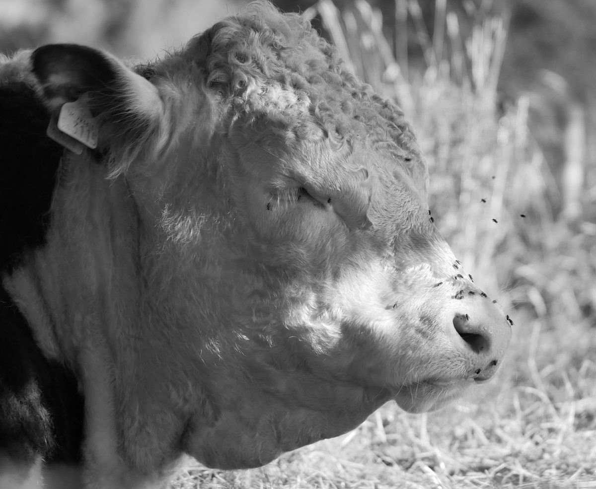 |
Highly Commended: Pesky Flies by Anne Richards A beautifully sharp image, full of light and shadow on the face of this lovely beast. I almost want to run my fingers through his (or her) curls! The subject matter is strong – the cow and those pesky flies! Good range of tones again and lots of texture and fine detail. Good depth of field. The only critique I have is that I would have masked out the face and toned down the background as its very bright which impacts on the head of the cow. |
 |
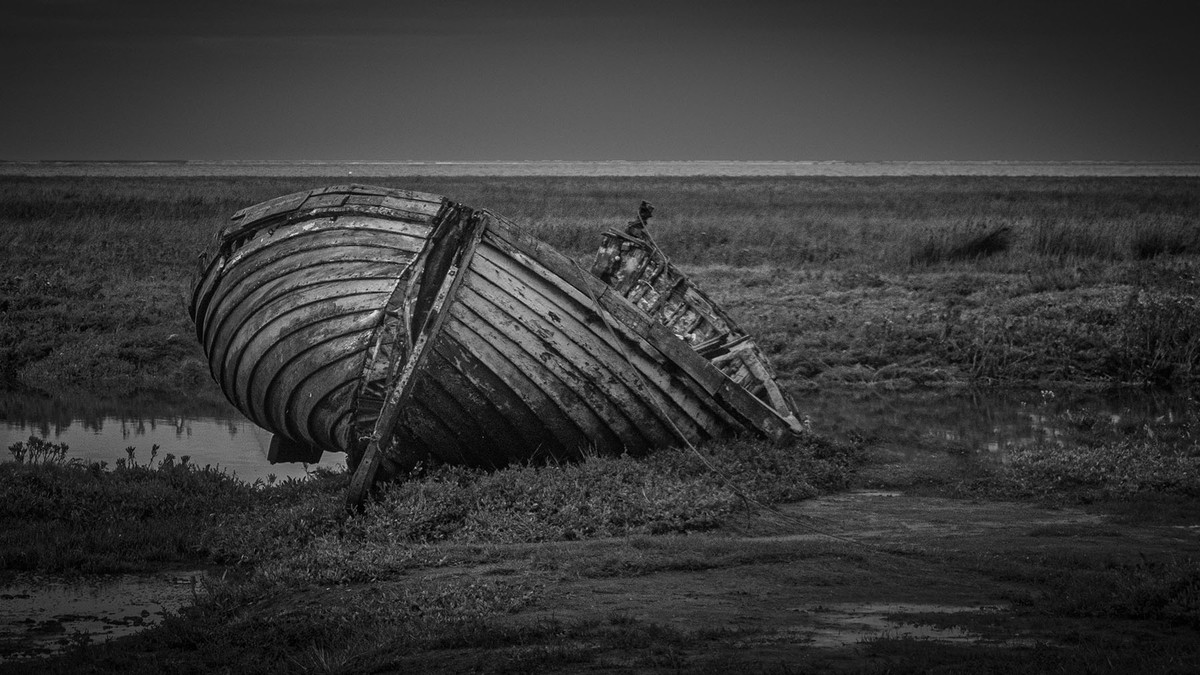
Commended: Beached by John Crowland My kind of image – I love decay, abandonment and ruin. Your image is full of texture and detail and sharp where it needs to be. The sky is full of movement and drama. However, the image does lack contrast and by adding contrast it would lift this image to another level. Add some white to all those grey clouds for added contrast and also, as it’s obviously a sunny day with the sun hitting the long side of the wreck and the post, add more light to these in post processing it would have brought more life and depth to the image. Be careful of horizons…. |
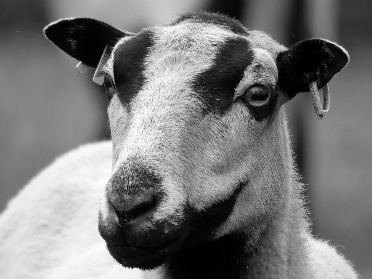 |
Commended: I am Looking at You by Anne Richards Good detail, texture and sharpness throughout the face. The prominent eye is sharp, I can see the shadow of someone, possibly the photographer. I love the detail in the fleece down the RH side of the neck – fabulous. Good depth of field used with no distracting elements in the background. I did feel that the back of the sheep was a little too bright and I think if this had been darkened down and the face lifted slightly, the image would have been better balanced. Dark at the back, light at the front. |
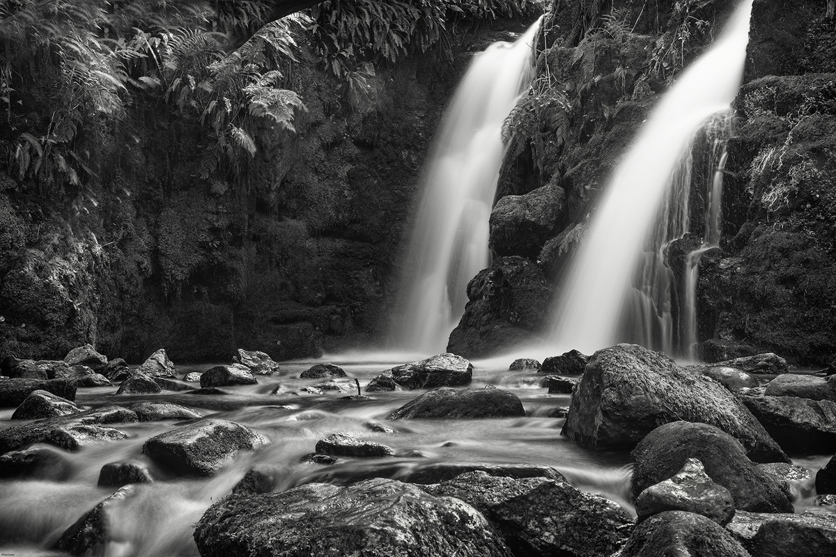 |
Commended: Venford Waterfall by Sue Carter Slow shutter speeds work well with monochrome/B&W and it does to a great extent here. Lots of foreground interest, with texture, detail and contrast. Good tonal range and the vegetation top left mirrors the rocks bottom right in respect of light and detail. The left-hand waterfall still has detail in it but unfortunately, the right hand one is completely blown out with no detail at all. I think a square crop taking out the left-hand waterfall would have made this image stronger. |
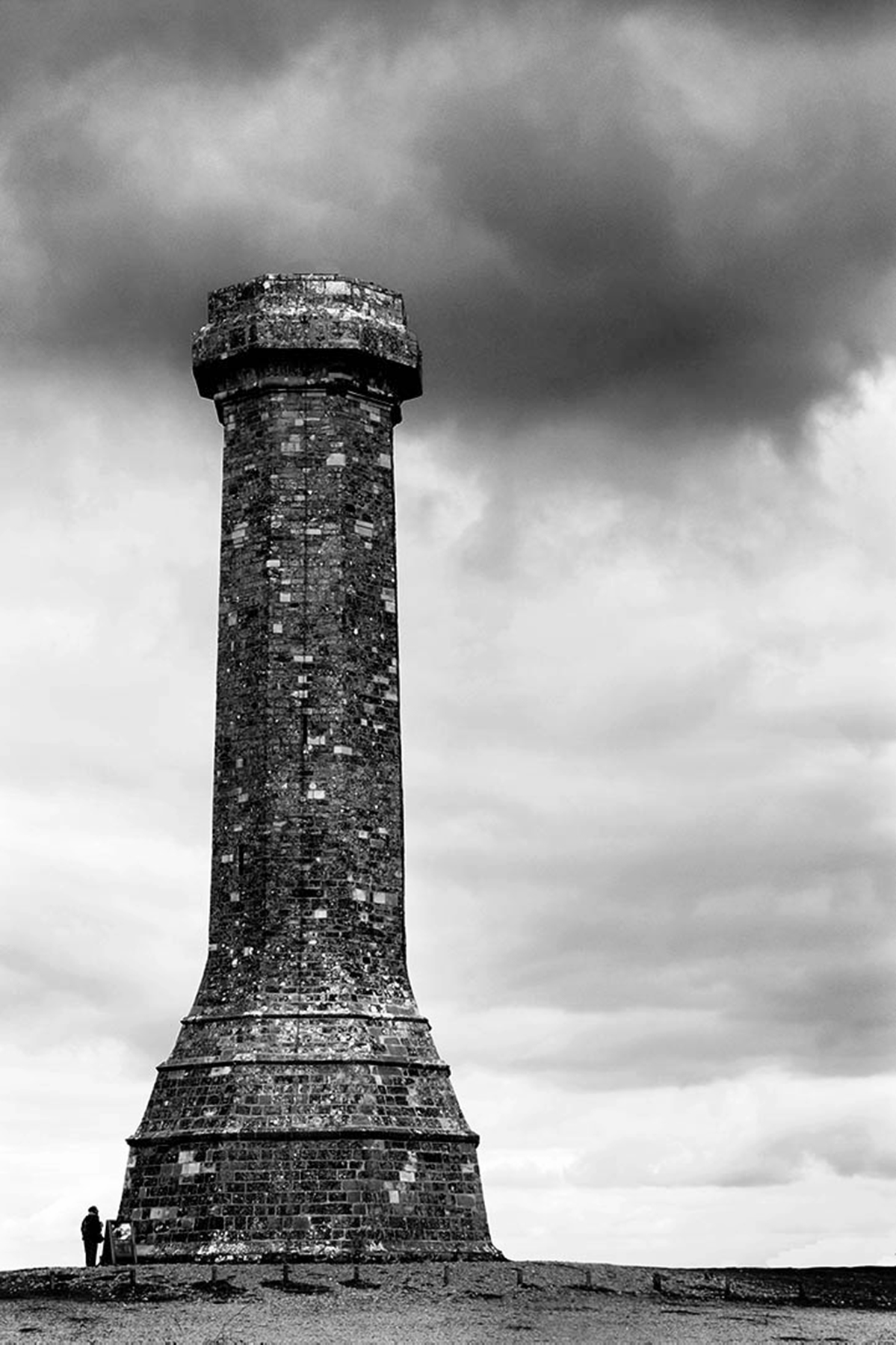 |
Commended: Hardy Monument by Adrian Butcher A strong subject with a good range of tones and the human element gives the whole image a sense of scale. Lots of good detail and texture in the monument, which is sharp, you can almost count every brick were you so inclined! Good solid base and the dark sky holds the image well. I just feel the image needs something else to hold your interest, perhaps a darker sky overall? I don’t know. Was this the best shooting viewpoint? |
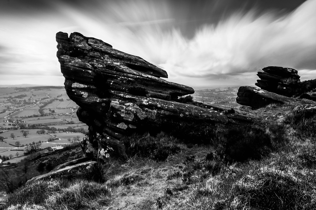 |
Commended: Rain on the Way by Adrian Butcher The rock formations are the strong and dominant element in this image. There’s a full range of tones throughout the image, as well and detail and texture, light and shade. So, it ticks most of the boxes of what is a good monochrome image although there are a lot of deep blacks in which detail is lost. For me though, I felt the title is a bit misleading and the prominent subject should have been the sky and not the rocks. The sky, although there is movement doesn’t give the drama suggesting rain is on the way. Also, my eyes kept roaming over the sharp scenery on the left. |
 |
Frightened Tree The image has good texture, good detail and a fair range of tones throughout. It’s a foreboding landscape and I should hate to be there in a storm! However, although the title should lead me to the tree it doesn’t. It’s a small piece in this very busy image and what’s holding my eye the most is the rock at the base of the image. Unfortunately, due to the slow shutter speed the waterfall and white cloud have been burnt out. |
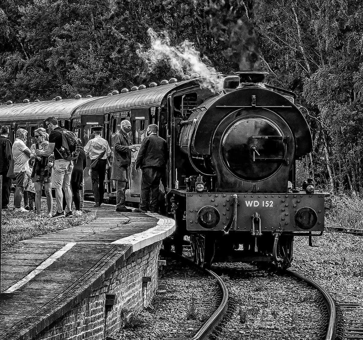 |
Hunslet 060 Austerity on the DFR There is a full range of blacks through to whites in your image and you have a main subject, the train. There is lots of texture and detail throughout. I do think that separation between the background and train would have worked with a larger aperture giving a good depth of field which would throw the background out of focus. Unfortunately, the image has been over sharpened and this can be seen as white lines around people and objects and in the trees and ground areas too. |
 |
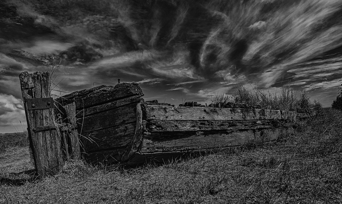
Seen Better Days Another rack and ruin photo which I love and old boats do this so well. There is a prominent subject showing how well and truly it has seen better days. The vignette holds the image well and the horizon is perfectly straight and on the top third. But unfortunately, the image has very little contrast, light and shade, blacks and whites, texture or detail and so the image is very flat. There are lots of post processing tools that could be used to bring out so much more to make this a great image. |
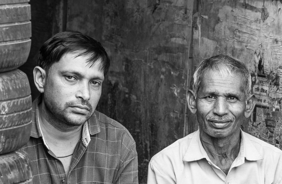 |
Tyre Sellers The guy on the right has a face so full of character with just a hint of a smile and a lovely catch light in his eyes. Lots of lines and textures too. The one on the left doesn’t seem to enjoy having his photo taken. The image does have a full range of tones and I love the textured background. I do think though there’s a lot of wasted space above their heads. It needs a different aspect so that we could see more of them which is important because they are the title and the story of them being tyre sellers. Perhaps portrait mode would have worked better. |
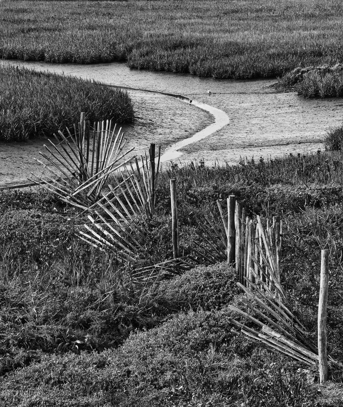 |
Twisting and Turning A twisted leading line of the fence leading down to the bend in the river or stream with the first post anchoring the starting point of my gaze. There’s a fair range of tones throughout the image. There is texture and detail in the image but unfortunately, it’s the same texture and detail being repeated throughout the image. Adding in light and shaded areas would have given your image more depth and appeal. Also, would a crop on the top down to just above the silver river line work. I did feel that there’s not a lot of interest in the image to hold the viewers attention for long. |
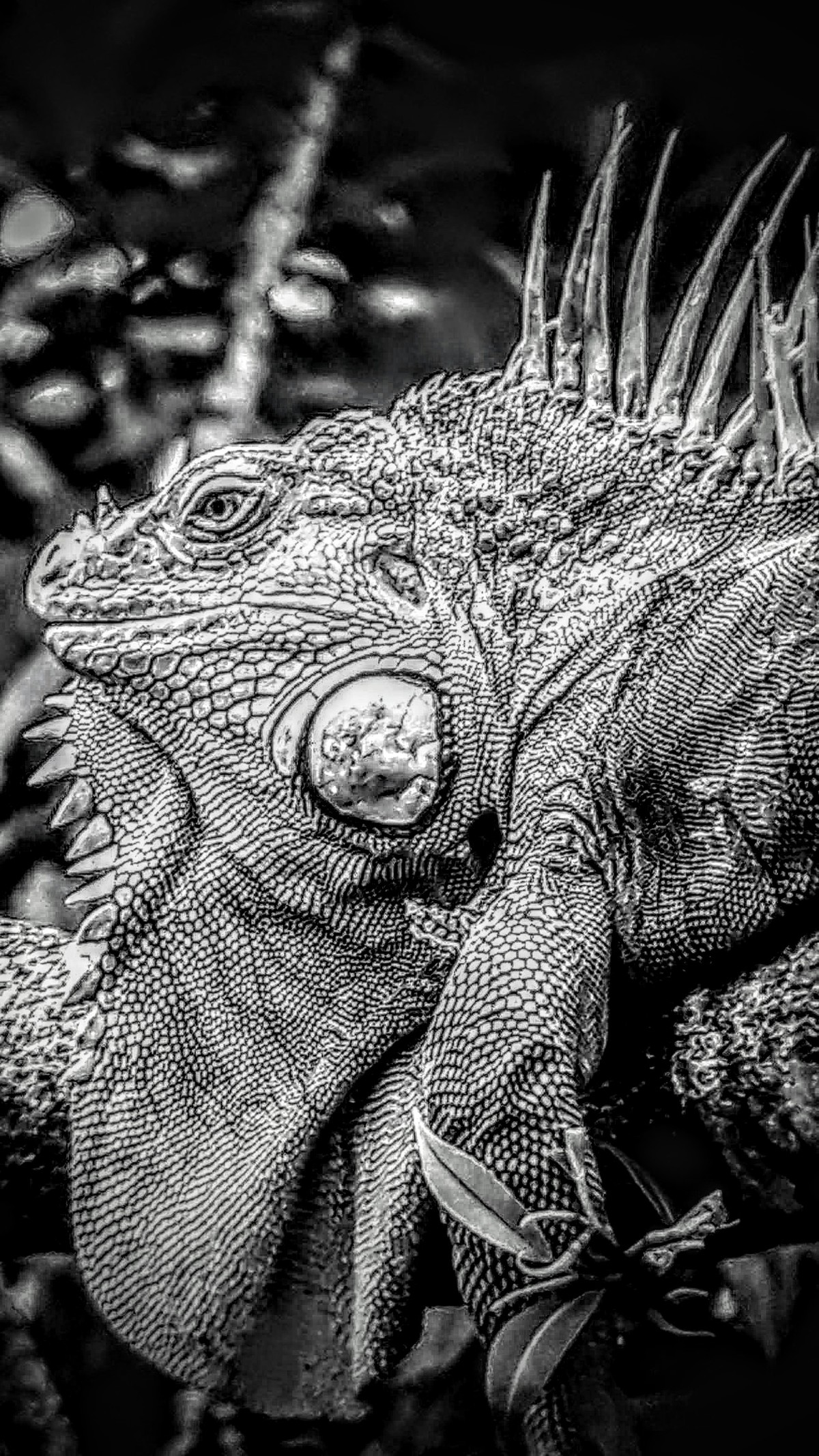 |
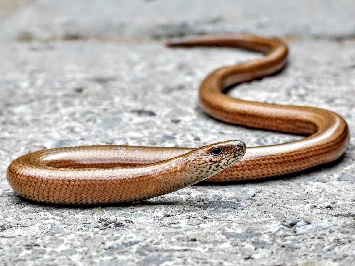
The Observer The image has a strong and dominant subject and there is a range of tones throughout and there’s texture and detail in the body of the lizard. I do think it’s been cropped a little too tight especially on the left. Sadly however, the image has been over sharpened to such an extent that this has produced strong artefacts throughout. If you look at the head of the lizard and follow it down, there is a distinct black line most of the way around. The effect of this over sharpening can also be seen in the elements in the background which are very distracting. |
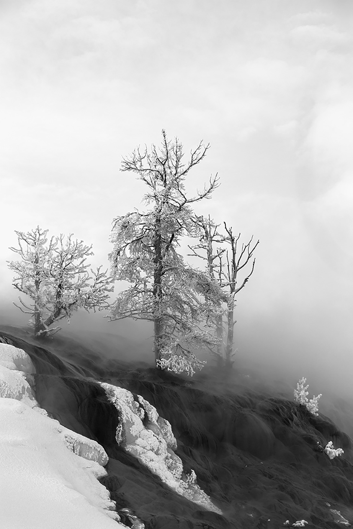 |
Winter in Yellowstone This image has a main element, the trees, and also it has blacks through to whites and fits the category of monochrome but unfortunately, other important elements are missing, such as texture, detail, light, shade etc. Since there’s no detail in the sky, the top section could be cropped to make this a stronger image. I am confused by the image though. When I first saw it, I thought infrared. But since it’s called Winter….. I figured it’s not infrared. I’m struggling to work out what’s happened to the black/grey ground, it’s almost as if it has a covering of ash? Maybe it’s a covering of low fog? Also, I can’t work out what the grey parts of the rocks are where the snow covering is and also in the trees? |
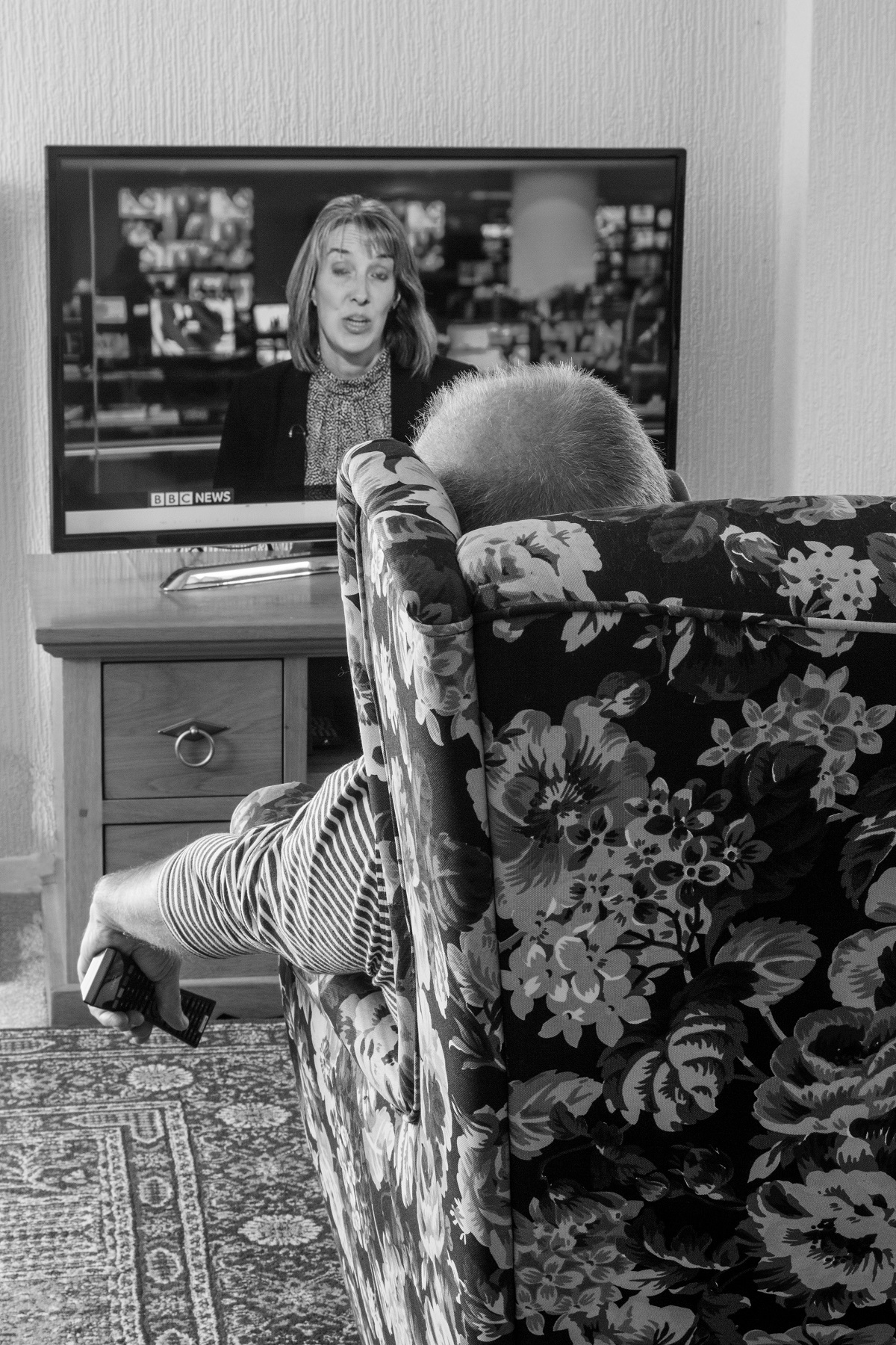 |
1st Place: Alone Waiting for News by Jackie Poulter The idea for the image is a great one, it tells a story about the person who appears to have fallen asleep. Exposure is good and a complete TV frame has been captured. It works really well in Black and white; colour would probably be too distracting. |
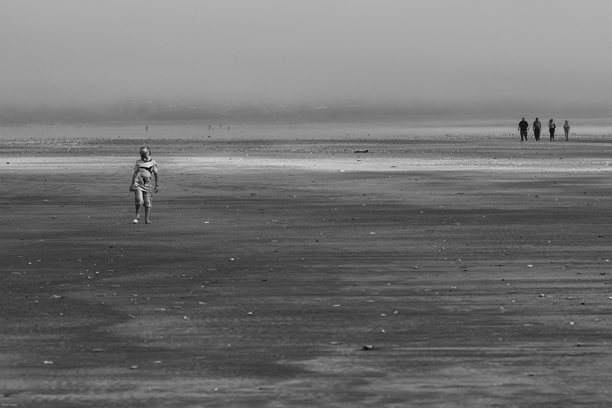 |
2nd Place: Boy With a Ball by Sue Carter A lovely image suited to black and white with a good range of tones. The textures in the sand are good and nice background which prevents the hills in the background become a distraction. The boy is well placed giving the sense of isolation from the other people on the beach. |
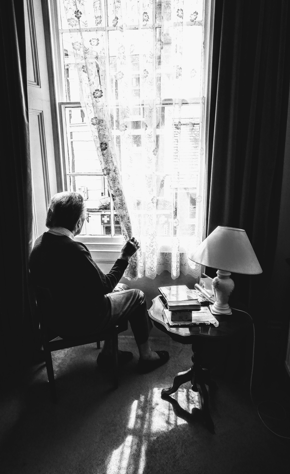 |
3rd Place: Silent Vision by Deb Griffiths It tells a story of someone needing contact with the outside world. The light from the window falling on the carpet leads to the eye to the table then on to the window. The bright light from the window draws the eye to try and see what the figure is looking at. The exposure is well controlled given the lighting conditions and the brightness from the window leads most of the room to be dark which enhances the viewers concentration onto the person and what's out of the window. The lead to the lamp and a white object on the bottom right-hand side of the image are a distraction and could be removed. |
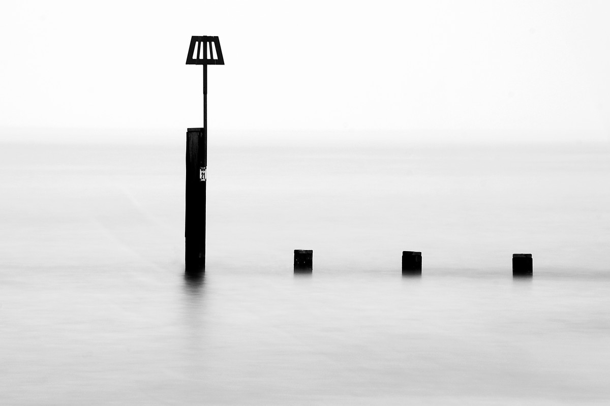 |
Highly Commended: Bleak Solitude by Adrian Butcher An excellent minimalist image. The tall post is in just the right place. The way that the sea merges into sky means that the is no distraction form the main subject. There is a shadow to the left of the main post that I find distracting (running at 45deg from either side of the bottom of the post). This could be easily smoothed out. |
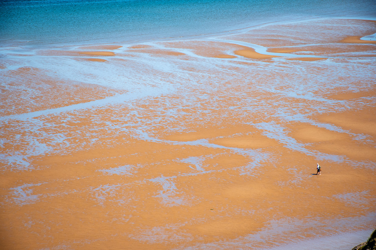 |
Highly Commended: Billy No Mates by Keith Sharples This image captures the sense of isolation. The contrasting blues and orange in the beach are very effective, the meandering lines of water add interest to the picture. Positioning of the lone person is about right as it exaggerates the sense of big space. The small amount of cliff in the bottom right-hand corner isn't needed and could be removed since the theme is isolation and it doesn't add anything in that context. |
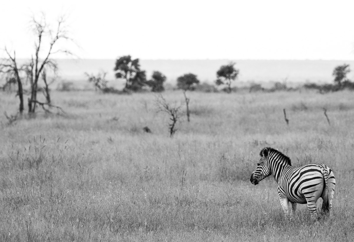 |
Highly Commended: Lone Zebra by Elisa Best This image is well suited to black and white, a good range of tones from black to white in the zebra really makes him stand out from the background. The zebra is very sharp from nose to tail with most of the rest of the image out of focus demonstrates good control of depth of field. Locating the zebra right in the corner exaggerates the sense of enormity of its environment. |
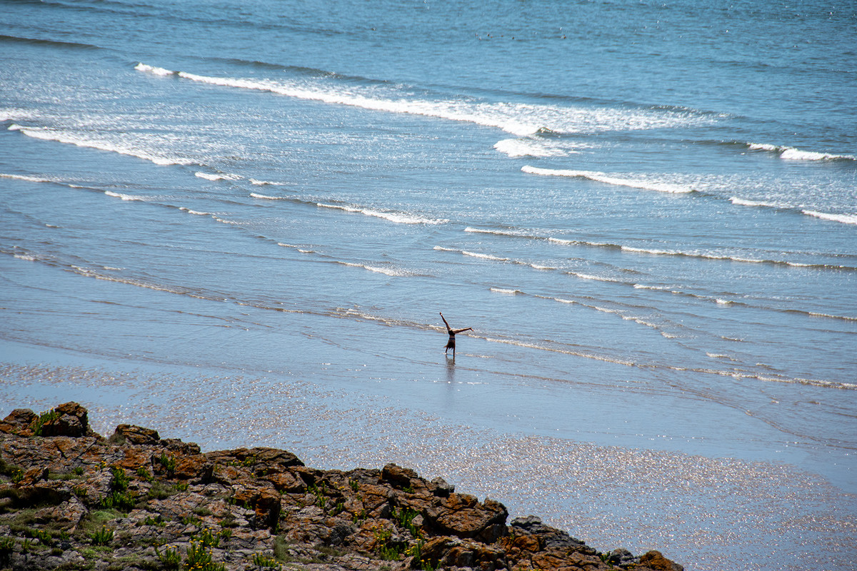 |
Commended: Lonely Gymnast by Lyn Sharples The water and waves give the feeling of being alone and isolated. The reflection of the blue sky in the water add a feeling of warmth and wellbeing. The gymnast has been caught at exactly the right moment to make the picture. It has been captured at a high enough shutter speed to freeze the motion. The foreground does not add to the image, by rotating the picture by about 30 degrees anticlockwise the top right part of the sea and foreground could be cropped off. |
 |
Commended: Nature's Isolation by Keith Sharples Well spotted, the cloud really gives the feeling of isolation but is a warm inviting way because of the blue sky. The beach is a necessary part of the picture but has been put in the right place. |
 |
All Alone This is a nicely composed image benefitting from the lead in line taking the eye to the main subject, which is nicely framed in the doorway of the building. It benefits from conversion to black and white and grain gives it more atmosphere. It would benefit from a dark vignette, particularly in the top corners. |
 |
All on my Own A nice image of a wading bird with nice rippled reflection which reflects the sky giving the image an overall warm feeling. Thye bird is all in focus but could do with a little lightening on the body (use shadows slider) to bring out colours and texture of the feathers |
 |
Brexit Brexit, isolation from Europe, an interesting alternative interpretation of the theme. The warmth of the sun shining on the misty window gives a warm feeling to the image. The triangular black patch bottom could be cropped off and the shadow of the bin is a distraction. |
 |
Caged A nice animal image, good to see the subject looking straight at the camera. The animal is nicely in focus but its face is slightly blurred, it needs a higher shutter speed to freeze it. The sun coming from behind gives a nice warm feeling to the picture. Depth of field is good making the background blurred and less of a distraction. |
 |
Extreme Social Distancing Another interesting interpretation of the theme. The young cow is clearly feeling isolation, hence its interest in the photographer. The subject would be better if located at the edge of the frame rather than the centre and some of the distracting background cropped off. The barbed wire is an essential feature of this picture to emphasise the isolation of the cow from the rest of the world. It would be better if in focus, this could easily be achieved by taking an extra picture focussed on the wire and the combined with original. |
 |
Fishing A well composed image, main subject placed in the right place and just enough beach to anchor the image. The sky and its reflection give the image a nice warm feeling and provide a nice rim light glow to the back of the figure. Detail in the figure and texture on the sea is excellent and contrasts with the out of focus background. |
 |
I Am Lonely A nice image of a wading bird. Water colour reflecting the sky give the image a warm summery feel. The subject is sharp despite its movement. The left-hand side could be cropped just behind the ripples made by the bird, moving the bird onto a third line. The right-hand side allows space for the bird to walk into. |
 |
Lonely The overall feel of this image is one of summer and serenity. The flower is nicely positioned in the frame. All parts of it are sharp while the rest of the picture is out of focus, allowing the bright purple of the flower really stand out. The tree on the left, although out of focus is a little distracting and could be cropped out. |
 |
Lost in Thought The person is clearly deep in thought looking out to sea, I wonder if the pile of rocks feels the same?? That pile of rocks makes this image. The bright patch in the water highlights its presence. The dark clouds add a moodiness to the image and its works well in black and white. There is a white halo round the figure that needs to be removed. |
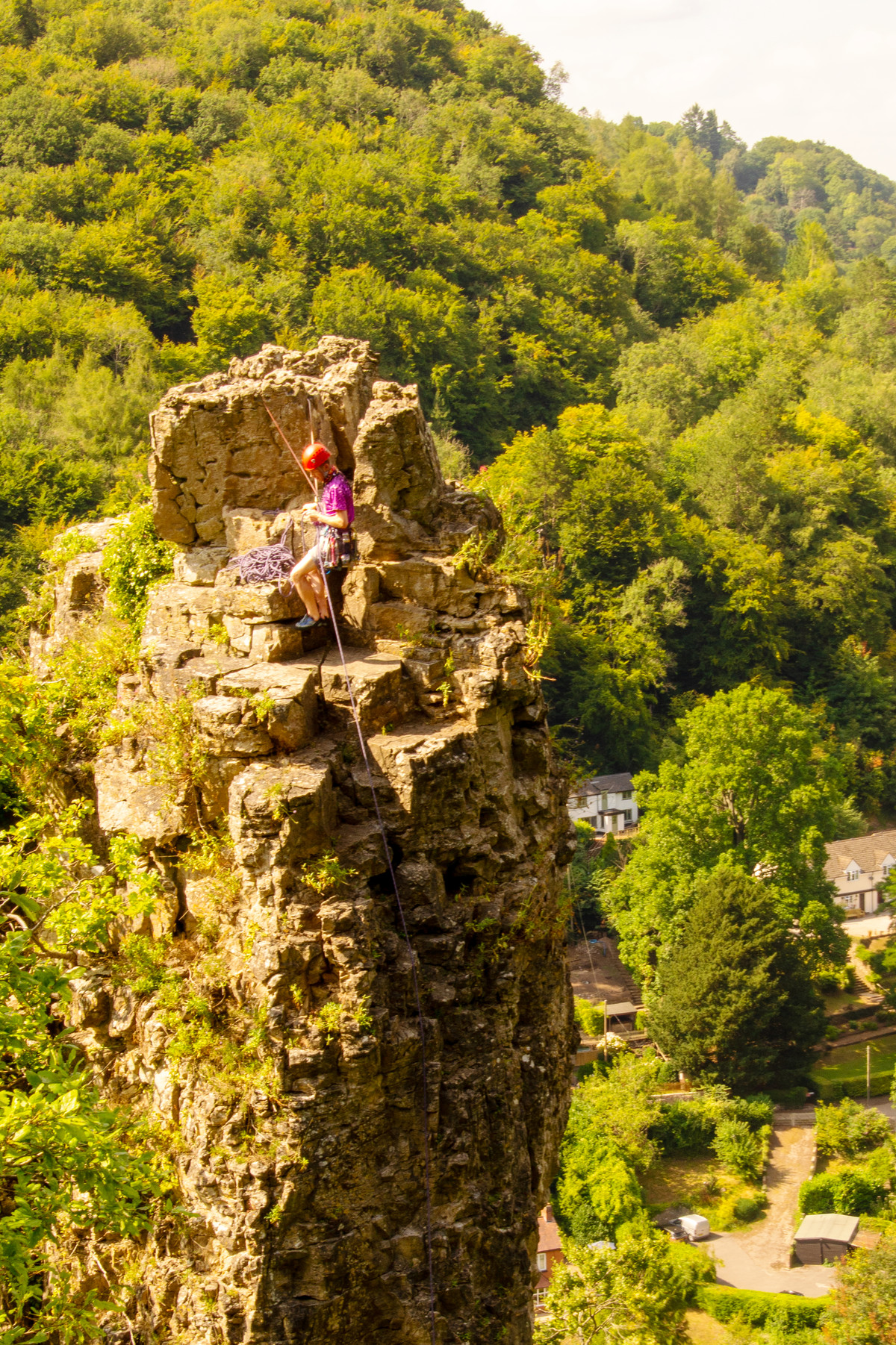 |
On Top of the World This is a difficult picture to take as the rock pinnacle tends to merge into the background, so well done for getting some separation. The climber looks as though he is bringing up a second, it would have been good to wait until he/she appeared into the lower part of the picture. The sun gives a nice warm summery feel to the image. |
 |
Room to Grow A nice open vista with some nice recession into the background. The tree is nicely placed in the frame and fits nicely with the shape of the water running through the centre of the image. The branches of the tree take one's eye to the hills in the background. The image might benefit from some clarity or dehaze to provide more contrast into the hill lines. |
 |
Splendid Isolation A very nice view of the river, with the theme nicely depicted by the figure sitting looking at the vista. A good compositional feature is the river running in from the left making an S and then exiting to the right. It would have been good to include the edge of the bend on the left-hand side of the image. |
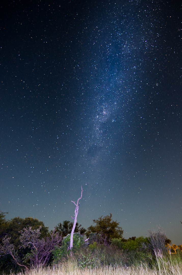 |
Talamati Stars This type of image is very difficult to capture and this is a really good attempt. The lone tree looks as if it is reaching up to meet the line of the milky way. It would be better if a bit more of the light grass at the bottom was visible (or cropped off) as it awkward being neither in nor out! The sky would better show the stars if it were a bit darker, try reducing the blacks slider and see how it looks. |
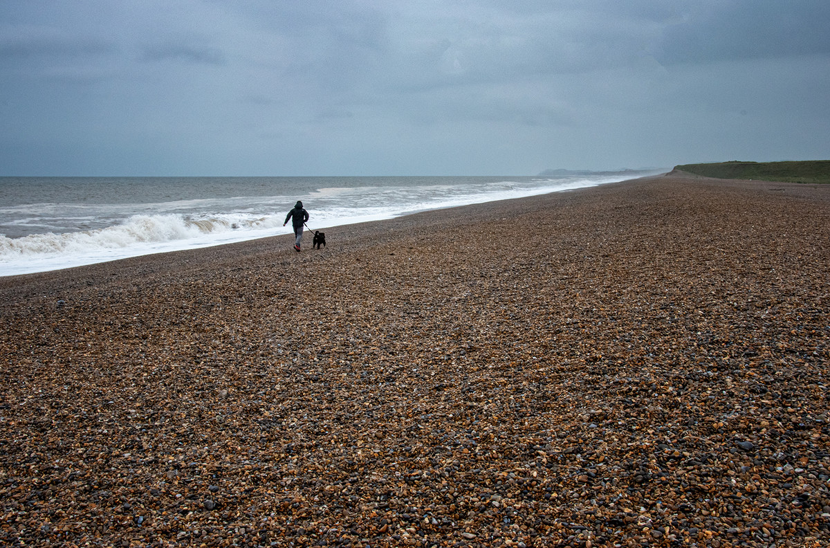 |
The Long Walk Home A wide open space which enhances the feeling of a wide-open space and isolation as there is only 1 person in the image. The way that the sea line leads the eye to the subject then on where it converges to infinity and meets the line of the land on a third is a good compositional feature. This image could be cropped to a letterbox from the point where the sea meets the left-hand edge of the frame. |
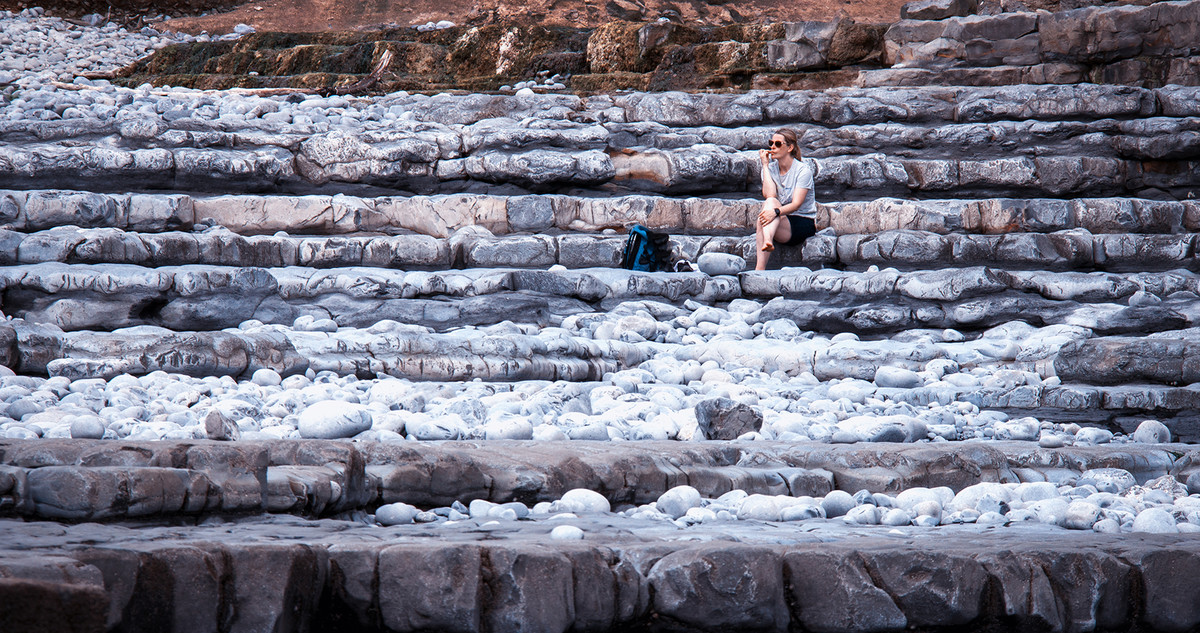 |
When Will It Happen A nice composition with the subject placed on a third and looking into the picture. The layers of rock work really well and the dark layer at the bottom of the picture give a nice border, matched by the dark layer at the top. The light boulders a third of the way up are stacked across rock layers leading up to the lady sitting contemplating the view. |
 |
Which Way Interesting image. The vertical blocks give a sense of mystery, the sky top centre is burnt out, normally that's a no-no but in this case it enhances the image. It gives an ethereal feeling, maybe there is a heaven, is the figure heading that way?? It would have been good to see verticals straight, easily fixed in Lightroom. |
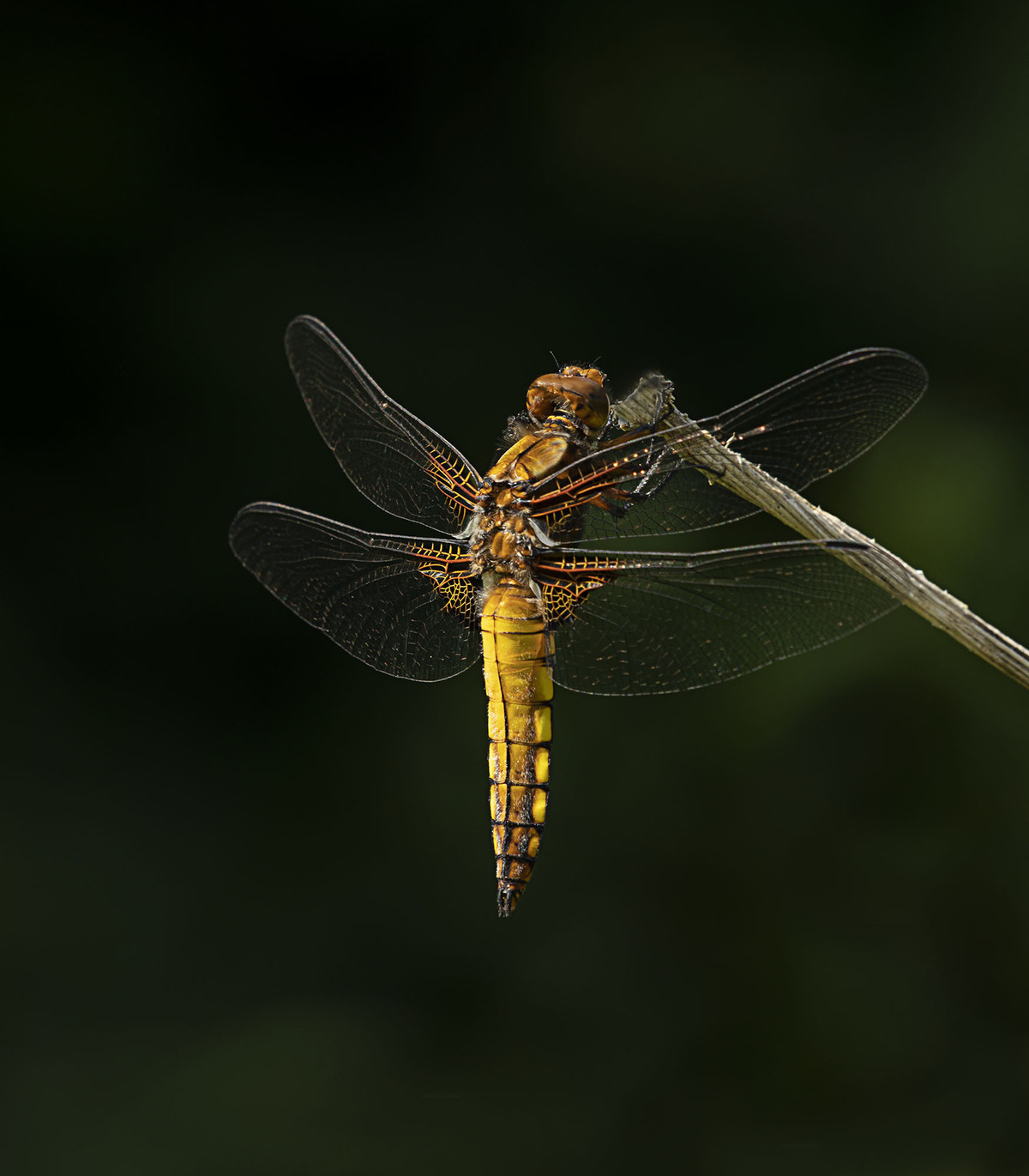 |
1st Place: Female Broad Bodied Chaser by Sue Carter Well exposed, well focused image on a good background. Beautiful Image. |
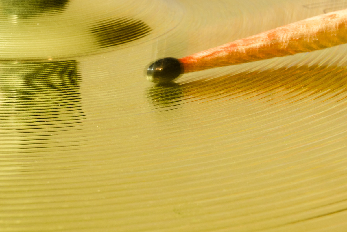 |
2nd Place: High Hat by Brian Challis Good pattern on the cymbal and movement in the stick make for a dynamic but simple image. Maybe crop about 25% off the right side and make the viewer work a little harder. |
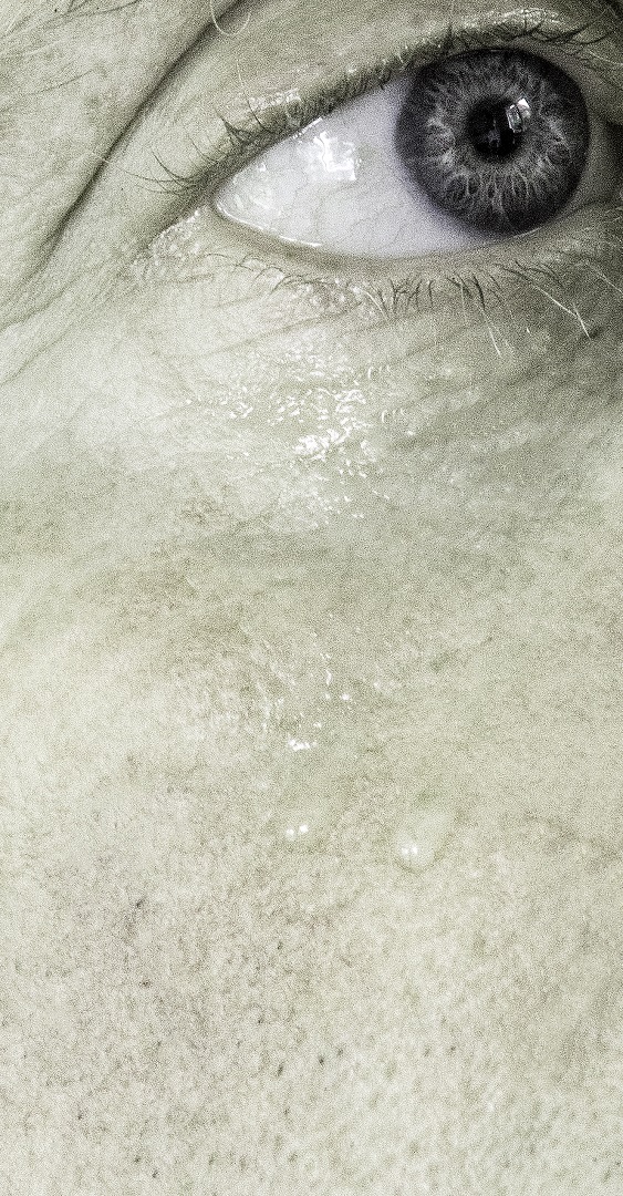 |
3rd Place: The Eye by Jackie Poulter A bold image with the main focus in the top corner and a secondary location with the tears. Sharp eye with good catchlight. I wonder if you tried a crop with a little more of the eye on the right. A pure black & white may improve the image. |
 |
Highly Commended: Catrina by John Crowland Square format suits this image and the prominent eye grabs the viewer. I might have reduced the highlights in the non-prominent eye a little. |
 |
Highly Commended: Fourteen Spot Ladybird by Sue Carter Good composition with the use of the leaf as a leading line and good focus. Image is a bit grainy but more “wormy” but fine viewed at proper distance. |
 |
Commended: Keep Out by Chris Morris Most people would not see this image but the directional light has made an interesting picture. Cropping a little from the right just improves the composition. |
 |
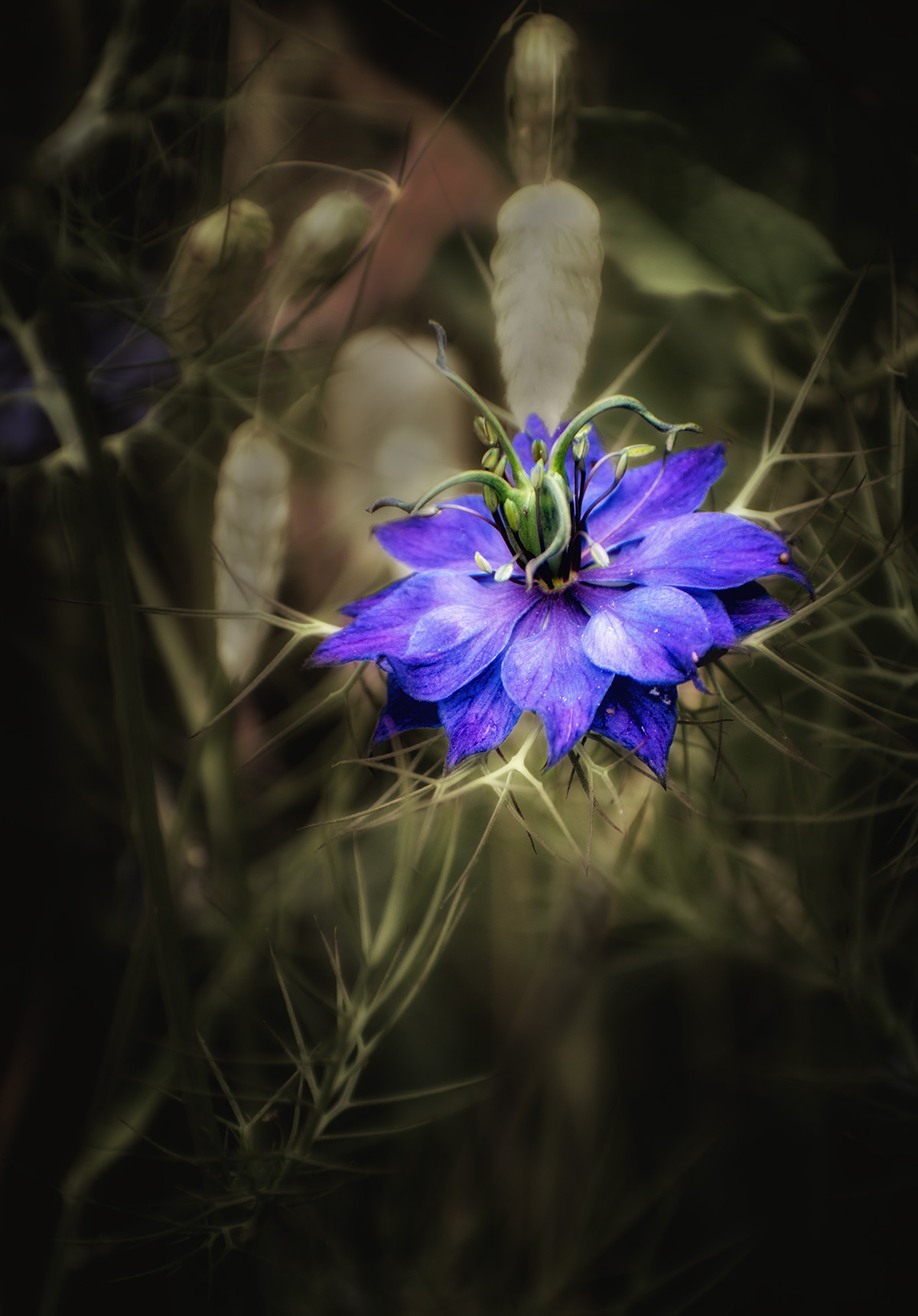
Commended: Love in the Mist by John Crowland The high contrast treatment has lifted this image against the de-focused background very well. Adding vignette to the right side may balance the picture. |
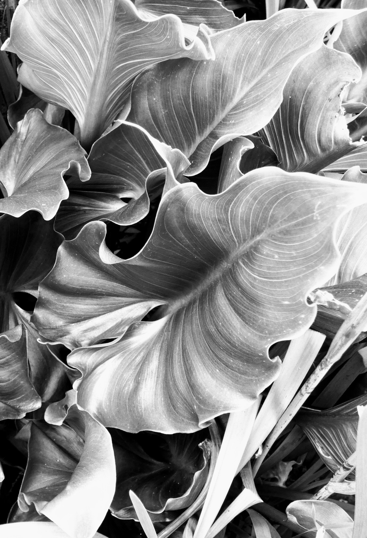 |
Commended: Canna Lily Leaf by Deb Griffiths Monochrome works well showing leaf lines as main image feature and adequate contrast. Bottom 25% would be better cropped to remove blown leaf and tangled stems. |
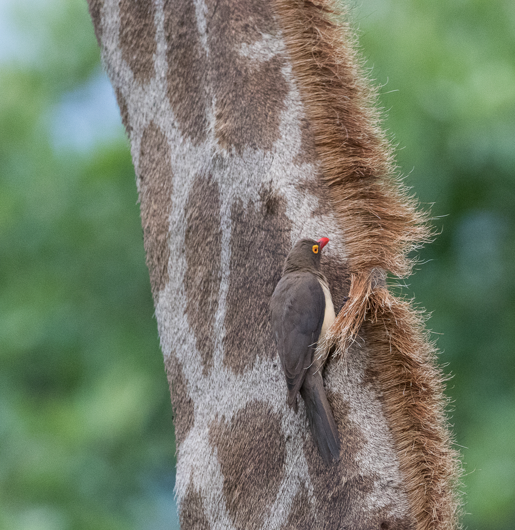 |
Commended: Hanging On by Elisa Best The bird and the bent-back hairline sit in the best position in this picture. The lighting is a bit flat so an increase in contrast would help. |
 |
Complex Connections Complex pattern it is and diagonal light works well. The text on the black disks complicates this picture so I might have tried reducing the number of disks, say 3 x 2, and adding a border. |
 |
Confetti Close cropping works well and leaf branch running into top left is good. White “dots”, bottom left and partial at the top, could be removed and the photo cropped from the right up to the black dot. |
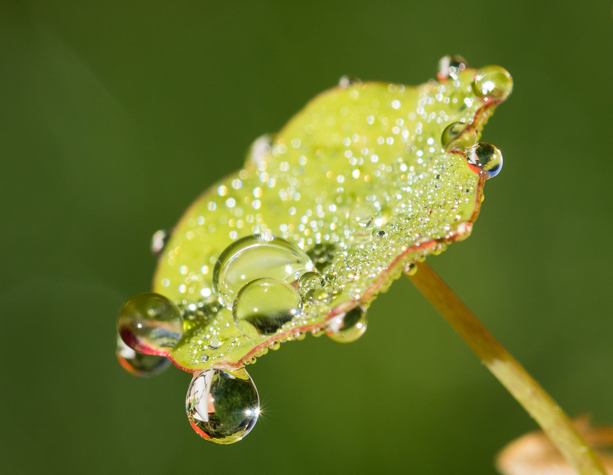 |
Dewdrop Good background and shallow depth of field works well to focus on main dewdrop. The white area in the main dewdrop could be darkened and also the bright area around the stem base. |
 |
Golfer's Score Card The diagonal lines of this photo are good and the background texture suits the image. The lighting is a bit harsh but could easily be fixed using window light on a dull day. |
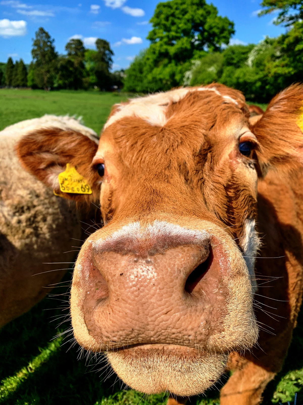 |
Good Moooing The textured nose and spiky hairs are well seen in this image. Maybe cropping out the sky and trees would exagerate them even more. |
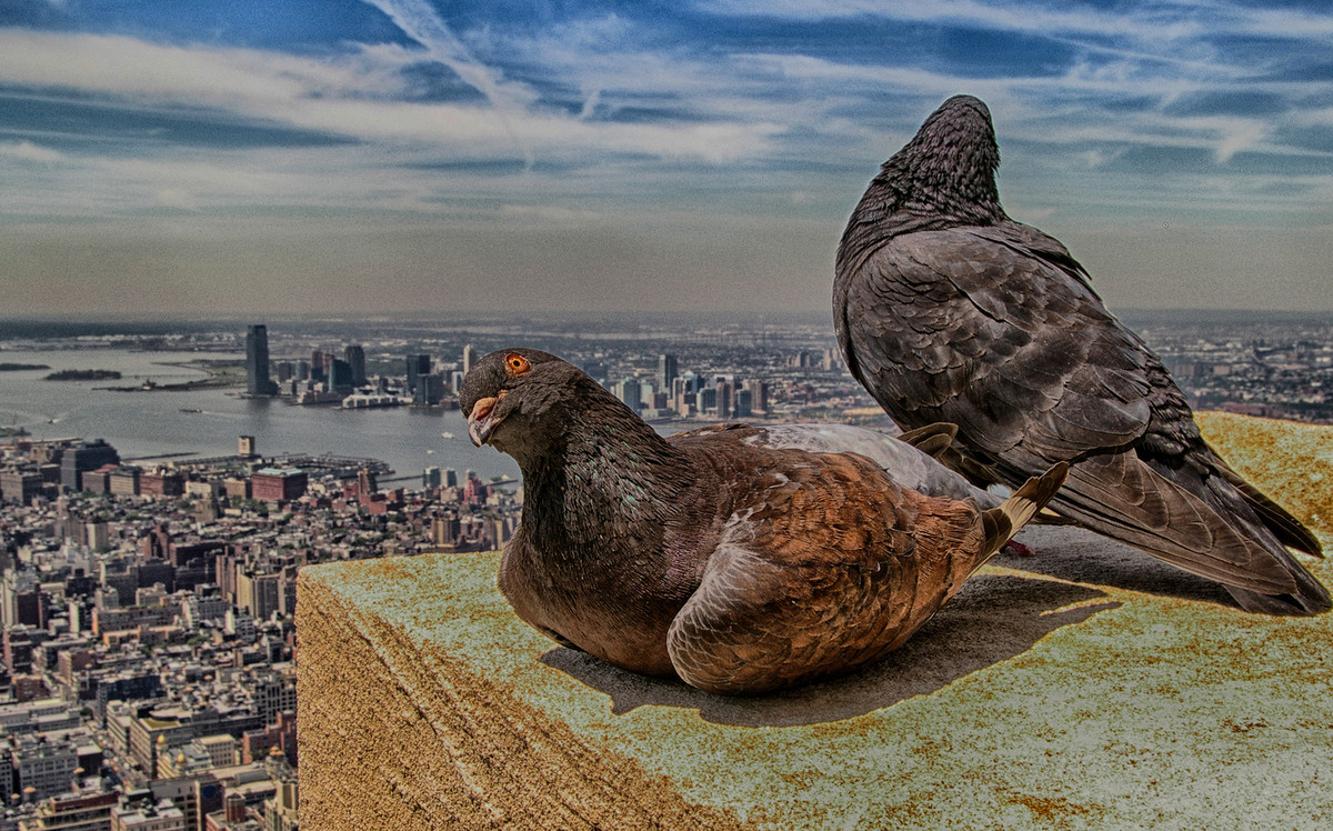 |
High Flyers Unusual viewpoint for these pigeons high above the city. Well exposed and sharp. The yellow stone could be darkened to concentrate the viewer on the birds, and the rear bird is cropped very close to the image edge. |
 |
I am a nice Colour The insect colour is a good contrast for the background leaves and the letter box crop works. Focus is just off on the head and tail, so a sideways-on view may have improved this. |
 |
Just Checking The eye grabs the attention and is caught well in this image. Cropping from the right, past the first vertical stick, and darkening the bright area above the bird will remove brighter distractions. |
 |
I am Looking Into Your Soul The eyes and the darker eyebrows make for a well focused image. A crop to centre the eyes and darken the nose area may lift this photo. |
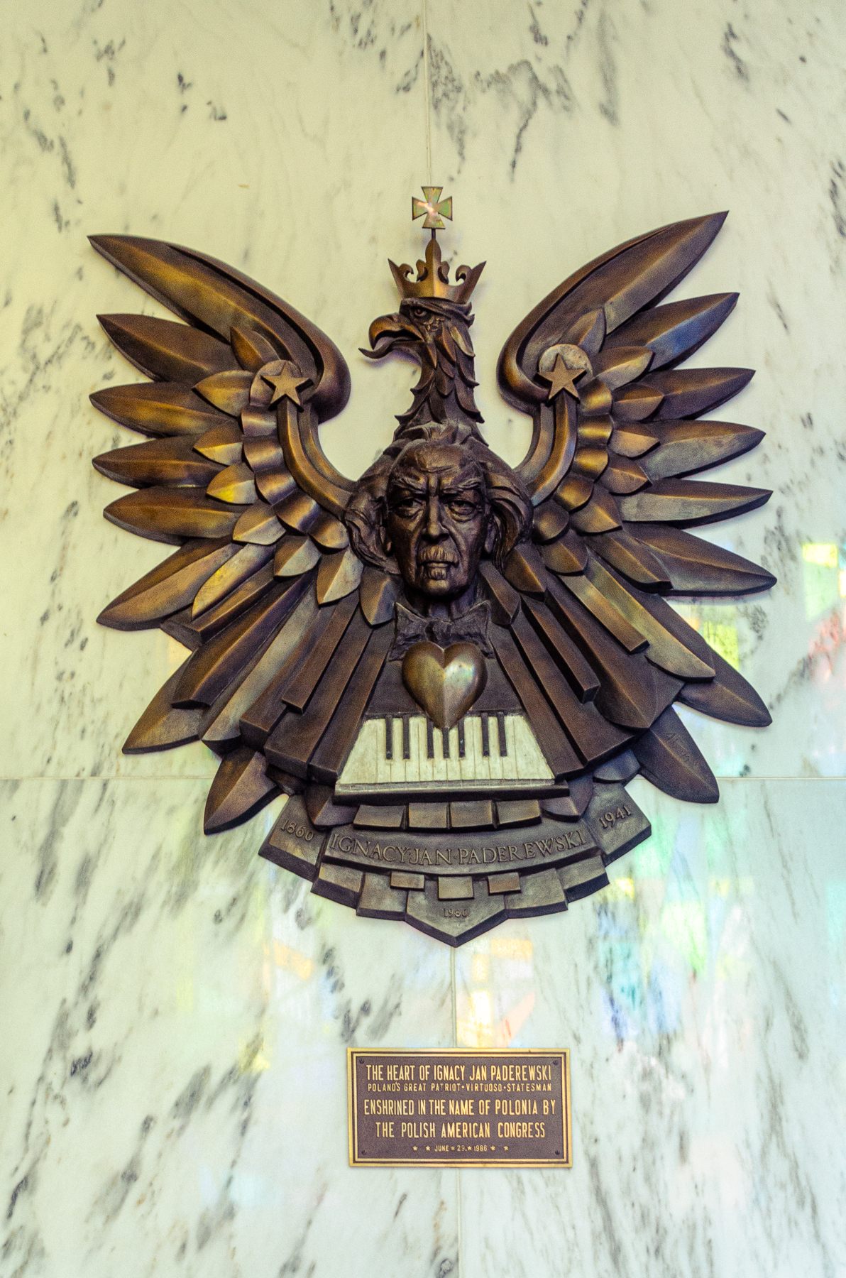 |
Paderewski Memorial The lighting on this bronze is good and the image is a good record of this memorial. An option would have been to frame the image on a particular area of the bronze, maybe the left wing with the good lighting and the star as the focus point. |
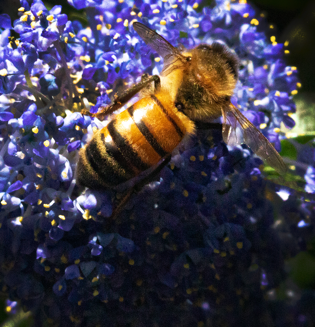 |
Pollen Collection Blues and yellows always work well and the diagonal line of the bee is good. The contrasty light has not helped here so maybe move position slightly to reduce the strong glare. |
 |
Poppy Well balanced picture within the square format. Colours work well. Perhaps darken the three corners to match the bottom right to concentrate attention on the centre. |
 |
Scavenger Well executed image with sharp eye and blurred background. Getting the camera down to the eye level would really boost the photo. |
 |
Slow Worm A good portrait of this creature with a well focused eye positioned well in the frame. Perhaps the top half could be darkened to commit the viewers eye to the well marked head. |
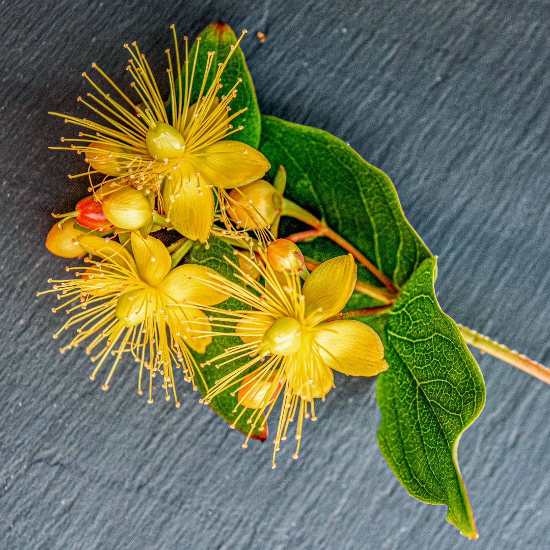 |
St John's Wort Colourful image with good background and suits the square format. A 90 deg clockwise turn will place the stem at the bottom and the orange spot removed from the top middle will improve the image. |
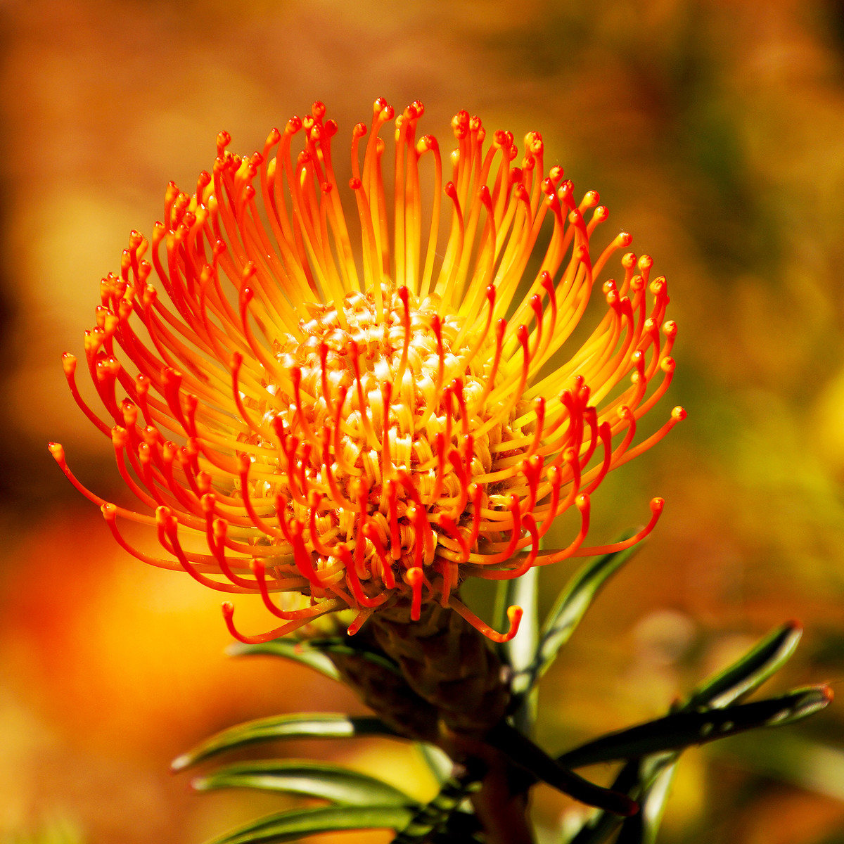 |
Sun Catcher Eye catching colourful image with good defocused background. Maybe a little over-exposed with highlights in the centre of the flower. |
 |
The Body Image works well in monochrome with good blacks and good whites. Just crop the bottom to remove the small light area and try flipping it horizontal to read from left to right. |
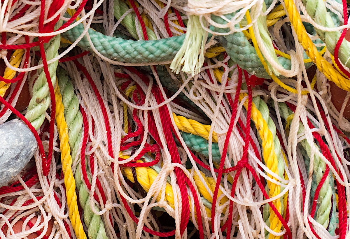 |
Tangled Fishing Nets Good colours and texture in this picture. May work better rotating counter-clockwise by 90 deg then thicker green cord becomes main focus of image. |
 |
Waiting for Lunch Good sharp image of this beast and rightly cropped on the head only. Flipping the image horizontal will let it read left to right and a dark vignette will concentrate the viewer on the jaw and eye. |
 |
1st Place: Evening Glow by Janet Cox Superb colours and light. Exposure handled very well. For me, removal of the chair on the left would have enhanced it beautifully. Pure Still Life. Soft subtle lighting and as the title suggests Evening Glow. |
 |
2nd Place: Slow Time by Jackie Poulter Love it. It's not something you normally see. Thinking outside the box, but within the brief. I would have just cropped on the left slightly. A great idea. I must give it a try! |
 |
3rd Place: Feeling Wobbly by Jackie Poulter Very wobbly, Part of a bike, trolley or maybe a disability vehicle. Love the colour red yellow green. Nothing is over processed and the ‘wobble’ is a great idea to make you think. Just one thing, I would have removed the black ‘knob’ in the bottom right corner. Great shot, Love it. |
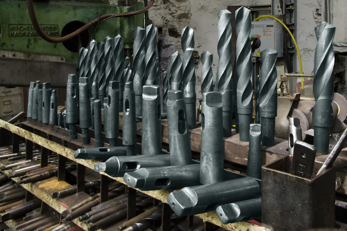 |
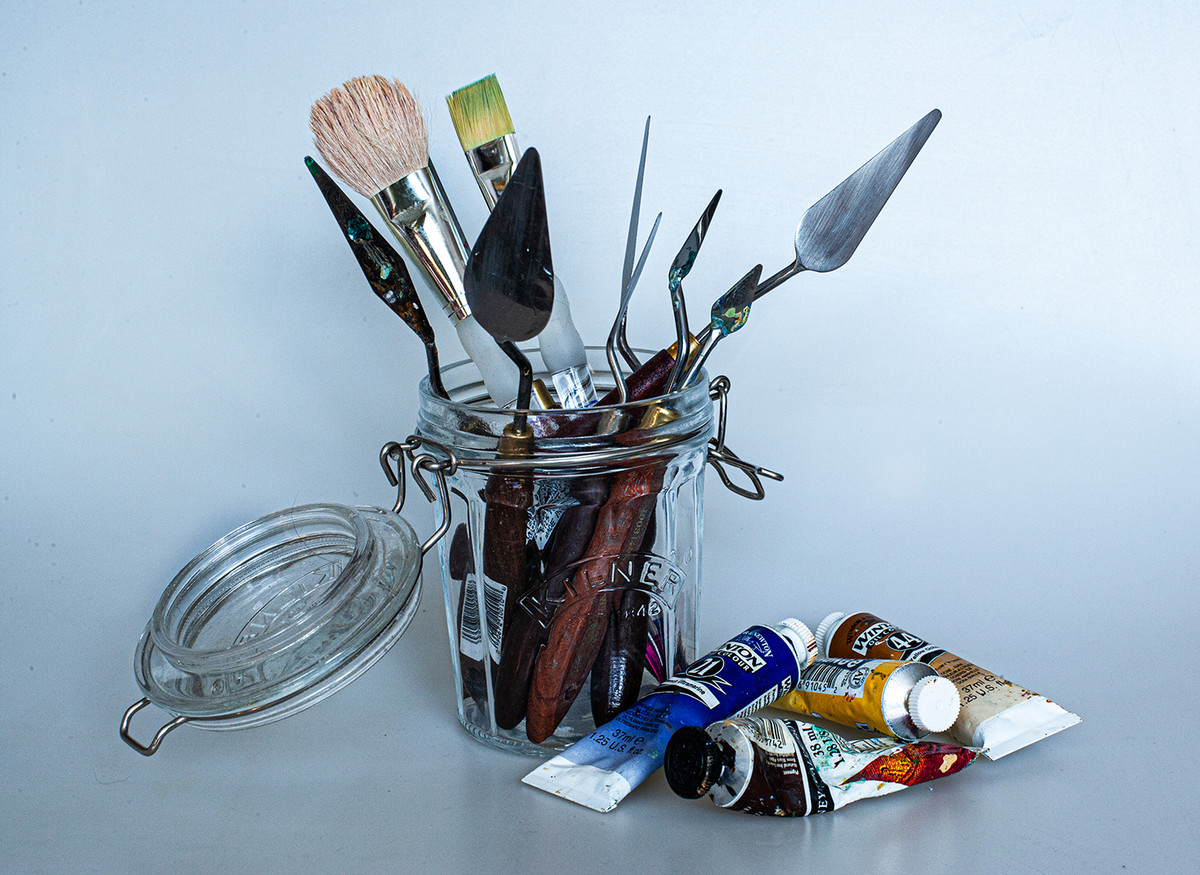
Highly Commended: Just Bits by Mike Roberts I think I know where you took this. Its a great place to go. Well exposed and plenty of detail in the drills. I can just about read all the writing which is very important as everyone wants to see what words are written in an image. Great composition. I really like this one, probably because its my type of photography |
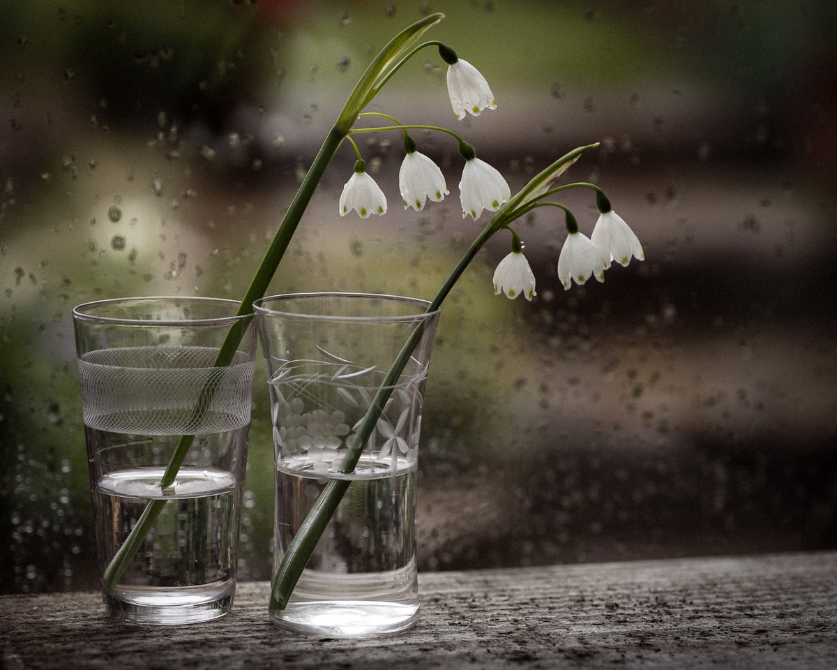 |
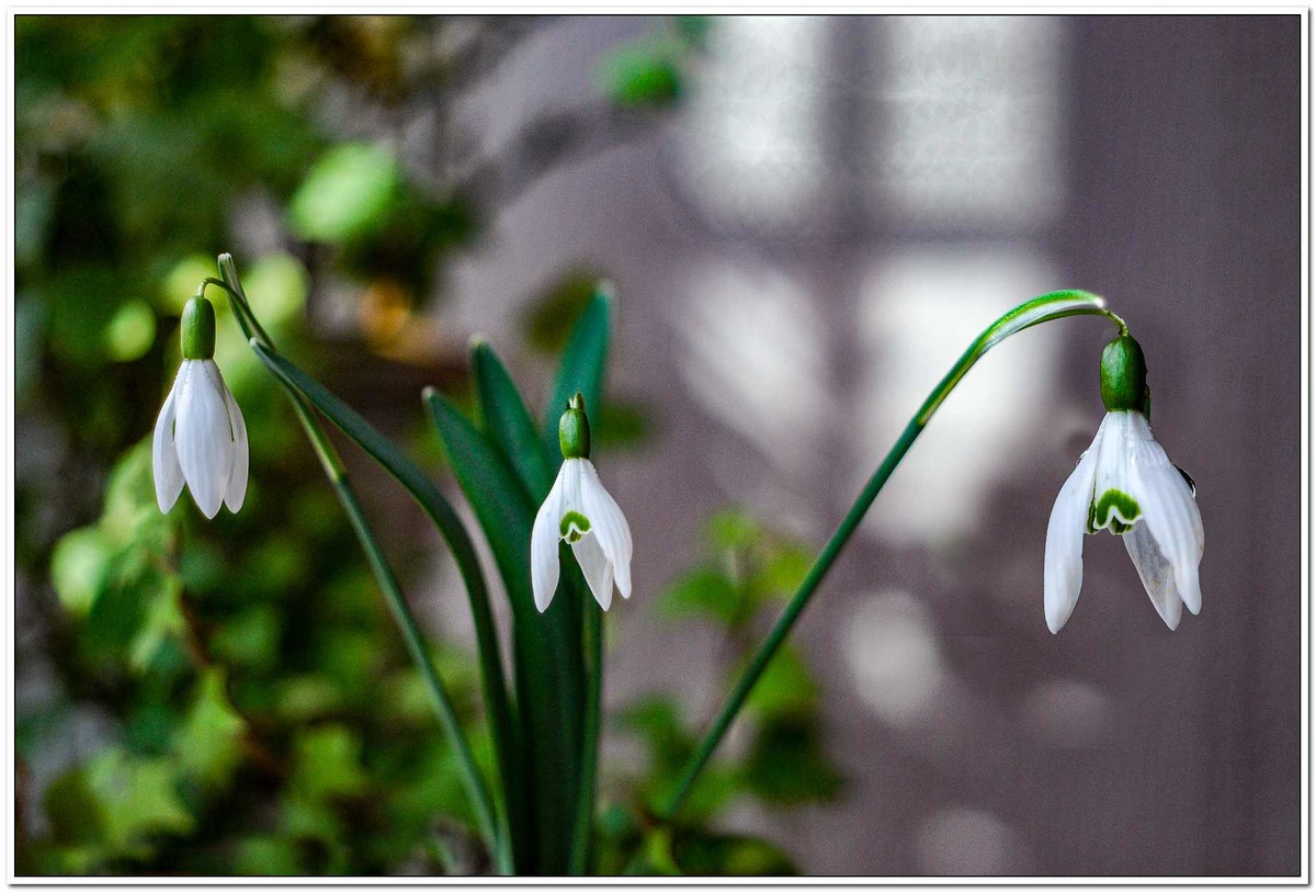
Commended: Spring in Isolation by Pat Hopkins The snowdrops are very delicate and you have handled the exposure very well. It doesn’t matter to me that there are only two as the two that are there are lovely. I like the way you have used the raindrops on the glass behind to help with the backgound. Well done. |
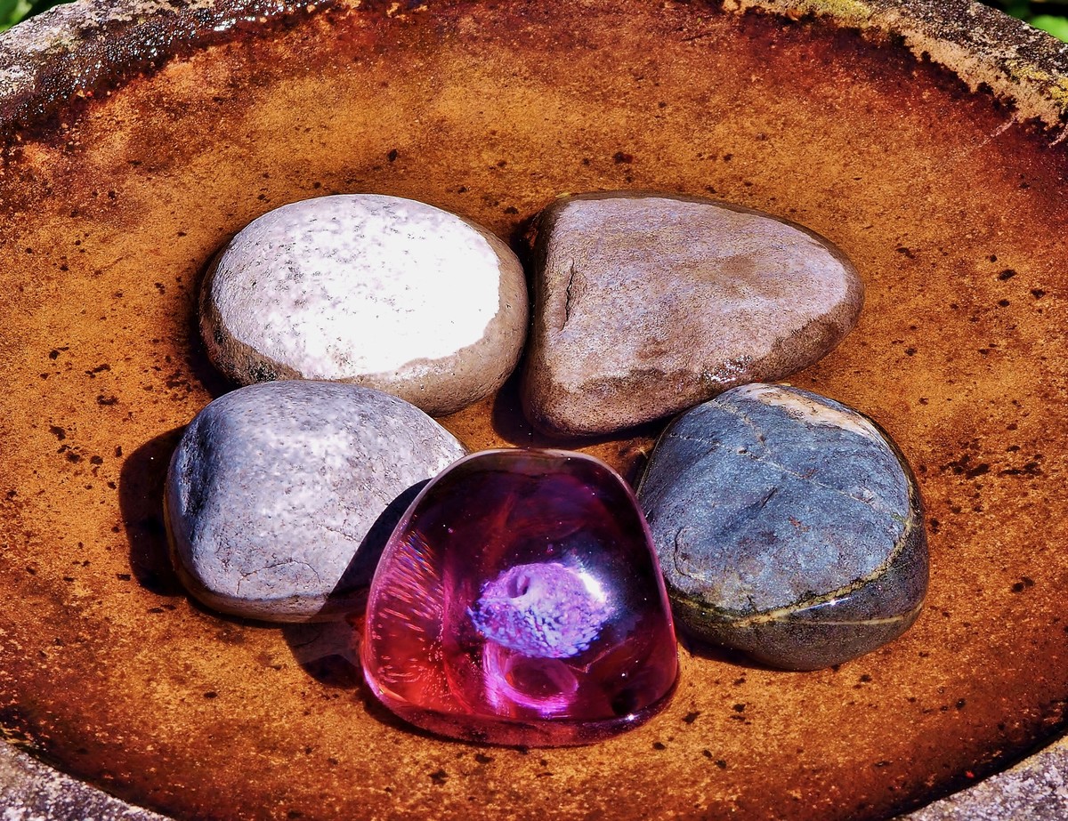 |
An Odd Pebble Colours are lovely, I like the glass in the front, but the highlights could have been handled better in both the glass and the top left stone. Perhaps a tighter crop would help as the corners of the image are a bit distracting. |
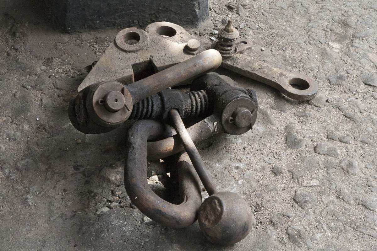 |
A Spare Link I like the colours of this, but the rust colour could have been brought out a little more. Not over processed at all, great light in places. Maybe put on a more diagonal for greater effect and the dark stone removed at the top. |
 |
Blossom Classic shot of Hawthorn flower. Nice blurred background going into black, although removal of the petal at the bottom of the shot and the orange of the leaf on the right would improve things. Almost sharp, very difficult with breeze just moving the flower. Good colour. |
 |
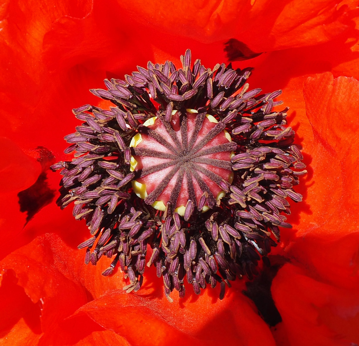
Colour Contrast A great idea, but Im not sure about the colour of the poppy, never seen a purple one, maybe wrong. It certainly hits you when you first see it. A crop on the right to a square format would help.. Really like the orange centre, a difficult shot to get whatever colour the flower is! |
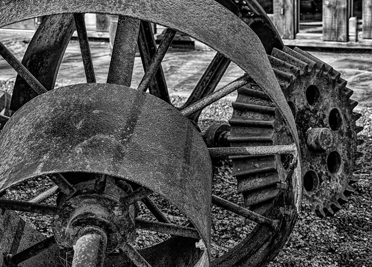 |
Useful Gear A classic gritty mono shot of wheels. It looks a bit ‘ghosty’ to me probably over processed. Think I would pull back the clarity a little, Good contrast, but a little more black would be useful. Good composition. Well thought out. |
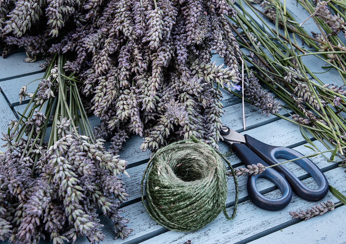 |
Lavender Harvest A nice idea. Colours are muted possibly a little too much.Nice and sharp but I would have removed the stalk 1/3 from the right just above the scicssors to balance the image better. The string and scissors add a nice touch. Well done. |
 |
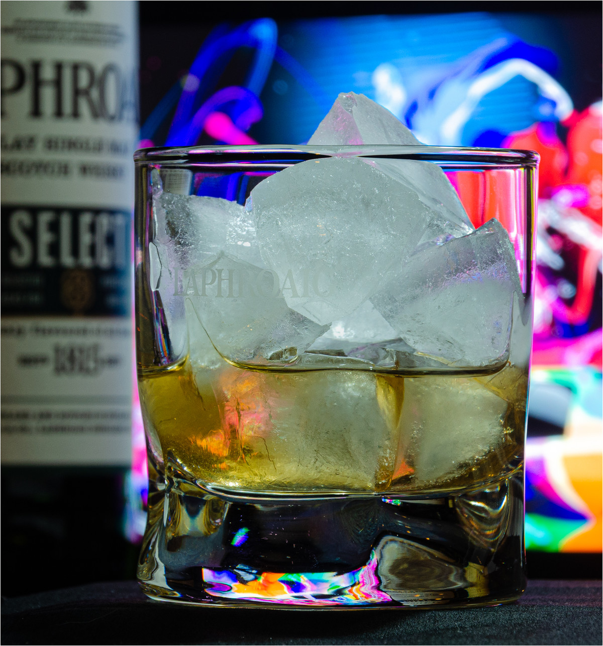
On the Rocks Someone likes their whiskey. Colours are great, but there are a lot of marks on the glass which could have quite easily been taken out. Colours are good too. Maybe a piece of black card behind the glass would have helped. It would be interesting to have the whiskey in the glass and go in close for the reflection in the bottom of the glass. That would be a great abstract. Hope you enjoyed the whiskey! |
 |
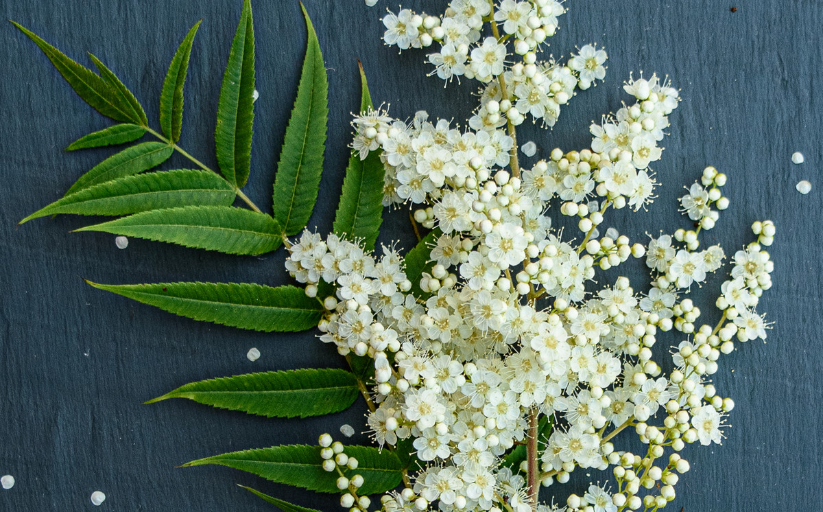
Love in the Mist Lovely shot of this classic flower. Very sharp where it needs to be. Not sure about the leaf at the top, it could have been darkened a little. Nice vignette . Maybe take a few of the spots off the flower would help. |
 |
A Perfect End to a Perfect Day Yes, definitely, although lunch springs to mind half way on the walk. Lovely colours, no over exposure and it tells a story of a day out. Well done |
 |
Paint Set I really like this, colours are good, (a little lifting of the shadows just a tad) . image is well presented but you have sensor spots. A shame, take these out and it will improve things no end. |
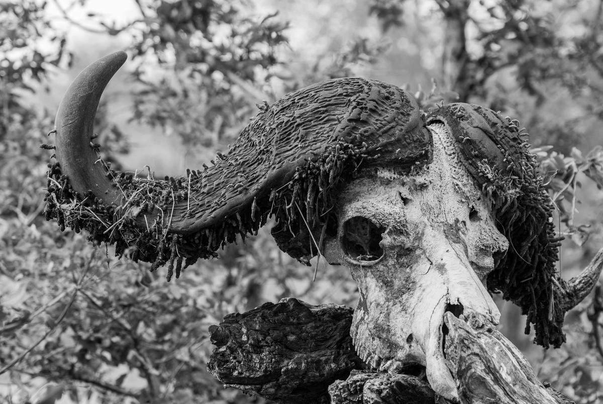 |
Buffalo Skull Different type of image. The skull is sharp and well put together. For me, I would have tried it in colour as I think it would show up better as unfortunately, this image is lacking contrast and the skull blends into the background. Try using a different F stop to blur the background more. |
 |
Prickly Subject Yes very still life. You have handled the subject well. Background is blurred, but maybe a little work on the light spots on the background would help a lot. |
 |
Prime Colours Another ‘art shot’. Certainly a big range of colours, but I think a lifting of the shadows and the blacks might help this. Its a difficult one as the paint is quite smooth but I still want to see detail in it. There is no burnt out and that’s good. I hope my suggestions help. If you have Lightroom its very easy to use a range mask to achieve this. |
 |
Tangerine Spike A real piece of abstract photography. Makes you think. Maybe crop to a square as the right hand side looks a bit strange. |
 |
Ted to the Rescue A very novel idea. Well done Ted. Colours and exposure are handled lovely. Maybe try again and blow the background out. Everything is very sharp, just thinking by softening the background it would focus your eye more on Ted and his mates. |
 |
Thermometer Yes nice colours and a different type of thermometer. I think I would crop in really tight and it would focus your eye even more. Well exposed image. |
 |
Three Owls It's nice to see the two small ones being held by the big one. Not sure about the lighting, Shadow too harsh. Maybe you could try it in natural light as the shadows are very distracting. |
 |
1st place: Who Orderd This by Pat Hopkins This is a superb image, which says everything we need to know its in a winter garden, so fits the bill perfectly, and as Christmas cards show this is the type of image that winter can give us. The bird is sharp and colourful and the out of focus snow in both the background and foreground again add to the impact of this image. The image is on the thirds and thus it make it a good quality image. |
 |
2nd place: View from my Garden by Heather Elliot Again, fits the bill of the theme of a winters garden with the undisturbed snow on the trees and hedgerow with the garden path leading us out through this image into the into the beautiful snowy landscape beyond. I would have liked the highlights in this image to be brought up a fraction and give the snow a bit more of a whiter and crisper feeling. |
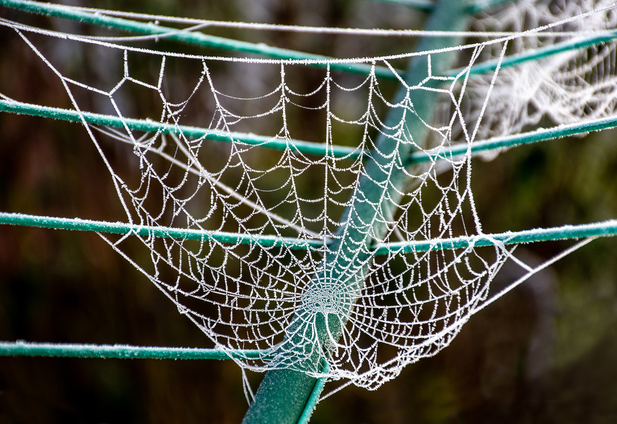 |
3rd place: Frosted Web by Keith Sharples Beautiful image, the author has seen this and clearly understood the theme. Showing the complete frosted web on the clothes pole which is in the garden, and the way the frost has collected all over it, makes it a very good image. |
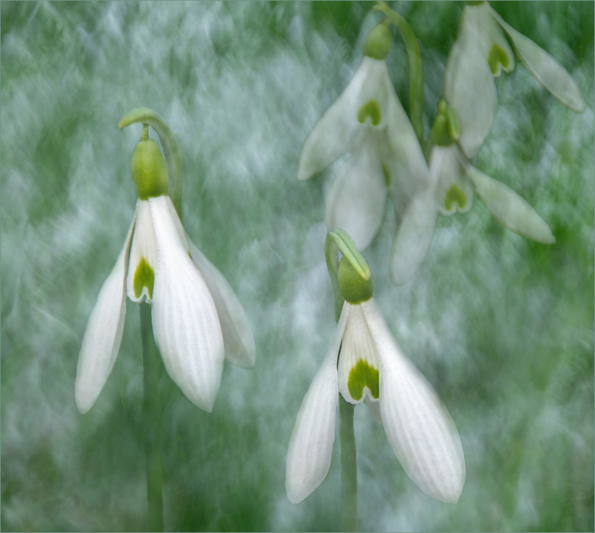 |
Highly Commended: Snowdrops by Lyn Sharples A beautiful image taken in the garden perhaps. I like the way the two snowdrops appear strong and sharp in the foreground while the others are more blurred keeping the viewers eye on the front two flowers. I find that the background is a little too busy and one of the back flowers intersects with one of the front flowers. I would have liked to see separation between the front and rear and by perhaps changing you position slightly this could have been achieved. The texture or treatment given to this image works well and enhances the image well. |
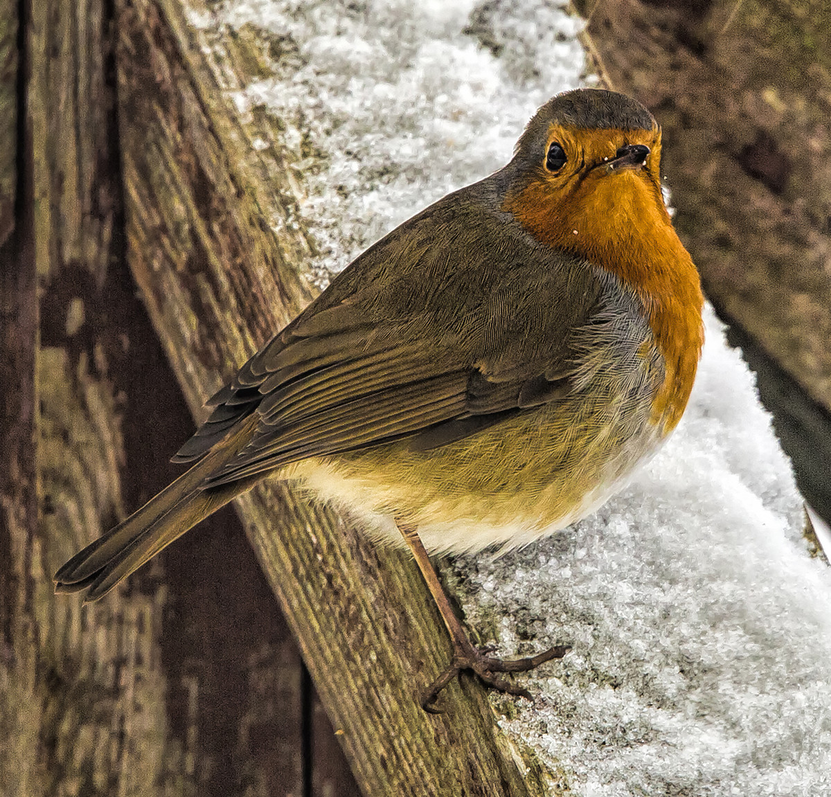 |
Highly Commended: Robin by John Crowland This image fits the theme, the robin is sharp and colourful and its sitting on a fence which has snow or ice on it. This fits the bill and the background is not overpowering, but I do find the image a little grainy and I think dropping the ISO a little, would perhaps reduce this as the robin is fairly static. |
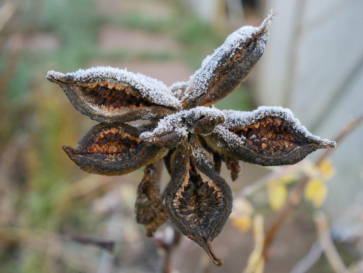 |
Commended: Frosty Seed Head by Anne Richards Again, another which fits the theme of, in the winter garden. The seed head is very sharp, and I like the way the author has captured the whole of the flower head in this image with white frost on the tops of the seed heads. The only problem I have is the yellow flowers in the background in the bottom right hand corner which are distracting and keep dragging my eye to them, perhaps by stepping to one side or the other we could have eliminated these and the other light coloured items that are also in the background. |
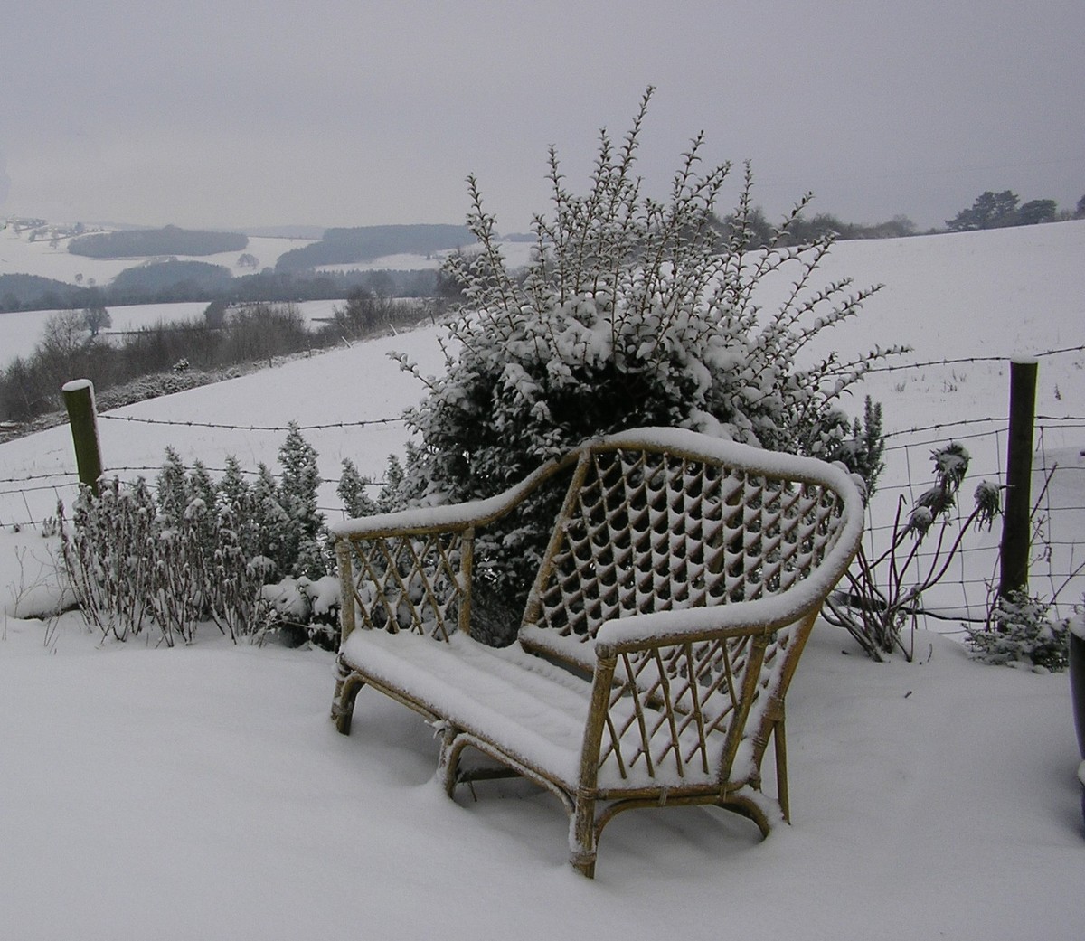 |
Commended: The Wicker Seat by Heather Elliot Certainly, fits the theme, a beautiful snowy scene with the wicker seat covered in snow and the fence behind which tells me it is indeed in a garden, and then as we look further, we can see the rolling snow covered hills in the background. My only criticism is that the snow is just not white enough and needs a small boost in photoshop to bring it up. Excellent well seen image. |
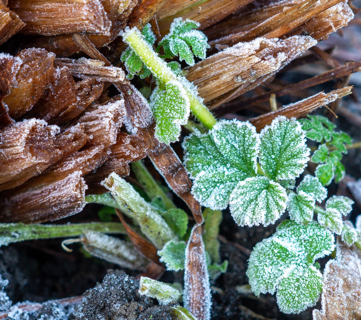 |
Frosty Morning This image is of a group of nettles and other stems. I like the way the author has gone out into their garden on a frosty morning to capture this image. The green nettles on the bottom right hand side attract my eye and with icy frost on them give me the sense of being cold. The brown stems covered in frost show that this plant has died down because its in winter. So, this covers the theme and I do like the way the nettle stems cross diagonally from top to bottom in the image. Could the author have gone in closer to show the patterns of frost on the nettles? |
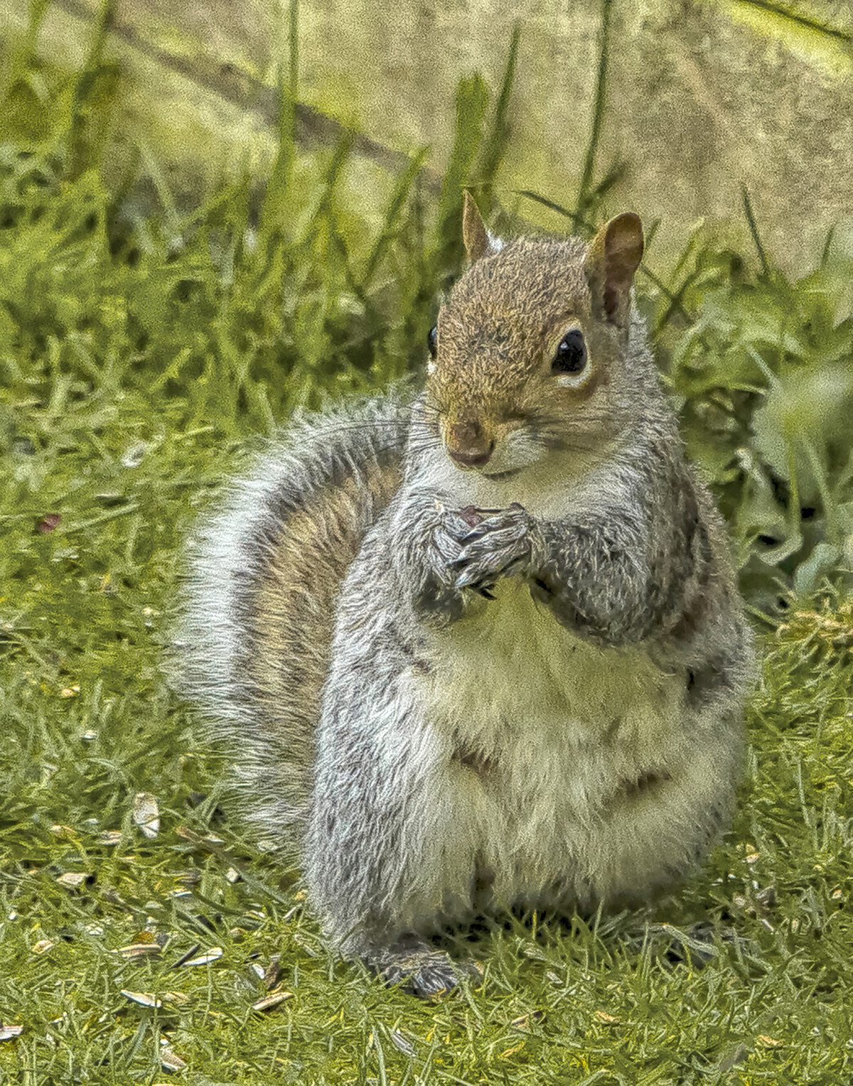 |
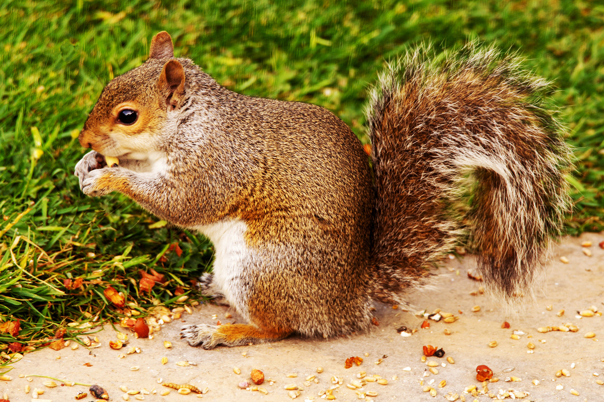
Grey Squirrel Good sharp image of a grey squirrel, with the eye sharp and I can see discarded nut shells giving me the idea that the squirrel has been eating them. For me, though I have seen many grey squirrels around most of the year, they normally hibernate in winter, although this winter has been mild, so maybe they are awake. I feel that if this image had snow or frost in it would perhaps fit the theme more. |
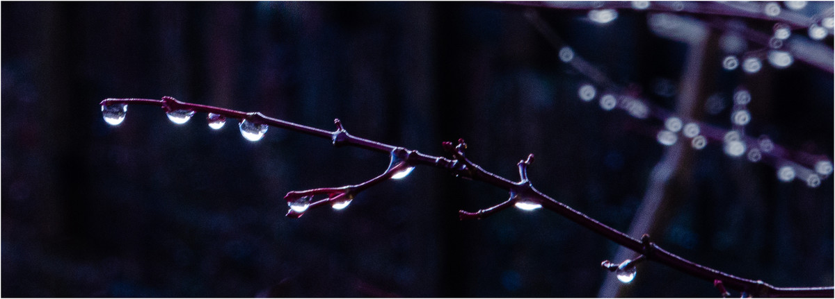 |
Snow Melt Beautiful well seen shot with the beautiful water droplets on the small branch and I like the way the author has letterboxed this image. Sadly, the right-hand side of this image has a lot of bright distractions which constantly take my eye away from the left-hand side. This image has 2 images in it, the left a superb image with the water droplets in and on the right a bright blurred image which I feel is not needed, and it could have been made much stronger if the right hand side was cropped out just leaving the one branch and the droplets on the left. |
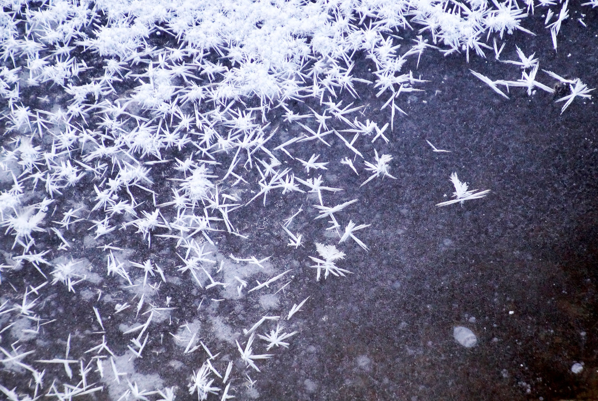 |
Starting to Freeze Although this image indicates that its cold and ice has started to form, I am not clear what this image is about, it does not have a clear focal point and no message and is very confusing. The bottom right is empty, and I find there is just too much in this image with no clear focal point. Could the author have gone in closer and focused on just a few of the items. |
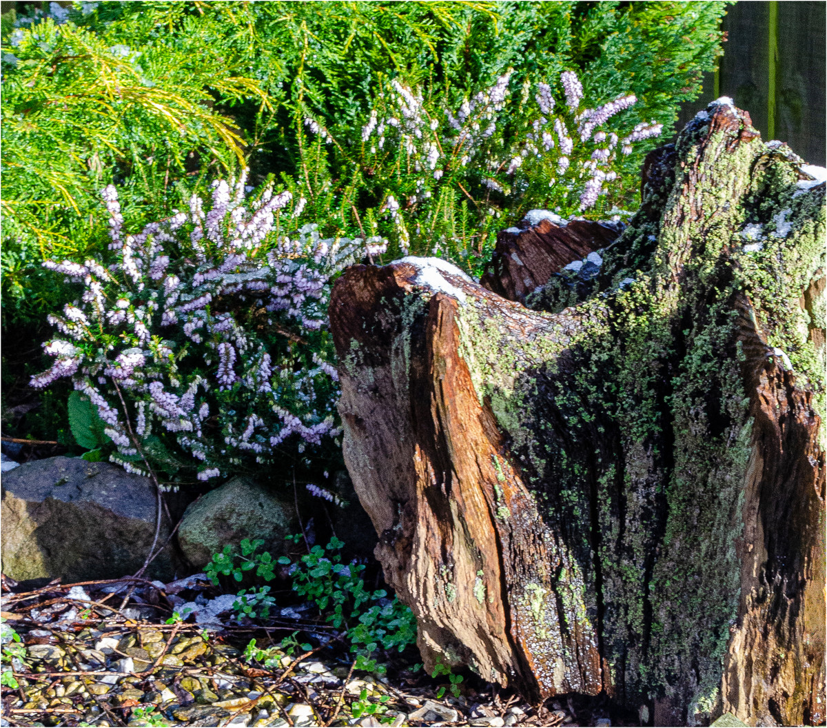 |
Stump and Heather Well seen by the author with the tree stump on the right and the purple heather behind. There is a smattering of snow on the tree stump to give me the idea that this is indeed winter and therefore fits the theme, but I do feel the overall image is just a little too colourful. |
 |
Winter Leaf I like the way the author has placed this leaf diagonally across the image on top of the moss adding a little more dynamism to this image. I find though there is too much contrast on the leaf, the highlights have burnt out and the same goes for the moss. This should have been taken on a cloudier day to reduce this, and really this does not fit the theme in the winters garden as with the lack of snow or frost it could have been taken at any time through the year or at least in autumn. |
 |
Snowy Scene Beautiful snowy scene, a winter delight I like the way the viewer can travel down the road and wonder perhaps what is at the bottom. Unfortunately, I can see nothing else and the theme is in the winters garden and this is not in a garden but is in the road and therefore does not fit the theme. |
 |
Cold and Rain Certainly with the amount of rain we have had just lately along with the flooding this is a poignant image, the summer garden is now flooded and inaccessible so we can say this is in winter and in line with the theme. But for me there is just too much of the branch of the tree blocking the view and the author should if possible have moved to the right to give me a clearer view. |
 |
Frosty Garden Beautiful image, clearly following the theme of winter, although if it's in the garden who knows or cares. I like the way the frost is covering all the leaves thus suggesting it's winter. My only criticism is that there are perhaps just too many leaves and possibly could the author have found a single leaf or maybe three to photograph. |
 |
Wet, Wet, Wet A scene of tragic devastation showing flood waters approaching a couple of homes that perhaps look like they are alongside a river and may be soon flooded. With the floods just recently, we can see why the author has selected this image. A good image title of wet wet wet sums up this photo but it seems to be a little soft and on the flat side where a bit more contrast could have helped. |
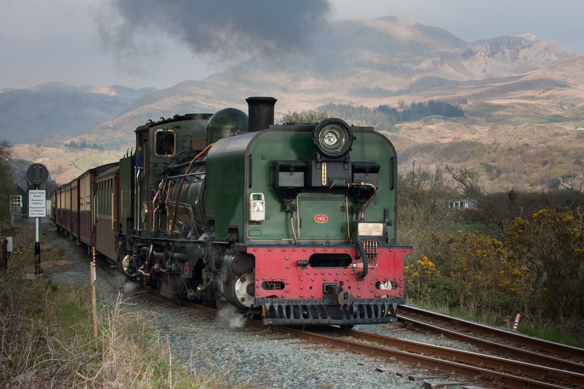 |
1st place: WHR Garrett at Pont Croesor by Terry Rees Pedlar Super, nothing to criticize fantastic image. |
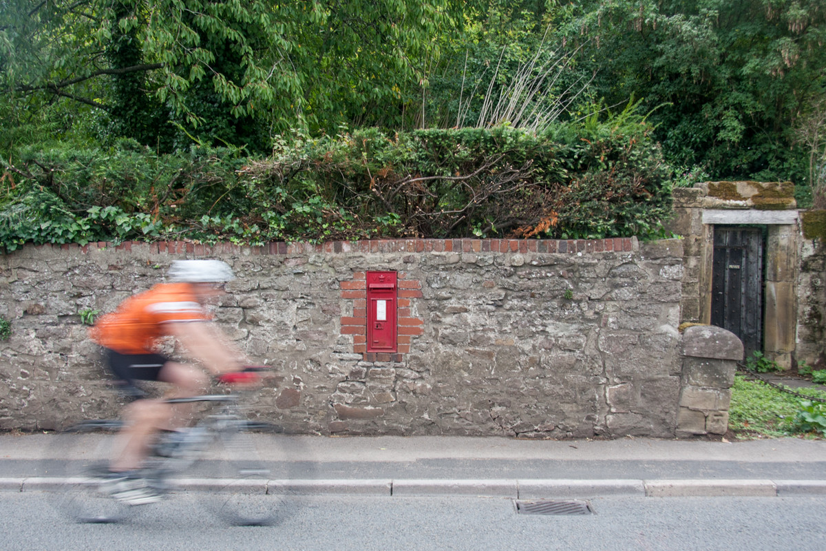 |
2nd place: Usk Cyclist by Terry Rees Pedlar Lovely image very well seen and the slow shutter speed has rendered the cyclist blurred but distinguishable. The dark foliage background is a good foil, especially important is the old building to hold the image in. The red post box is a bonus. |
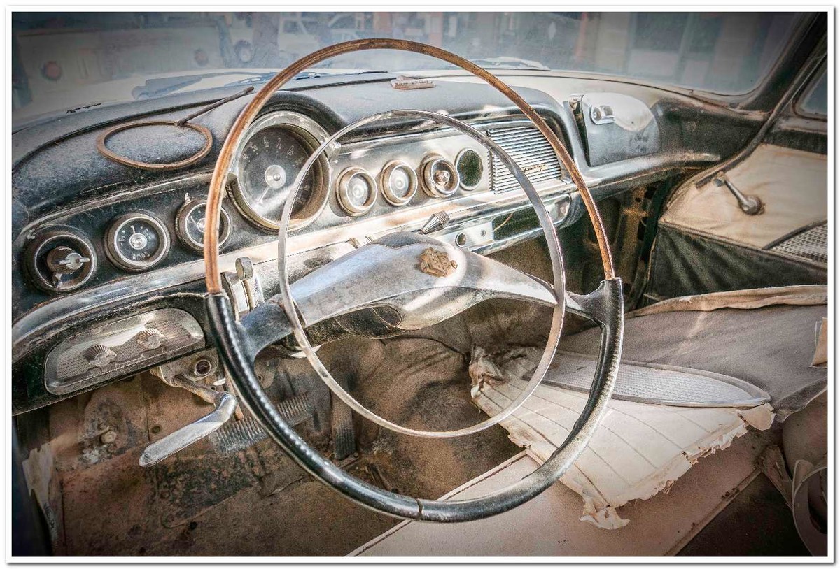 |
3rd place: MOT Failure by Chris Morris A very interesting very sharp image, good going in close and just showing the steering wheel and the dials and the torn upholstery. I don’t think this car has passed an MOT for many a year. I love the almost monochromatic colours there is nothing to distract and plenty to look at. |
 |
Highly Commended: Off to School by Elisa Best A nicely constructed image, I don’t think we need to see the child’s face we can read all the information from the sash and the school bag on the back of the bike. The child is in a good position with plenty of road to go down. The dappled shade creates shadows on the road and muted greens in the foliage. The only thing that I would do is to tone down the bright track on the left-hand side. |
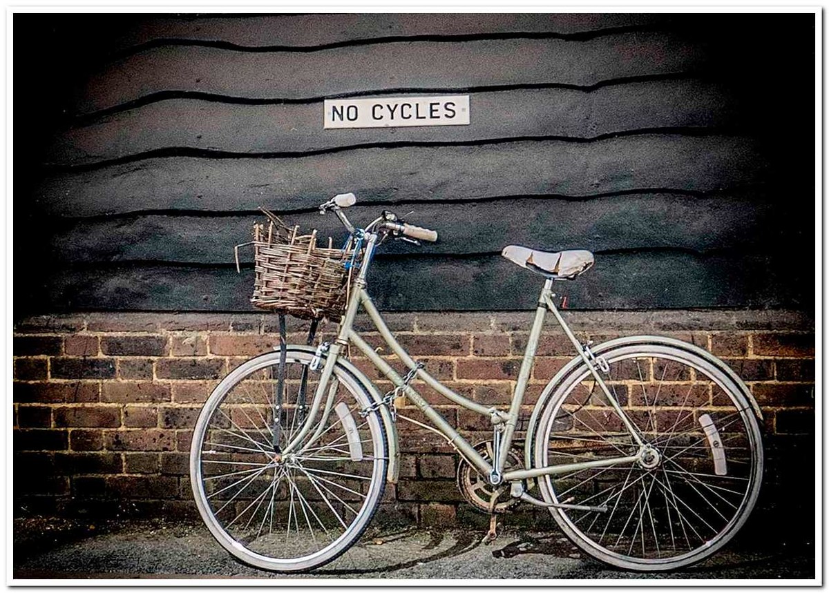 |
Highly Commended: No Bikes by Chris Morris Lovely, simple and fits the subject very well, there is nothing to distract us, good that you have darkened the corners it put all the light on the bike, it is set off centre to give space at the front. I wonder why it is chained up I don’t think anyone would want to steal it. Why was the title not NO CYCLES? |
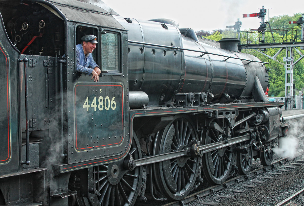 |
Commended: 44806 by Catherine Jones Depicts the subject beautifully, the train driver adds extra interest in what would otherwise be a good picture of the steam train. Perhaps a little more room for the engine to move into, I love the puff of steam filling the space at the front of the engine. The one thing that moves this down the placings is the bald sky. |
| Transport for London. Well seen, I like the person and the platform being sharp against the moving train. I do find the two very white panels in the centre of the image distracting, especially the large white shape on the top of the second panel, perhaps if the train had been going a bit slower we would have been able to see some of the passengers. |
|
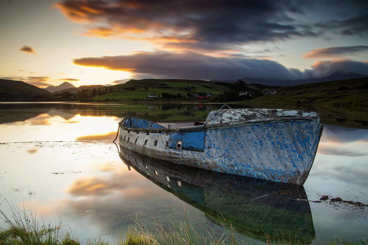 |
Boat for Hire. A beautiful calm scene, I love the top half of the left hand side with the super reflections in the water, the bottom half could have been darkened a little to match the top. The boat is in a good position and filling the frame. I think the hills in the background are lacking in contrast and quite dark, perhaps you could work on these, also the horizon is almost in the middle of the picture, perhaps you could have cropped the very dark sky at the top to move the horizon up. |
| Transport Interchange. Very interesting viewpoint showing the complex ability of the road network. I like the fact that there are three lorries coming down the incline. I find the image very busy with no real focal point, your eyes keep going around with nowhere to settle. I think I would have taken a bit off the top, perhaps down to the matrix sign across the motorway this would remove the red object at the top and remove the distraction in the right top. |
|
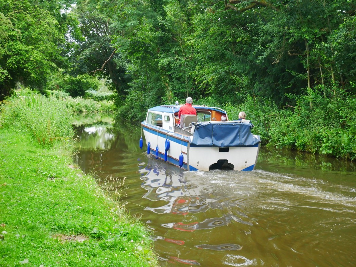 |
Canal Boat. A very English scene I love the reflection of the boat in the water filling the bottom space. To give the image more impact I think a bold crop would make the boat more prominent and remove quite a lot of the green vegetation. I suggest crop the top down to below where the light is shining through the trees and on the left hand side leaving just enough of the river bank to show an edge to the canal. |
| Converted Canal Transport. Are these canal boats able to be moved or are they moored homes? This image needs cropping on the left hand side to remove the large expanse of dark tarmac, I suggest up to the light coloured building, this leaves a dark base and all the lovely reflections in the water, also I think a crop at the top, just above the taller lamp post, doing both of these crops would concentrate the viewers eyes to the main part of the scene .. the boats. |
|
 |
Going Nowhere. This image has great potential but I think it is spoilt by the fact that nothing is sharp. I don’t mind the out of focus vegetation and the rusty building, but I do think the boat should have been sharper. |
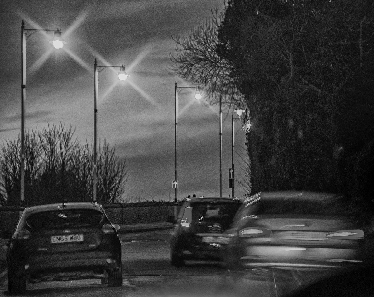 |
Going Home. A good idea catching the evening traffic. To my mind the picture is the two cars on the right hand side with just one lamp post catching the light, I am sure there is more detail in the very dark hedge that could be brought out. |
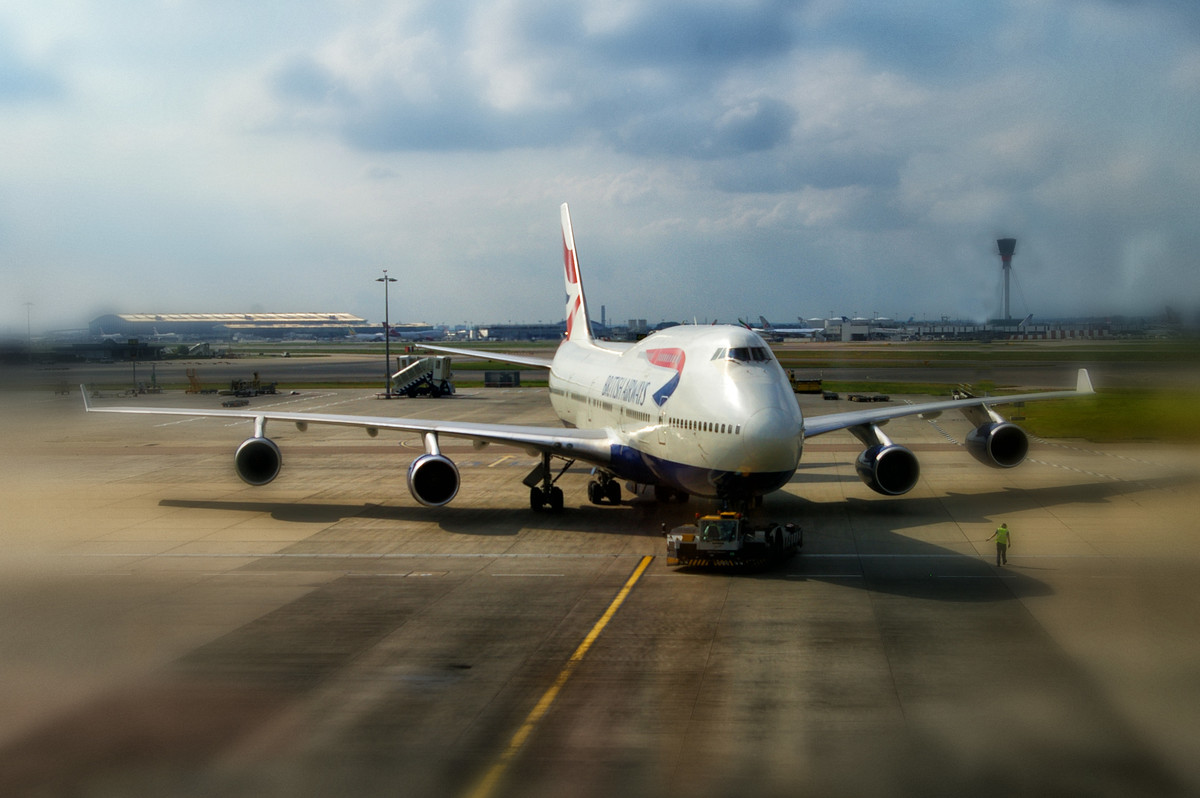 |
Heathrow 747 We have all looked out of the large airport windows and seen these monster planes getting ready for take-off. I think because this picture was taken through glass, (I hope this is so), it lacks sharpness and is very blurred especially on the left-hand side. I like the man standing beside the plane on the tarmac this give scale to the plane. |
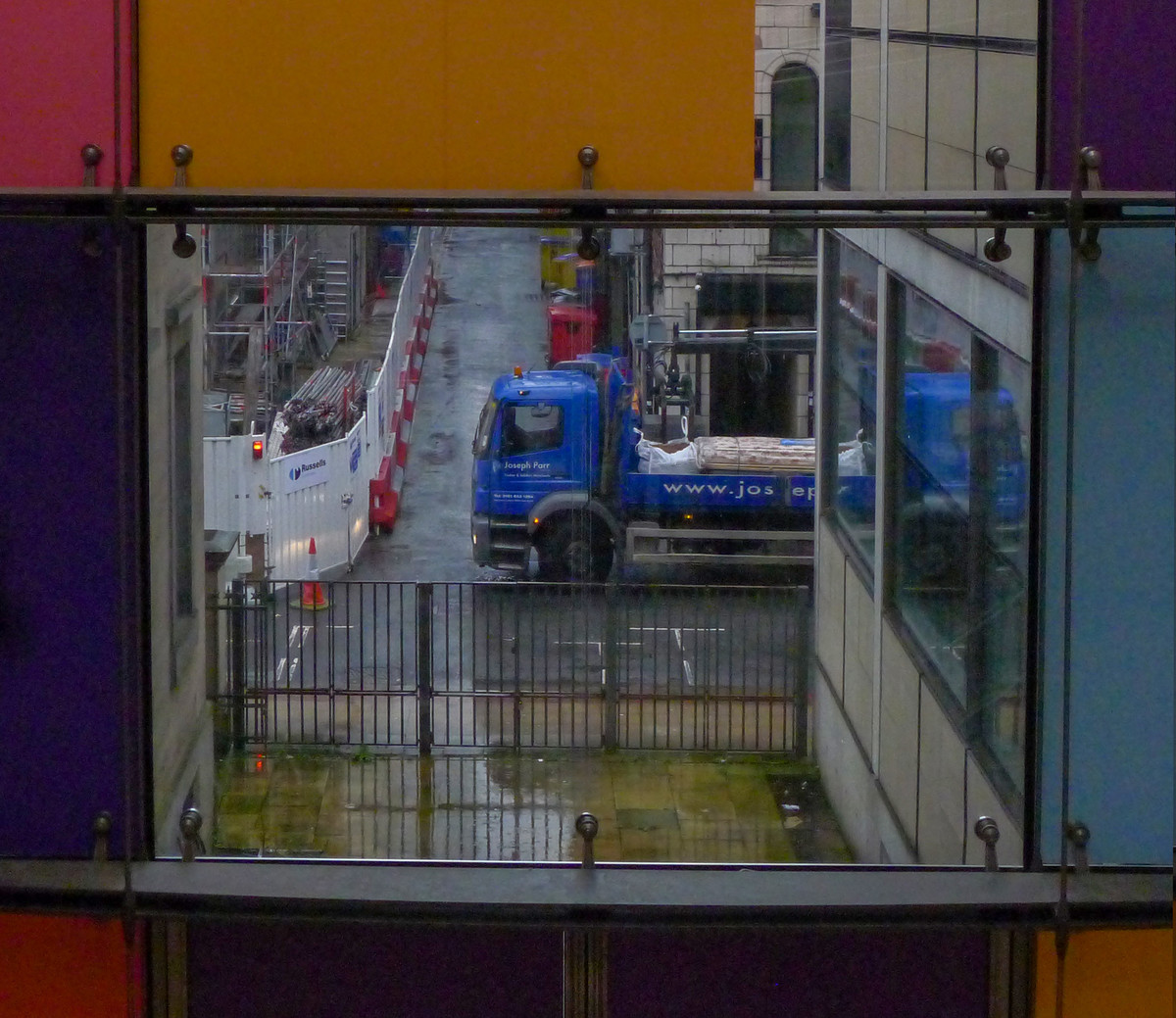 |
Lorry Delivering. This is another image that needs cropping, the orange and pink blinds are a distraction and do nothing for the picture. Also all the workings behind the white barriers are a messy and don’t help the image. Crop the top to below the blinds and on the left hand side up to the straight line of the barricades, this will give a bit of mystery to the image as it looks as though the lorry has nowhere to go, where is the driver? |
 |
On Yer Bike Well thought out image, fits the brief very well. It is pin sharp all over. I think the mixture of red and black bikes helps the composition. There is nothing I would change. |
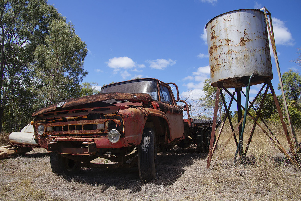 |
One Careful Owner. An old and rusty truck taken on a super day, lovely white fluffy clouds make an interesting sky. There are two things that worry me, the water tank seems to leaning and the white object behind the car which takes your eye, I also think the dark underside of the car could be lightened a bit. |
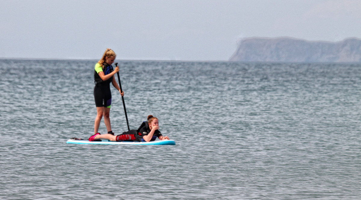 |
Paddling Along. A very different form of transport. I would have liked to see some action perhaps if the person paddling could have moved the paddle to make some movement in the water. I also think it is unfortunate that the girls head crosses the horizon, I think it would have been better if she had been framed against the sea and you could then do away with the large expanse of sky. |
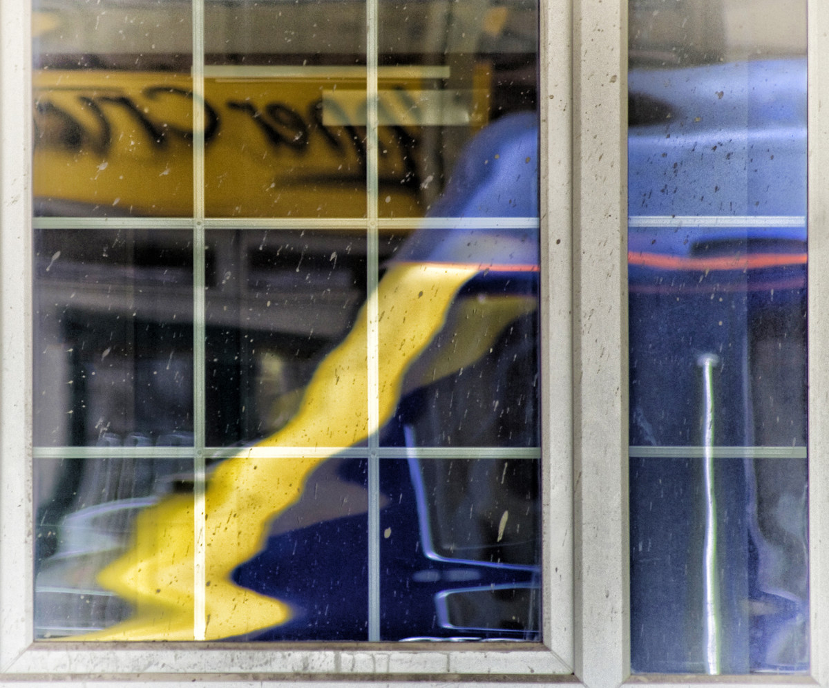 |
Reflection. This picture puzzles me I really cannot see what it is in relation to transport. Maybe it might be a lorry cab or part of a bus…..sorry author |
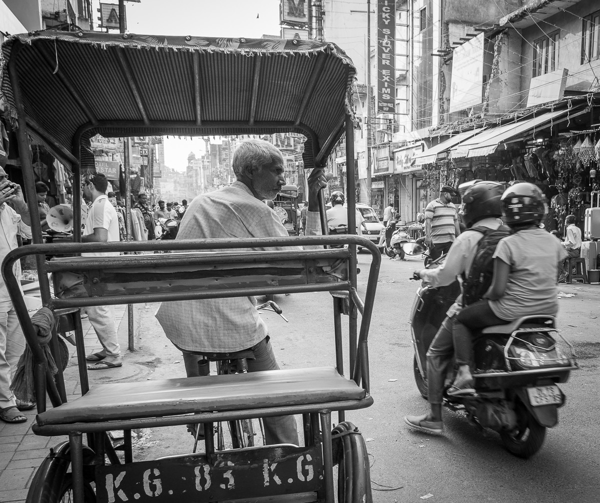 |
Rickshaw This image really shows the chaotic nature of the street which I suspect is in India. I think it needs a bit more contrast, it all seems a bit grey, the only true white is in the man’s shirt on the left, this is a distraction because it is almost the first thing you look at. I think it would improve the image visually if the bottom of the rickshaw was level. |
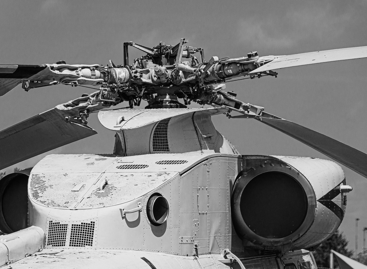 |
Rotor Assembly. This could have been a very interesting image but the title is not the main part of the image, and the rotor motor could have been more detailed. Be brave crop off all the white bottom half up to the oval of the rotor housing and try and get more detail in the motor itself. |
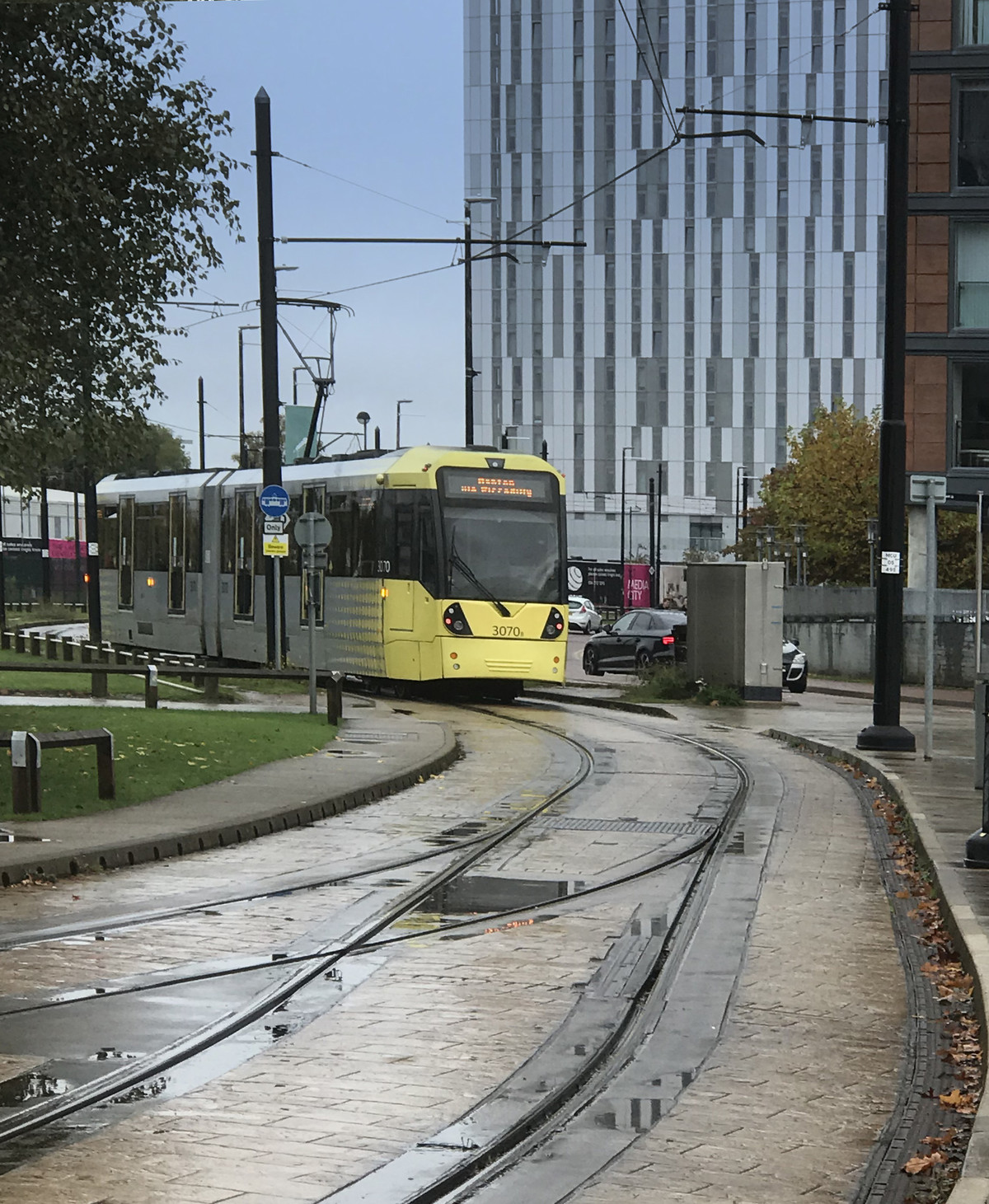 |
Salford Quays Tram. A pleasing image, the tram is in just the right position and the rain on the tracks adds interest. I am sorry to say it again but I would have cropped the dark building on the left and re-moved the small white sign, also clone out the red stop light on the car. |
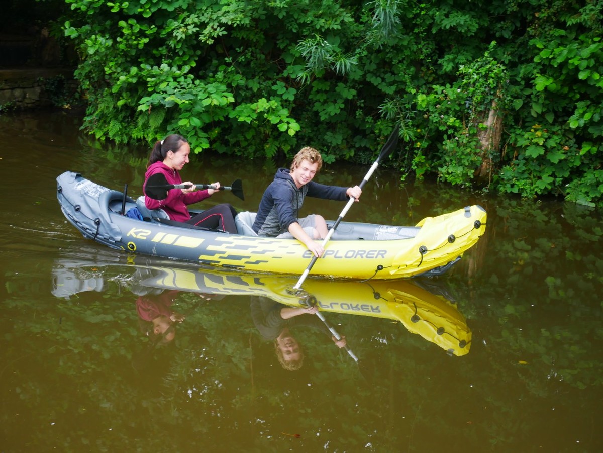 |
Yellow Canoe. This seems a very posed image, the boy looks as though he is doing all the work. It would have looked good if the paddle had broken the water and disturbed the perfect reflection, making it all wavy. I think the green foliage behind the girl is a bit bright. |